What is WPF?
WPF, which stands for Windows Presentation Foundation, is Microsoft's latest approach to a GUI framework, used with the .NET framework.But what IS a GUI framework? GUI stands for Graphical User Interface, and you're probably looking at one right now. Windows has a GUI for working with your computer, and the browser that you're likely reading this document in has a GUI that allows you to surf the web.
A GUI framework allows you to create an application with a wide range of GUI elements, like labels, textboxes and other well known elements. Without a GUI framework you would have to draw these elements manually and handle all of the user interaction scenarios like text and mouse input. This is a LOT of work, so instead, most developers will use a GUI framework which will do all the basic work and allow the developers to focus on making great applications.
There are a lot of GUI frameworks out there, but for .NET developers, the most interesting ones are currently WinForms and WPF. WPF is the newest, but Microsoft is still maintaining and supporting WinForms. As you will see in the next chapter, there are quite a few differences between the two frameworks, but their purpose is the same: To make it easy to create applications with a great GUI.
WPF vs. WinForms
In the previous chapter, we talked about what WPF is and a little bit about WinForms. In this chapter, I will try to compare the two, because while they do serve the same purpose, there is a LOT of differences between them. If you have never worked with WinForms before, and especially if WPF is your very first GUI framework, you may skip this chapter, but if you're interested in the differences then read on.The single most important difference between WinForms and WPF is the fact that while WinForms is simply a layer on top of the standard Windows controls (e.g. a TextBox), WPF is built from scratch and doesn't rely on standard Windows controls in almost all situations. This might seem like a subtle difference, but it really isn't, which you will definitely notice if you have ever worked with a framework that depends on Win32/WinAPI.
A great example of this is a button with an image and text on it. This is not a standard Windows control, so WinForms doesn't offer you this possibility out of the box. Instead you will have to draw the image yourself, implement your own button that supports images or use a 3rd party control. With WPF, a button can contain anything because it's essentially a border with content and various states (e.g. untouched, hovered, pressed). The WPF button is "look-less", as are most other WPF controls, which means that it can contain a range of other controls inside of it. You want a button with an image and some text? Just put an Image and a TextBlock control inside of the button and you're done! You simply don’t get this kind of flexibility out of the standard WinForms controls, which is why there's a big market for rather simple implementations of controls like buttons with images and so on.
The drawback to this flexibility is that sometimes you will have to work harder to achieve something that was very easy with WinForms, because it was created for just the scenario you need it for. At least that's how it feels in the beginning, where you find yourself creating templates to make a ListView with an image and some nicely aligned text, something that the WinForms ListViewItem does in a single line of code.
This was just one difference, but as you work with WPF, you will realize that it is in fact the underlying reason for many of the other differences - WPF is simply just doing things in its own way, for better and for worse. You're no longer constrained to doing things the Windows way, but to get this kind of flexibility, you pay with a little more work when you're really just looking to do things the Windows way.
The following is a completely subjective list of the key advantages for WPF and WinForms. It should give you a better idea of what you're going into.
WPF advantages
- It's newer and thereby more in tune with current standards
- Microsoft is using it for a lot of new applications, e.g. Visual Studio
- It's more flexible, so you can do more things without having to write or buy new controls
- When you do need to use 3rd party controls, the developers of these controls will likely be more focused on WPF because it's newer
- XAML makes it easy to create and edit your GUI, and allows the work to be split between a designer (XAML) and a programmer (C#, VB.NET etc.)
- Databinding, which allows you to get a more clean separation of data and layout
- Uses hardware acceleration for drawing the GUI, for better performance
- It allows you to make user interfaces for both Windows applications and web applications (Silverlight/XBAP)
WinForms advantages
- It's older and thereby more tried and tested
- There are already a lot of 3rd party controls that you can buy or get for free
- The designer in Visual Studio is still, as of writing, better for WinForms than for WPF, where you will have to do more of the work yourself with WPF
Visual Studio Express
WPF is, as already described, a combination of XAML (markup) and C#/VB.NET/any other .NET language. All of it can be edited in any text editor, even Notepad included in Windows, and then compiled from the command line. However, most developers prefer to use an IDE (Integrated Development Environment), since it makes everything, from writing code to designing the interface and compiling it all so much easier.The preferred choice for a .NET/WPF IDE is Visual Studio, which costs a lot quite a bit of money though. Luckily, Microsoft has decided to make it easy and absolutely free for everyone to get started with .NET and WPF, so they have created a free version of Visual Studio, called Visual Studio Express. This version contains less functionality than the real Visual Studio, but it has everything that you need to get started learning WPF and make real applications.
The latest version, as of writing this text, is Microsoft Visual Studio Express 2012. To create WPF applications, you should get the Windows Desktop edition, which can be downloaded for free from this website: http://www.microsoft.com/visualstudio/eng/products/visual-studio-express-for-windows-desktop.
After downloading and installing, you can use this product for 30 days without any registration. After that, you will need to register it on the above mentioned website, which is also completely free.
Hello, WPF!
The first and very classic example in pretty much any programming tutorial is the "Hello, world!" example, but in this tutorial we'll go nuts and change that into "Hello, WPF!" instead. The goal is simply to get this piece of text onto the screen, to show you how easy it is to get started.The rest of this tutorial assumes that you have an IDE installed, preferably Visual Studio or Visual Studio Express (see the previous article for instructions on how to get it). If you're using another product, you will have to adapt the instructions to your product.
In Visual Studio, start by selecting New project from the File menu. On the left, you should have a tree of categories. This tutorial will focus on C# whenever code is involved, so you should select that from the list of templates, and since we'll be creating Windows applications, you should select Windows from the tree. This will give you a list of possible Windows application types to the right, where you should select a WPF Application. I named my project "HelloWPF" in the Name text field. Make sure that the rest of the settings in the bottom part of the dialog are okay and then press the Ok button.
Your new project will have a couple of files, but we will focus on just one of them now: MainWindox.xaml. This is the applications primary window, the one shown first when launching the application, unless you specifically change this. The XAML code found in it (XAML is discussed in details in another chapter of this tutorial) should look something like this:
<Window x:Class="WpfApplication1.MainWindow"
        xmlns="http://schemas.microsoft.com/winfx/2006/xaml/presentation"
        xmlns:x="http://schemas.microsoft.com/winfx/2006/xaml"
        Title="MainWindow" Height="350" Width="525">
    <Grid>

    </Grid>
</Window>
This is the base XAML that Visual Studio creates for our window, all parts of it explained in the chapters on XAML and "The Window". You can actually run the application now (select Debug -> Start debugging or press F5) to see the empty window that our application currently consists of, but now it's time to get our message on the screen. We'll do it by adding a TextBlock control to the Grid panel, with our aforementioned message as the content:
<Window x:Class="WpfApplication1.MainWindow"
        xmlns="http://schemas.microsoft.com/winfx/2006/xaml/presentation"
        xmlns:x="http://schemas.microsoft.com/winfx/2006/xaml"
        Title="MainWindow" Height="350" Width="525">
    <Grid>
                <TextBlock HorizontalAlignment="Center" VerticalAlignment="Center" FontSize="72">
                        Hello, WPF!
                </TextBlock>
    </Grid>
</Window>
Try running the application now (select Debug -> Start debugging or press F5) and see the beautiful result of your hard work - your first WPF application:
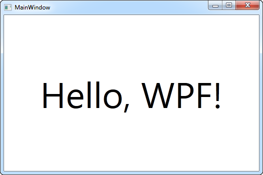 You will notice that we used three different attributes on the
TextBlock to get a custom alignment (in the middle of the window), as
well the FontSize property to get bigger text. All of these concepts
will be treated in later articles.
You will notice that we used three different attributes on the
TextBlock to get a custom alignment (in the middle of the window), as
well the FontSize property to get bigger text. All of these concepts
will be treated in later articles.What is XAML?
XAML, which stands for eXtensible Application Markup Language, is Microsoft's variant of XML for describing a GUI. In previous GUI frameworks, like WinForms, a GUI was created in the same language that you would use for interacting with the GUI, e.g. C# or VB.NET and usually maintained by the designer (e.g. Visual Studio), but with XAML, Microsoft is going another way. Much like with HTML, you are able to easily write and edit your GUI.This is not really a XAML tutorial, but I will briefly tell you about how you use it, because it's such an essential part of WPF. Whether you're creating a Window or a Page, it will consist of a XAML document and a CodeBehind file, which together creates the Window/Page. The XAML file describes the interface with all its elements, while the CodeBehind handles all the events and has access to manipulate with the XAML controls.
Basic XAML
In the previous chapter, we talked about what XAML is and what you use it for, but how do you create a control in XAML? As you will see from the next example, creating a control in XAML is as easy as writing it's name, surrounded by angle brackets. For instance, a Button looks like this:<Button>
XAML tags has to be ended, either by writing the end tag or by putting a forward slash at the end of the start tag:<Button></Button>
Or<Button />A lot of controls allow you to put content between the start and end tags, which is then the content of the control. For instance, the Button control allows you to specify the text shown on it between the start and end tags:
<Button>A button</Button>HTML is not case-sensitive, but XAML is, because the control name has to correspond to a type in the .NET framework. The same goes for attribute names, which corresponds to the properties of the control. Here's a button where we define a couple of properties by adding attributes to the tag:
<Button FontWeight="Bold" Content="A button" />We set the FontWeight property, giving us bold text, and then we set the Content property, which is the same as writing the text between the start and end tag. However, all attributes of a control may also be defined like this, where they appear as child tags of the main control, using the Control-Dot-Property notation:
<Button>
    <Button.FontWeight>Bold</Button.FontWeight>
    <Button.Content>A button</Button.Content>
</Button>
The result is exactly the same as above, so in this case, it's all about syntax and nothing else. However, a lot of controls allow content other than text, for instance other controls. Here's an example where we have text in different colors on the same button by using several TextBlock controls inside of the Button:
<Button>
    <Button.FontWeight>Bold</Button.FontWeight>
    <Button.Content>
        <WrapPanel>
            <TextBlock Foreground="Blue">Multi</TextBlock>
            <TextBlock Foreground="Red">Color</TextBlock>
            <TextBlock>Button</TextBlock>
        </WrapPanel>
    </Button.Content>
</Button>
The Content property only allows for a single child element, so we use a WrapPanel to contain the differently colored blocks of text. Panels, like the WrapPanel, plays an important role in WPF and we will discuss them in much more details later on - for now, just consider them as containers for other controls. The exact same result can be accomplished with the following markup, which is simply another way of writing the same:
<Button FontWeight="Bold">
    <WrapPanel>
        <TextBlock Foreground="Blue">Multi</TextBlock>
        <TextBlock Foreground="Red">Color</TextBlock>
        <TextBlock>Button</TextBlock>
    </WrapPanel>
</Button>
Code vs. XAML
Hopefully the above examples show you that XAML is pretty easy to write, but with a lot of different ways of doing it, and if you think that the above example is a lot of markup to get a button with text in different colors, then try comparing it to doing the exact same thing in C#:Button btn = new Button(); btn.FontWeight = FontWeights.Bold; WrapPanel pnl = new WrapPanel(); TextBlock txt = new TextBlock(); txt.Text = "Multi"; txt.Foreground = Brushes.Blue; pnl.Children.Add(txt); txt = new TextBlock(); txt.Text = "Color"; txt.Foreground = Brushes.Red; pnl.Children.Add(txt); txt = new TextBlock(); txt.Text = "Button"; pnl.Children.Add(txt); btn.Content = pnl; pnlMain.Children.Add(btn);Of course the above example could be written less explicitly and using more syntactical sugar, but I think the point still stands: XAML is pretty short and concise for describing interfaces.
Events in XAML
Most modern UI frameworks are event driven and so is WPF. All of the controls, including the Window (which also inherits the Control class) exposes a range of events that you may subscribe to. You can subscribe to these events, which means that your application will be notified when they occur and you may react to that.There are many types of events, but some of the most commonly used are there to respond to the user's interaction with your application using the mouse or the keyboard. On most controls you will find events like KeyDown, KeyUp, MouseDown, MouseEnter, MouseLeave, MouseUp and several others.
We will look more closely at how events work in WPF, since this is a complex topic, but for now, you need to know how to link a control event in XAML to a piece of code in your Code-behind file. Have a look at this example:
<Window x:Class="WpfTutorialSamples.XAML.EventsSample"
        xmlns="http://schemas.microsoft.com/winfx/2006/xaml/presentation"
        xmlns:x="http://schemas.microsoft.com/winfx/2006/xaml"
        Title="EventsSample" Height="300" Width="300">
        <Grid Name="pnlMainGrid" MouseUp="pnlMainGrid_MouseUp" Background="LightBlue">

    </Grid>
</Window>
Notice how we have subscribed to the MouseUp event of the Grid by writing a method name. This method needs to be defined in code-behind, using the correct event signature. In this case it should look like this:
private void pnlMainGrid_MouseUp(object sender, MouseButtonEventArgs e)
{
        MessageBox.Show("You clicked me at " + e.GetPosition(this).ToString());
}
The MouseUp event uses a delegate called MouseButtonEventHandler, which you subscribe to. It has two parameters, a sender (the control which raised the event) and a MouseButtonEventArgs object that will contain useful information. We use it in the example to get the position of the mouse cursor and tell the user about it.
Several events may use the same delegate type - for instance, both MouseUp and MouseDown uses the MouseButtonEventHandler delegate, while the MouseMove event uses the MouseEventHandler delegate. When defining the event handler method, you need to know which delegate it uses and if you don't know that, you can look it up in the documentation.
Fortunately, Visual Studio can help us to generate a correct event handler for an event. The easiest way to do this is to simply write the name of the event in XAML and then let the IntelliSense of VS do the rest for you:
 When you select <New Event Handler> Visual Studio will
generate an appropriate event handler in your Code-behind file. It will
be named <control name>_<event name>, in our case pnlMainGrid_MouseDown. Right-click in the event name and select Navigate to Event Handler and VS will take you right to it.
When you select <New Event Handler> Visual Studio will
generate an appropriate event handler in your Code-behind file. It will
be named <control name>_<event name>, in our case pnlMainGrid_MouseDown. Right-click in the event name and select Navigate to Event Handler and VS will take you right to it.Subscribing to an event from Code-behind
The most common way to subscribe to events is explained above, but there may be times where you want to subscribe to the event directly from Code-behind instead. This is done using the += C# syntax, where you add an event handler to event directly on the object. The full explanation of this belongs in a dedicated C# example, but for comparison, here's an example:using System; using System.Windows; using System.Windows.Input; namespace WpfTutorialSamples.XAML{ public partial class EventsSample : Window { public EventsSample() { InitializeComponent(); pnlMainGrid.MouseUp += new MouseButtonEventHandler(pnlMainGrid_MouseUp); } private void pnlMainGrid_MouseUp(object sender, MouseButtonEventArgs e) { MessageBox.Show("You clicked me at " + e.GetPosition(this).ToString()); } } }Once again, you need to know which delegate to use, and once again, Visual Studio can help you with this. As soon as you write:
pnlMainGrid.MouseDown +=
Visual Studio will offer its assistance:
 Simply press the [Tab] key twice to have Visual Studio generate the
correct event handler for you, right below the current method, ready for
imeplentation. When you subscribe to the events like this, you don't
need to do it in XAML.
Simply press the [Tab] key twice to have Visual Studio generate the
correct event handler for you, right below the current method, ready for
imeplentation. When you subscribe to the events like this, you don't
need to do it in XAML.A WPF Application - Introduction
In this tutorial, our primary focus will be on using WPF to create applications. As you may know, .NET can be executed on all platforms which have a .NET implementation, but the most common platform is still Microsoft Windows. When we talk about Windows applications in this tutorial, it really just means an application that runs on Windows (or another .NET compatible platform) and not in a browser or remotely over the Internet.A WPF application requires the .NET framework to run, just like any other .NET application type. Fortunately, Microsoft has been including the .NET framework on all versions of Windows since Vista, and they have been pushing out the framework on older versions through Windows Update. In other words, you can be pretty sure that most Windows users out there will be able to run your WPF application.
The Window
When creating a WPF application, the first thing you will meet is the Window class. It serves as the root of a window and provides you with the standard border, title bar and maximize, minimize and close buttons. A WPF window is a combination of a XAML (.xaml) file, where the <Window> element is the root, and a CodeBehind (.cs) file. If you're using Visual Studio (Express) and you create a new WPF application, it will create a default window for you, which will look something like this:<Window x:Class="WpfApplication1.Window1" xmlns="http://schemas.microsoft.com/winfx/2006/xaml/presentation" xmlns:x="http://schemas.microsoft.com/winfx/2006/xaml" Title="Window1" Height="300" Width="300"> <Grid> </Grid> </Window>The x:class attribute tells the XAML file which class to use, in this case Window1, which Visual Studio has created for us as well. You will find it in the project tree in VS, as a child node of the XAML file. By default, it looks something like this:
using System;
using System.Windows;
using System.Windows.Controls;
//…more using statements
namespace WpfApplication1
{
    /// <summary>
    /// Interaction logic for Window1.xaml
    /// </summary>
    public partial class Window1 : Window
    {
        public Window1()
        {
            InitializeComponent();
        }
    }
}
As you can see, the Window1 class is definied as partial, because it's being combined with your XAML file in runtime to give you the full window. This is actually what the call to InitializeComponent() does, which is why it's required to get a full functioning window up and running.
If we go back to the XAML file, you will notice a couple of other interesting attributes on the Window element, like Title, which defines the title of the window (shown in the title bar) as well as the starting width and height. There are also a couple of namespace definitions, which we will talk about in the XAML chapters.
You will also notice that Visual Studio has created a Grid control for us inside the Window. The Grid is one of the WPF panels, and while it could be any panel or control, the Window can only have ONE child control, so a Panel, which in turn can contain multiple child controls, is usually a good choice. Later in this tutorial, we will have a much closer look into the different types of panels that you can use, as they are very important in WPF.
Important Window properties
The WPF Window class has a bunch of interesting attributes that you may set to control the look and behavior of your application window. Here's a short list of the most interesting ones:Icon - Allows you to define the icon of the window, which is usually shown in the upper right corner, right before the window title.
ResizeMode - This controls whether and how the end-user can resize your window. The default is CanResize, which allows the user to resize the window like any other window, either by using the maximize/minimize buttons or by dragging one of the edges. CanMinimize will allow the user to minimize the window, but not to maximize it or drag it bigger or smaller. NoResize is the strictest one, where the maximize and minimize buttons are removed and the window can't be dragged bigger or smaller.
ShowInTaskbar - The default is true, but if you set it to false, your window won't be represented in the Windows taskbar. Useful for non-primary windows or for applications that should minimize to the tray.
SizeToContent - Decide if the Window should resize itself to automatically fit its content. The default is Manual, which means that the window doesn't automatically resize. Other options are Width, Height and WidthAndHeight, and each of them will automatically adjust the window size horizontally, vertically or both.
Topmost - The default is false, but if set to true, your Window will stay on top of other windows unless minimized. Only useful for special situations.
WindowStartupLocation - Controls the initial position of your window. The default is Manual, which means that the window will be initially positioned according to the Top and Left properties of your window. Other options are CenterOwner, which will position the window in the center of it's owner window, and CenterScreen, which will position the window in the center of the screen.
WindowState - Controls the initial window state. It can be either Normal, Maximized or Minimized. The default is Normal, which is what you should use unless you want your window to start either maximized or minimized.
Working with App.xaml
App.xaml is the declarative starting point of your application. Visual Studio will automatically create it for you when you start a new WPF application, including a Code-behind file called App.xaml.cs. They work much like for a Window, where the two files are partial classes, working together to allow you to work in both markup (XAML) and Code-behind.App.xaml.cs extends the Application class, which is a central class in a WPF Windows application. .NET will go to this class for starting instructions and then start the desired Window or Page from there. This is also the place to subscribe to important application events, like application start, unhandled exceptions and so on. More about that later.
One of the most commonly used features of the App.xaml file is to define global resources that may be used and accessed from all over an application, for instance global styles. This will be discussed in detail later on.
App.xaml structure
When creating a new application, the automatically generated App.xaml will look something like this:<Application x:Class="WpfTutorialSamples.App" xmlns="http://schemas.microsoft.com/winfx/2006/xaml/presentation" xmlns:x="http://schemas.microsoft.com/winfx/2006/xaml" StartupUri="MainWindow.xaml"> <Application.Resources> </Application.Resources> </Application>The main thing to notice here is the StartupUri property. This is actually the part that instructs which Window or Page to start up when the application is launched. In this case, MainWindow.xaml will be started, but if you would like to use another window as the starting point, you can simply change this.
In some situations, you want more control over how and when the first window is displayed. In that case, you can remove the StartupUri property and value and then do it all from Code-Behind instead. This will be demonstrated below.
App.xaml.cs structure
The matching App.xaml.cs will usually look like this for a new project:using System; using System.Collections.Generic; using System.Windows; namespace WpfTutorialSamples { public partial class App : Application { } }You will see how this class extends the Application class, allowing us to do stuff on the application level. For instance, you can subscribe to the Startup event, where you can manually create your starting window. Here's an example:
<Application x:Class="WpfTutorialSamples.App"
             xmlns="http://schemas.microsoft.com/winfx/2006/xaml/presentation"
             xmlns:x="http://schemas.microsoft.com/winfx/2006/xaml"
                         Startup="Application_Startup">
    <Application.Resources></Application.Resources>
</Application>
Notice how the StartupUri has been replaced with a subscription to the Startup event (subscribing to events through XAML is explained in another chapter). In Code-Behind, you can use the event like this:
using System;
using System.Collections.Generic;
using System.Windows;
namespace WpfTutorialSamples
{
        public partial class App : Application
        {

                private void Application_Startup(object sender, StartupEventArgs e)
                {
                        // Create the startup window
                        MainWindow wnd = new MainWindow();
                        // Do stuff here, e.g. to the window
                        wnd.Title = "Something else";
                        // Show the window
                        wnd.Show();
                }
        }
}
The cool thing in this example, compared to just using the StartupUri property, is that we get to manipulate the startup window before showing it. In this, we change the title of it, which is not terribly useful, but you could also subscribe to events or perhaps show a splash screen. When you have all the control, there are many possibilities. We will look deeper into several of them in the next articles of this tutorial.
Command-line parameters in WPF
Command-line parameters are a technique where you can pass a set of parameters to an application that you wish to start, to somehow influence it. The most common example is to make the application open with a specific file, e.g. in an editor. You can try this yourself with the built-in Notepad application of Windows, by running (select Run from the Start menu or press [WindowsKey-R]):notepad.exe c:\Windows\win.ini
This will open Notepad with the win.ini file opened (you may have to adjust the path to match your system). Notepad simply looks for one or several parameters and then uses them and your application can do the same!
Command-line parameters are passed to your WPF application through the Startup event, which we subscribed to in the App.xaml article. We will do the same in this example, and then use the value passed on to through the method arguments. First, the App.xaml file:
<Application x:Class="WpfTutorialSamples.App"
             xmlns="http://schemas.microsoft.com/winfx/2006/xaml/presentation"
             xmlns:x="http://schemas.microsoft.com/winfx/2006/xaml"
                         Startup="Application_Startup">
    <Application.Resources></Application.Resources>
</Application>
All we do here is to subscribe to the Startup event, replacing the StartupUri property. The event is then implemented in App.xaml.cs:
using System;
using System.Collections.Generic;
using System.Windows;
namespace WpfTutorialSamples
{
        public partial class App : Application
        {

                private void Application_Startup(object sender, StartupEventArgs e)
                {
                        MainWindow wnd = new MainWindow();
                        if(e.Args.Length == 1)
                                MessageBox.Show("Now opening file: \n\n" + e.Args[0]);
                        wnd.Show();
                }
        }
}
The StartupEventArgs is what we use here. It's passed into the Application Startup event, with the name e. It has the property Args, which is an array of strings. Command-line parameters are separated by spaces, unless the space is inside a quoted string.
Testing the command-line parameter
If you run the above example, nothing will happen, because no command-line parameters have been specified. Fortunately, Visual Studio makes it easy to test this in your application. From the Project menu select "[Project name] properties" and then go to the Debug tab, where you can define a command-line parameter. It should look something like this: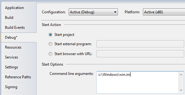 Try running the application and you will see it respond to your
parameter. Of course, the message isn't terribly useful. Instead you
might want to either pass it to the constructor of your main window or
call a public open method on it, like this:
Try running the application and you will see it respond to your
parameter. Of course, the message isn't terribly useful. Instead you
might want to either pass it to the constructor of your main window or
call a public open method on it, like this:using System; using System.Collections.Generic; using System.Windows; namespace WpfTutorialSamples { public partial class App : Application { private void Application_Startup(object sender, StartupEventArgs e) { MainWindow wnd = new MainWindow(); if(e.Args.Length == 1) wnd.OpenFile(e.Args[0]); wnd.Show(); } } }
Command-line possibilities
In this example, we test if there is exactly one argument and if so, we use it as a filename. In a real world example, you might collect several arguments and even use them for options, e.g. toggling a certain feature on or off. You would do that by looping through the entire list of arguments passed while collecting the information you need to proceed, but that's beyond the scope of this article.The TextBlock control
TextBlock is not a control, per se, since it doesn't inherit from the Control class, but it's used much like any other control in the WPF framework, so we'll call it a control to keep things simple.The TextBlock control is one of the most fundamental controls in WPF, yet it's very useful. It allows you to put text on the screen, much like a Label control does, but in a simpler and less resource demanding way. A common understanding is that a Label is for short, one-line texts (but may include e.g. an image), while the TextBlock works very well for multiline strings as well, but can only contain text (strings). Both the Label and the TextBlock offers their own unique advantages, so what you should use very much depends on the situation.
We already used a TextBlock control in the "Hello, WPF!" article, but for now, let's have a look at the TextBlock in its simplest form:
<Window x:Class="WpfTutorialSamples.Basic_controls.TextBlockSample"
        xmlns="http://schemas.microsoft.com/winfx/2006/xaml/presentation"
        xmlns:x="http://schemas.microsoft.com/winfx/2006/xaml"
        Title="TextBlockSample" Height="100" Width="200">
    <Grid>
                <TextBlock>This is a TextBlock</TextBlock>
    </Grid>
</Window>
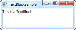 That's as simple as it comes and if you have read the previous
chapters of this tutorial, then there should be nothing new here. The
text between the TextBlock is simply a shortcut for setting the Text
property of the TextBlock.
That's as simple as it comes and if you have read the previous
chapters of this tutorial, then there should be nothing new here. The
text between the TextBlock is simply a shortcut for setting the Text
property of the TextBlock.For the next example, let's try a longer text to show how the TextBlock deals with that. I've also added a bit of margin, to make it look just a bit better:
<Window x:Class="WpfTutorialSamples.Basic_controls.TextBlockSample"
        xmlns="http://schemas.microsoft.com/winfx/2006/xaml/presentation"
        xmlns:x="http://schemas.microsoft.com/winfx/2006/xaml"
        Title="TextBlockSample" Height="100" Width="200">
    <Grid>
                <TextBlock Margin="10">This is a TextBlock control and it comes with a very long text</TextBlock>
    </Grid>
</Window>
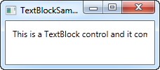
Dealing with long strings
As you will soon realize from the screenshot, the TextBlock is perfectly capable of dealing with long, multiline texts, but it will not do anything by default. In this case the text is too long to be rendered inside the window, so WPF renders as much of the text as possible and then just stops. Fortunately, there are several ways of dealing with this. In the next example I'll show you all of them, and then I'll explain each of them afterwards:<Window x:Class="WpfTutorialSamples.Basic_controls.TextBlockSample" xmlns="http://schemas.microsoft.com/winfx/2006/xaml/presentation" xmlns:x="http://schemas.microsoft.com/winfx/2006/xaml" Title="TextBlockSample" Height="200" Width="250"> <StackPanel> <TextBlock Margin="10" Foreground="Red"> This is a TextBlock control<LineBreak /> with multiple lines of text. </TextBlock> <TextBlock Margin="10" TextTrimming="CharacterEllipsis" Foreground="Green"> This is a TextBlock control with text that may not be rendered completely, which will be indicated with an ellipsis. </TextBlock> <TextBlock Margin="10" TextWrapping="Wrap" Foreground="Blue"> This is a TextBlock control with automatically wrapped text, using the TextWrapping property. </TextBlock> </StackPanel> </Window>
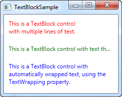 So, we have three TextBlock controls, each with a different color
(using the Foreground property) for an easier overview. They all handle
the fact that their text content is too long in different ways:
So, we have three TextBlock controls, each with a different color
(using the Foreground property) for an easier overview. They all handle
the fact that their text content is too long in different ways:The red TextBlock uses a LineBreak tag to manually break the line at a designated location. This gives you absolute control over where you want the text to break onto a new line, but it's not very flexible for most situations. If the user makes the window bigger, the text will still wrap at the same position, even though there may now be room enough to fit the entire text onto one line.
The green TextBlock uses the TextTrimming property with the value CharacterEllipsis to make the TextBlock show an ellipsis (...) when it can't fit any more text into the control. This is a common way of showing that there's more text, but not enough room to show it. This is great when you have text that might be too long but you absolutely don't want it to use more than one line. As an alternative to CharacterEllipsis you may use WordEllipsis, which will trim the text at the end of the last possible word instead of the last possible character, preventing that a word is only shown in part.
The blue TextBlock uses the TextWrapping property with the value Wrap, to make the TextBlock wrap to the next line whenever it can't fit anymore text into the previous line. Contrary to the first TextBlock, where we manually define where to wrap the text, this happens completely automatic and even better: It's also automatically adjusted as soon as the TextBlock get more or less space available. Try making the window in the example bigger or smaller and you will see how the wrapping is updated to match the situation.
This was all about dealing with simple strings in the TextBlock. In the next chapter, we'll look into some of the more advanced functionality of the TextBlock, which allows us to create text of various styles within the TextBlock and much more.
The TextBlock control - Inline formatting
In the last article we looked at the core functionality of the TextBlock control: Displaying a simple string and wrapping it if necessary. We even used another color than the default for rendering the text, but what if you wanted to do more than just define a static color for all the text in the TextBlock?Luckily the TextBlock control supports inline content. These small control-like constructs all inherit from the Inline class, which means that they can be rendered inline, as a part of a larger text. As of writing, the supported elements include AnchoredBlock, Bold, Hyperlink, InlineUIContainer, Italic, LineBreak, Run, Span, and Underline. In the following examples, we'll have a look at most of them.
Bold, Italic and Underline
These are probably the simplest types of inline elements. The names should tell you a lot about what they do, but we'll still give you a quick example on how to use them:<Window x:Class="WpfTutorialSamples.Basic_controls.TextBlockInlineSample" xmlns="http://schemas.microsoft.com/winfx/2006/xaml/presentation" xmlns:x="http://schemas.microsoft.com/winfx/2006/xaml" Title="TextBlockInlineSample" Height="100" Width="300"> <Grid> <TextBlock Margin="10" TextWrapping="Wrap"> TextBlock with <Bold>bold</Bold>, <Italic>italic</Italic> and <Underline>underlined</Underline> text. </TextBlock> </Grid> </Window>
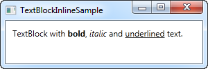 Much like with HTML, you just surround your text with a Bold tag to
get bold text and so on. This makes it very easy to create and display
diverse text in your applications.
Much like with HTML, you just surround your text with a Bold tag to
get bold text and so on. This makes it very easy to create and display
diverse text in your applications.All three of these tags are just child classes of the Span element, each setting a specific property on the Span element to create the desired effect. For instance, the Bold tag just sets the FontWeight property on the underlying Span element, the Italic element sets the FontStyle and so on.
LineBreak
Simply inserts a line break into the text. Please see the previous chapter for an example where we use the LineBreak element.Hyperlink
The Hyperlink element allows you to have links in your text. It's rendered with a style that suits your current Windows theme, which will usually be some sort of underlined blue text with a red hover effect and a hand mouse cursor. You can use the NavigateUri property to define the URL that you wish to navigate to. Here's an example:<Window x:Class="WpfTutorialSamples.Basic_controls.TextBlockHyperlinkSample" xmlns="http://schemas.microsoft.com/winfx/2006/xaml/presentation" xmlns:x="http://schemas.microsoft.com/winfx/2006/xaml" Title="TextBlockHyperlinkSample" Height="100" Width="300"> <Grid> <TextBlock Margin="10" TextWrapping="Wrap"> This text has a <Hyperlink RequestNavigate="Hyperlink_RequestNavigate" NavigateUri="https://www.google.com">link</Hyperlink> in it. </TextBlock> </Grid> </Window>
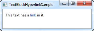 The Hyperlink is also used inside of WPF Page's, where it can be used
to navigate between pages. In that case, you won't have to specifically
handle the RequestNavigate event, like we do in the example, but for
launching external URL's from a regular WPF application, we need a bit
of help from this event and the Process class. We subscribe to the
RequestNavigate event, which allows us to launch the linked URL in the
users default browser with a simple event handler like this one in the
code behind file:
The Hyperlink is also used inside of WPF Page's, where it can be used
to navigate between pages. In that case, you won't have to specifically
handle the RequestNavigate event, like we do in the example, but for
launching external URL's from a regular WPF application, we need a bit
of help from this event and the Process class. We subscribe to the
RequestNavigate event, which allows us to launch the linked URL in the
users default browser with a simple event handler like this one in the
code behind file:private void Hyperlink_RequestNavigate(object sender, System.Windows.Navigation.RequestNavigateEventArgs e) { System.Diagnostics.Process.Start(e.Uri.AbsoluteUri); }
Run
The Run element allows you to style a string using all the available properties of the Span element, but while the Span element may contain other inline elements, a Run element may only contain plain text. This makes the Span element more flexible and therefore the logical choice in most cases.Span
The Span element doesn't have any specific rendering by default, but allows you to set almost any kind of specific rendering, including font size, style and weight, background and foreground colors and so on. The great thing about the Span element is that it allows for other inline elements inside of it, making it easy to do even advanced combinations of text and style. In the following example, I have used many Span elements to show you some of the many possibilities when using inline Span elements:<Window x:Class="WpfTutorialSamples.Basic_controls.TextBlockSpanSample" xmlns="http://schemas.microsoft.com/winfx/2006/xaml/presentation" xmlns:x="http://schemas.microsoft.com/winfx/2006/xaml" Title="TextBlockSpanSample" Height="100" Width="300"> <Grid> <TextBlock Margin="10" TextWrapping="Wrap"> This <Span FontWeight="Bold">is</Span> a <Span Background="Silver" Foreground="Maroon">TextBlock</Span> with <Span TextDecorations="Underline">several</Span> <Span FontStyle="Italic">Span</Span> elements, <Span Foreground="Blue"> using a <Bold>variety</Bold> of <Italic>styles</Italic> </Span>. </TextBlock> </Grid> </Window>
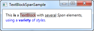 So as you can see, if none of the other elements doesn't make sense
in your situation or if you just want a blank canvas when starting to
format your text, the Span element is a great choice.
So as you can see, if none of the other elements doesn't make sense
in your situation or if you just want a blank canvas when starting to
format your text, the Span element is a great choice.Formatting text from C#/Code-Behind
As you can see, formatting text through XAML is very easy, but in some cases, you might prefer or even need to do it from your C#/Code-Behind file. This is a bit more cumbersome, but here's an example on how you may do it:<Window x:Class="WpfTutorialSamples.Basic_controls.TextBlockCodeBehindSample" xmlns="http://schemas.microsoft.com/winfx/2006/xaml/presentation" xmlns:x="http://schemas.microsoft.com/winfx/2006/xaml" Title="TextBlockCodeBehindSample" Height="100" Width="300"> <Grid></Grid> </Window>
using System;
using System.Windows;
using System.Windows.Controls;
using System.Windows.Documents;
using System.Windows.Media;
namespace WpfTutorialSamples.Basic_controls
{
        public partial class TextBlockCodeBehindSample : Window
        {
                public TextBlockCodeBehindSample()
                {
                        InitializeComponent();
                        TextBlock tb = new TextBlock();
                        tb.TextWrapping = TextWrapping.Wrap;
                        tb.Margin = new Thickness(10);
                        tb.Inlines.Add("An example on ");
                        tb.Inlines.Add(new Run("the TextBlock control ") { FontWeight = FontWeights.Bold });
                        tb.Inlines.Add("using ");
                        tb.Inlines.Add(new Run("inline ") { FontStyle = FontStyles.Italic });
                        tb.Inlines.Add(new Run("text formatting ") { Foreground = Brushes.Blue });
                        tb.Inlines.Add("from ");
                        tb.Inlines.Add(new Run("Code-Behind") { TextDecorations = TextDecorations.Underline });
                        tb.Inlines.Add(".");
                        this.Content = tb;
                }
        }
}
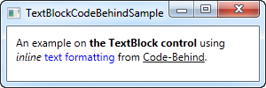 It's great to have the possibility, and it can be necessary to do it
like this in some cases, but this example will probably make you
appreciate XAML even more.
It's great to have the possibility, and it can be necessary to do it
like this in some cases, but this example will probably make you
appreciate XAML even more.The Label control
The Label control, in its most simple form, will look very much like the TextBlock which we used in another article. You will quickly notice though that instead of a Text property, the Label has a Content property. The reason for that is that the Label can host any kind of control directly inside of it, instead of just text. This content can be a string as well though, as you will see in this first and very basic example:<Window x:Class="WpfTutorialSamples.Basic_controls.LabelControlSample" xmlns="http://schemas.microsoft.com/winfx/2006/xaml/presentation" xmlns:x="http://schemas.microsoft.com/winfx/2006/xaml" Title="LabelControlSample" Height="100" Width="200"> <Grid> <Label Content="This is a Label control." /> </Grid> </Window>
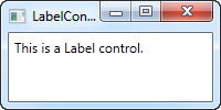 Another thing you might notice is the fact that the Label, by
default, has a bit of padding, allowing the text to be rendered a few
pixels away from the top, left corner. This is not the case for the
TextBlock control, where you will have to specify it manually.
 In a simple case like this, where the content is simply a string, the Label will actually create a TextBlock internally and show your string in that.
The Label control vs. the TextBlock control
So why use a Label at all then? Well, there are a few important differences between the Label and the TextBlock. The TextBlock only allows you to render a text string, while the Label also allows you to:- Specify a border
- Render other controls, e.g. an image
- Use templated content through the ContentTemplate property
- Use access keys to give focus to related controls
Label and Access keys (mnemonics)
In Windows and other operating systems as well, it's common practice that you can access controls in a dialog by holding down the [Alt] key and then pressing a character which corresponds to the control that you wish to access. The character to press will be highlighted when you hold down the [Alt] key. TextBlock controls doesn't support this functionality, but the Label does, so for control labels, the Label control is usually an excellent choice. Let's look at an example of it in action:<Window x:Class="WpfTutorialSamples.Basic_controls.LabelControlSample" xmlns="http://schemas.microsoft.com/winfx/2006/xaml/presentation" xmlns:x="http://schemas.microsoft.com/winfx/2006/xaml" Title="LabelControlSample" Height="180" Width="250"> <StackPanel Margin="10"> <Label Content="_Name:" Target="{Binding ElementName=txtName}" /> <TextBox Name="txtName" /> <Label Content="_Mail:" Target="{Binding ElementName=txtMail}" /> <TextBox Name="txtMail" /> </StackPanel> </Window>
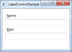 The screenshot shows our sample dialog as it looks when the Alt key
is pressed. Try running it, holding down the [Alt] key and then pressing
N and M. You will see how focus is moved between the two textboxes.
The screenshot shows our sample dialog as it looks when the Alt key
is pressed. Try running it, holding down the [Alt] key and then pressing
N and M. You will see how focus is moved between the two textboxes.So, there's several new concepts here. First of all, we define the access key by placing an underscore (_) before the character. It doesn't have to be the first character, it can be before any of the characters in your label content. The common practice is to use the first character that's not already used as an access key for another control.
We use the Target property to connect the Label and the designated control. We use a standard WPF binding for this, using the ElementName property, all of which we will describe later on in this tutorial. The binding is based on the name of the control, so if you change this name, you will also have to remember to change the binding.
Using controls as Label content
As already mentioned, the Label control allows you to host other controls, while still keeping the other benefits. Let's try an example where we have both an image and a piece of text inside the Label, while also having an access key for each of the labels:<Window x:Class="WpfTutorialSamples.Basic_controls.LabelControlAdvancedSample" xmlns="http://schemas.microsoft.com/winfx/2006/xaml/presentation" xmlns:x="http://schemas.microsoft.com/winfx/2006/xaml" Title="LabelControlAdvancedSample" Height="180" Width="250"> <StackPanel Margin="10"> <Label Target="{Binding ElementName=txtName}"> <StackPanel Orientation="Horizontal"> <Image Source="http://cdn1.iconfinder.com/data/icons/fatcow/16/bullet_green.png" /> <AccessText Text="_Name:" /> </StackPanel> </Label> <TextBox Name="txtName" /> <Label Target="{Binding ElementName=txtMail}"> <StackPanel Orientation="Horizontal"> <Image Source="http://cdn1.iconfinder.com/data/icons/fatcow/16/bullet_blue.png" /> <AccessText Text="_Mail:" /> </StackPanel> </Label> <TextBox Name="txtMail" /> </StackPanel> </Window>
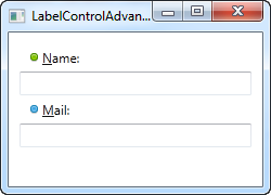 This is just an extended version of the previous example - instead of
a simple text string, our Label will now host both and image and a
piece of text (inside the AccessText control, which allows us to still
use an access key for the label). Both controls are inside a horizontal
StackPanel, since the Label, just like any other ContentControl
derivate, can only host one direct child control.
This is just an extended version of the previous example - instead of
a simple text string, our Label will now host both and image and a
piece of text (inside the AccessText control, which allows us to still
use an access key for the label). Both controls are inside a horizontal
StackPanel, since the Label, just like any other ContentControl
derivate, can only host one direct child control.The Image control, described later in this tutorial, uses a remote image - this is ONLY for demonstrational purposes and is NOT a good idea for most real life applications.
The TextBox control
The TextBox control is the most basic text-input control found in WPF, allowing the end-user to write plain text, either on a single line, for dialog input, or in multiple lines, like an editor.Single-line TextBox
The TextBox control is such a commonly used thing that you actually don't have to use any properties on it, to have a full-blown editable text field. Here's a barebone example:<Window x:Class="WpfTutorialSamples.Basic_controls.TextBoxSample" xmlns="http://schemas.microsoft.com/winfx/2006/xaml/presentation" xmlns:x="http://schemas.microsoft.com/winfx/2006/xaml" Title="TextBoxSample" Height="80" Width="250"> <StackPanel Margin="10"> <TextBox /> </StackPanel> </Window>

That's all you need to get a text field. I added the text after running the sample and before taking the screenshot, but you can do it through markup as well, to pre-fill the textbox, using the Text property:
<TextBox Text="Hello, world!" />Try right-clicking in the TextBox. You will get a menu of options, allowing you to use the TextBox with the Windows Clipboard. The default keyboard shortcuts for undoing and redoing (Ctrl+Z and Ctrl+Y) should also work, and all of this functionality you get for free!
Multi-line TextBox
If you run the above example, you will notice that the TextBox control by default is a single-line control. Nothing happens when you press Enter and if you add more text than what can fit on a single line, the control just scrolls. However, making the TextBox control into a multi-line editor is very simple:<Window x:Class="WpfTutorialSamples.Basic_controls.TextBoxSample" xmlns="http://schemas.microsoft.com/winfx/2006/xaml/presentation" xmlns:x="http://schemas.microsoft.com/winfx/2006/xaml" Title="TextBoxSample" Height="160" Width="280"> <Grid Margin="10"> <TextBox AcceptsReturn="True" TextWrapping="Wrap" /> </Grid> </Window>
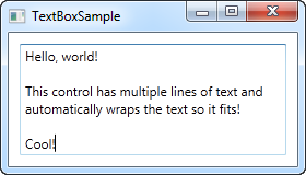
I have added two properties: The AcceptsReturn makes the TextBox into a multi-line control by allowing the use of the Enter/Return key to go to the next line, and the TextWrapping property, which will make the text wrap automatically when the end of a line is reached.
Spellcheck with TextBox
As an added bonus, the TextBox control actually comes with automatic spell checking for English and a couple of other languages (as of writing, English, French, German, and Spanish languages are supported). It works much like in Microsoft Word, where spelling errors are underlined and you can right-click it for suggested alternatives. Enabling spell checking is very easy:<Window x:Class="WpfTutorialSamples.Basic_controls.TextBoxSample" xmlns="http://schemas.microsoft.com/winfx/2006/xaml/presentation" xmlns:x="http://schemas.microsoft.com/winfx/2006/xaml" Title="TextBoxSample" Height="160" Width="280"> <Grid Margin="10"> <TextBox AcceptsReturn="True" TextWrapping="Wrap" SpellCheck.IsEnabled="True" Language="en-US" /> </Grid> </Window>
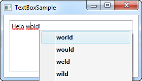
We have used the previous, multi-line textbox example as the basis and then I have added two new properties: The attached property from the SpellCheck class called IsEnabled, which simply enables spell checking on the parent control, and the Language property, which instructs the spell checker which language to use.
Working with TextBox selections
Just like any other editable control in Windows, the TextBox allows for selection of text, e.g. to delete an entire word at once or to copy a piece of the text to the clipboard. The WPF TextBox has several properties for working with selected text, all of them which you can read or even modify. In the next example, we will be reading these properties:<Window x:Class="WpfTutorialSamples.Basic_controls.TextBoxSelectionSample" xmlns="http://schemas.microsoft.com/winfx/2006/xaml/presentation" xmlns:x="http://schemas.microsoft.com/winfx/2006/xaml" Title="TextBoxSelectionSample" Height="150" Width="300"> <DockPanel Margin="10"> <TextBox SelectionChanged="TextBox_SelectionChanged" DockPanel.Dock="Top" /> <TextBox Name="txtStatus" AcceptsReturn="True" TextWrapping="Wrap" IsReadOnly="True" /> </DockPanel> </Window>The example consists of two TextBox controls: One for editing and one for outputting the current selection status to. For this, we set the IsReadOnly property to true, to prevent editing of the status TextBox. We subscribe the SelectionChanged event on the first TextBox, which we handle in the Code-behind:
using System;
using System.Text;
using System.Windows;
using System.Windows.Controls;
namespace WpfTutorialSamples.Basic_controls
{
        public partial class TextBoxSelectionSample : Window
        {
                public TextBoxSelectionSample()
                {
                        InitializeComponent();
                }

                private void TextBox_SelectionChanged(object sender, RoutedEventArgs e)
                {
                        TextBox textBox = sender as TextBox;
                        txtStatus.Text = "Selection starts at character #" + textBox.SelectionStart + Environment.NewLine;
                        txtStatus.Text += "Selection is " + textBox.SelectionLength + " character(s) long" + Environment.NewLine;
                        txtStatus.Text += "Selected text: '" + textBox.SelectedText + "'";
                }
        }
}
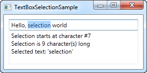
We use three interesting properties to accomplish this:
SelectionStart , which gives us the current cursor position or if there's a selection: Where it starts.
SelectionLength , which gives us the length of the current selection, if any. Otherwise it will just return 0.
SelectedText , which gives us the currently selected string if there's a selection. Otherwise an empty string is returned.
Modifying the selection
All of these properties are both readable and writable, which means that you can modify them as well. For instance, you can set the SelectionStart and SelectionLength properties to select a custom range of text, or you can use the SelectedText property to insert and select a string. Just remember that the TextBox has to have focus, e.g. by calling the Focus() method first, for this to work.The CheckBox control
The CheckBox control allows the end-user to toggle an option on or off, usually reflecting a Boolean value in the Code-behind. Let's jump straight into an example, in case you're not sure how a CheckBox looks:<Window x:Class="WpfTutorialSamples.Basic_controls.CheckBoxSample" xmlns="http://schemas.microsoft.com/winfx/2006/xaml/presentation" xmlns:x="http://schemas.microsoft.com/winfx/2006/xaml" Title="CheckBoxSample" Height="140" Width="250"> <StackPanel Margin="10"> <Label FontWeight="Bold">Application Options</Label> <CheckBox>Enable feature ABC</CheckBox> <CheckBox IsChecked="True">Enable feature XYZ</CheckBox> <CheckBox>Enable feature WWW</CheckBox> </StackPanel> </Window>

As you can see, the CheckBox is very easy to use. On the second CheckBox, I use the IsChecked property to have it checked by default, but other than that, no properties are needed to use it. The IsChecked property should also be used from Code-behind if you want to check whether a certain CheckBox is checked or not.
Custom content
The CheckBox control inherits from the ContentControl class, which means that it can take custom content and display next to it. If you just specify a piece of text, like I did in the example above, WPF will put it inside a TextBlock control and display it, but this is just a shortcut to make things easier for you. You can use any type of control inside of it, as we'll see in the next example:<Window x:Class="WpfTutorialSamples.Basic_controls.CheckBoxSample" xmlns="http://schemas.microsoft.com/winfx/2006/xaml/presentation" xmlns:x="http://schemas.microsoft.com/winfx/2006/xaml" Title="CheckBoxSample" Height="140" Width="250"> <StackPanel Margin="10"> <Label FontWeight="Bold">Application Options</Label> <CheckBox> <TextBlock> Enable feature <Run Foreground="Green" FontWeight="Bold">ABC</Run> </TextBlock> </CheckBox> <CheckBox IsChecked="True"> <WrapPanel> <TextBlock> Enable feature <Run FontWeight="Bold">XYZ</Run> </TextBlock> <Image Source="/WpfTutorialSamples;component/Images/question.png" Width="16" Height="16" Margin="5,0" /> </WrapPanel> </CheckBox> <CheckBox> <TextBlock> Enable feature <Run Foreground="Blue" TextDecorations="Underline" FontWeight="Bold">WWW</Run> </TextBlock> </CheckBox> </StackPanel> </Window>

As you can see from the sample markup, you can do pretty much whatever you want with the content. On all three check boxes, I do something differently with the text, and on the middle one I even throw in an Image control. By specifying a control as the content, instead of just text, we get much more control of the appearance, and the cool thing is that no matter which part of the content you click on, it will activate the CheckBox and toggle it on or off.
The IsThreeState property
As mentioned, the CheckBox usually corresponds to a boolean value, which means that it only has two states: true or false (on or off). However, since a boolean data type might be nullable, effectively allowing for a third option (true, false or null), the CheckBox control can also support this case. By setting the IsThreeState property to true, the CheckBox will get a third state called "the indeterminate state".A common usage for this is to have a "Enable all" CheckBox, which can control a set of child checkboxes, as well as show their collective state. Our example shows how you may create a list of features that can be toggled on and off, with a common "Enable all" CheckBox in the top:
<Window x:Class="WpfTutorialSamples.Basic_controls.CheckBoxThreeStateSample"
        xmlns="http://schemas.microsoft.com/winfx/2006/xaml/presentation"
        xmlns:x="http://schemas.microsoft.com/winfx/2006/xaml"
        Title="CheckBoxThreeStateSample" Height="170" Width="300">
        <StackPanel Margin="10">
                <Label FontWeight="Bold">Application Options</Label>
                <StackPanel Margin="10,5">
                        <CheckBox IsThreeState="True" Name="cbAllFeatures" Checked="cbAllFeatures_CheckedChanged" Unchecked="cbAllFeatures_CheckedChanged">Enable all</CheckBox>
                        <StackPanel Margin="20,5">
                                <CheckBox Name="cbFeatureAbc" Checked="cbFeature_CheckedChanged" Unchecked="cbFeature_CheckedChanged">Enable feature ABC</CheckBox>
                                <CheckBox Name="cbFeatureXyz" IsChecked="True" Checked="cbFeature_CheckedChanged" Unchecked="cbFeature_CheckedChanged">Enable feature XYZ</CheckBox>
                                <CheckBox Name="cbFeatureWww" Checked="cbFeature_CheckedChanged" Unchecked="cbFeature_CheckedChanged">Enable feature WWW</CheckBox>
                        </StackPanel>
                </StackPanel>
        </StackPanel>
</Window>
using System;
using System.Windows;
namespace WpfTutorialSamples.Basic_controls
{
        public partial class CheckBoxThreeStateSample : Window
        {
                public CheckBoxThreeStateSample()
                {
                        InitializeComponent();
                }


                private void cbAllFeatures_CheckedChanged(object sender, RoutedEventArgs e)
                {
                        bool newVal = (cbAllFeatures.IsChecked == true);
                        cbFeatureAbc.IsChecked = newVal;
                        cbFeatureXyz.IsChecked = newVal;
                        cbFeatureWww.IsChecked = newVal;
                }

                private void cbFeature_CheckedChanged(object sender, RoutedEventArgs e)
                {
                        cbAllFeatures.IsChecked = null;
                        if((cbFeatureAbc.IsChecked == true) && (cbFeatureXyz.IsChecked == true) && (cbFeatureWww.IsChecked == true))
                                cbAllFeatures.IsChecked = true;
                        if((cbFeatureAbc.IsChecked == false) && (cbFeatureXyz.IsChecked == false) && (cbFeatureWww.IsChecked == false))
                                cbAllFeatures.IsChecked = false;
                }

        }
}

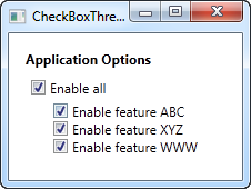
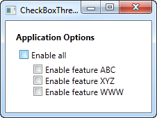
This example works from two different angles: If you check or uncheck the "Enable all" CheckBox, then all of the child check boxes, each representing an application feature in our example, is either checked or unchecked. It also works the other way around though, where checking or unchecking a child CheckBox affects the "Enable all" CheckBox state: If they are all checked or unchecked, then the "Enable all" CheckBox gets the same state - otherwise the value will be left with a null, which forces the CheckBox into the indeterminate state.
All of this behavior can be seen on the screenshots above, and is achieved by subscribing to the Checked and Unchecked events of the CheckBox controls. In a real world example, you would likely bind the values instead, but this example shows the basics of using the IsThreeState property to create a "Toggle all" effect.
The RadioButton control
The RadioButton control allows you to give your user a list of possible options, with only one of them selected at the same time. You can achieve the same effect, using less space, with the ComboBox control, but a set of radio buttons tend to give the user a better overview of the options they have.<Window x:Class="WpfTutorialSamples.Basic_controls.RadioButtonSample" xmlns="http://schemas.microsoft.com/winfx/2006/xaml/presentation" xmlns:x="http://schemas.microsoft.com/winfx/2006/xaml" Title="RadioButtonSample" Height="150" Width="250"> <StackPanel Margin="10"> <Label FontWeight="Bold">Are you ready?</Label> <RadioButton>Yes</RadioButton> <RadioButton>No</RadioButton> <RadioButton IsChecked="True">Maybe</RadioButton> </StackPanel> </Window>
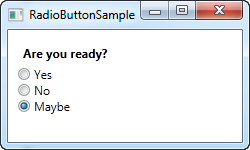
All we do is add a Label with a question, and then three radio buttons, each with a possible answer. We define a default option by using the IsChecked property on the last RadioButton, which the user can change simply by clicking on one of the other radio buttons. This is also the property you would want to use from Code-behind to check if a RadioButton is checked or not.
RadioButton groups
If you try running the example above, you will see that, as promised, only one RadioButton can be checked at the same time. But what if you want several groups of radio buttons, each with their own, individual selection? This is what the GroupName property comes into play, which allows you to specify which radio buttons belong together. Here's an example:<Window x:Class="WpfTutorialSamples.Basic_controls.RadioButtonSample" xmlns="http://schemas.microsoft.com/winfx/2006/xaml/presentation" xmlns:x="http://schemas.microsoft.com/winfx/2006/xaml" Title="RadioButtonSample" Height="230" Width="250"> <StackPanel Margin="10"> <Label FontWeight="Bold">Are you ready?</Label> <RadioButton GroupName="ready">Yes</RadioButton> <RadioButton GroupName="ready">No</RadioButton> <RadioButton GroupName="ready" IsChecked="True">Maybe</RadioButton> <Label FontWeight="Bold">Male or female?</Label> <RadioButton GroupName="sex">Male</RadioButton> <RadioButton GroupName="sex">Female</RadioButton> <RadioButton GroupName="sex" IsChecked="True">Not sure</RadioButton> </StackPanel> </Window>
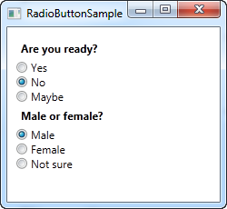
With the GroupName property set on each of the radio buttons, a selection can now be made for each of the two groups. Without this, only one selection for all six radio buttons would be possible.
Custom content
The RadioButton inherits from the ContentControl class, which means that it can take custom content and display next to it. If you just specify a piece of text, like I did in the example above, WPF will put it inside a TextBlock control and display it, but this is just a shortcut to make things easier for you. You can use any type of control inside of it, as we'll see in the next example:<Window x:Class="WpfTutorialSamples.Basic_controls.RadioButtonCustomContentSample" xmlns="http://schemas.microsoft.com/winfx/2006/xaml/presentation" xmlns:x="http://schemas.microsoft.com/winfx/2006/xaml" Title="RadioButtonCustomContentSample" Height="150" Width="250"> <StackPanel Margin="10"> <Label FontWeight="Bold">Are you ready?</Label> <RadioButton> <WrapPanel> <Image Source="/WpfTutorialSamples;component/Images/accept.png" Width="16" Height="16" Margin="0,0,5,0" /> <TextBlock Text="Yes" Foreground="Green" /> </WrapPanel> </RadioButton> <RadioButton Margin="0,5"> <WrapPanel> <Image Source="/WpfTutorialSamples;component/Images/cancel.png" Width="16" Height="16" Margin="0,0,5,0" /> <TextBlock Text="No" Foreground="Red" /> </WrapPanel> </RadioButton> <RadioButton IsChecked="True"> <WrapPanel> <Image Source="/WpfTutorialSamples;component/Images/question.png" Width="16" Height="16" Margin="0,0,5,0" /> <TextBlock Text="Maybe" Foreground="Gray" /> </WrapPanel> </RadioButton> </StackPanel> </Window>
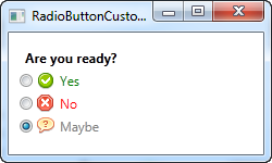
Markup-wise, this example gets a bit heavy, but the concept is pretty simple. For each RadioButton, we have a WrapPanel with an image and a piece of text inside of it. Since we now take control of the text using a TextBlock control, this also allows us to format the text in any way we want to. For this example, I have changed the text color to match the choice. An Image control (read more about those later) is used to display an image for each choice.
Notice how you can click anywhere on the RadioButton, even on the image or the text, to toggle it on, because we have specified it as content of the RadioButton. If you had placed it as a separate panel, next to the RadioButton, the user would have to click directly on the round circle of the RadioButton to activate it, which is less practical.
Introduction to WPF panels
Panels are one of the most important control types of WPF. They act as containers for other controls and control the layout of your windows/pages. Since a window can only contain ONE child control, a panel is often used to divide up the space into areas, where each area can contain a control or another panel (which is also a control, of course).Panels come in several different flavors, with each of them having its own way of dealing with layout and child controls. Picking the right panel is therefore essential to getting the behavior and layout you want, and especially in the start of your WPF career, this can be a difficult job. The next section will describe each of the panels shortly and give you an idea of when to use it. After that, move on to the next chapters, where each of the panels will be described in detail.
Canvas
A simple panel, which mimics the WinForms way of doing things. It allows you to assign specific coordinates to each of the child controls, giving you total control of the layout. This is not very flexible though, because you have to manually move the child controls around and make sure that they align the way you want them to. Use it (only) when you want complete control of the child control positions.WrapPanel
The WrapPanel will position each of its child controls next to the other, horizontally (default) or vertically, until there is no more room, where it will wrap to the next line and then continue. Use it when you want a vertical or horizontal list controls that automatically wraps when there's no more room.StackPanel
The StackPanel acts much like the WrapPanel, but instead of wrapping if the child controls take up too much room, it simply expands itself, if possible. Just like with the WrapPanel, the orientation can be either horizontal or vertical, but instead of adjusting the width or height of the child controls based on the largest item, each item is stretched to take up the full width or height. Use the StackPanel when you want a list of controls that takes up all the available room, without wrapping.DockPanel
The DockPanel allows you to dock the child controls to the top, bottom, left or right. By default, the last control, if not given a specific dock position, will fill the remaining space. You can achieve the same with the Grid panel, but for the simpler situations, the DockPanel will be easier to use. Use the DockPanel whenever you need to dock one or several controls to one of the sides, like for dividing up the window into specific areas.Grid
The Grid is probably the most complex of the panel types. A Grid can contain multiple rows and columns. You define a height for each of the rows and a width for each of the columns, in either an absolute amount of pixels, in a percentage of the available space or as auto, where the row or column will automatically adjust its size depending on the content. Use the Grid when the other panels doesn't do the job, e.g. when you need multiple columns and often in combination with the other panels.UniformGrid
The UniformGrid is just like the Grid, with the possibility of multiple rows and columns, but with one important difference: All rows and columns will have the same size! Use this when you need the Grid behavior without the need to specify different sizes for the rows and columns.The Canvas control
The Canvas is probably the simplest Panel of them all. It doesn't really do anything by default, it just allows you to put controls in it and then position them yourself using explicit coordinates.If you have ever used another UI library like WinForms, this will probably make you feel right at home, but while it can be tempting to have absolute control of all the child controls, this also means that the Panel won't do anything for you once the user starts resizing your window, if you localize absolutely positioned text or if the content is scaled.
More about that later, let's get into a simple example. This one is mostly about showing you just how little the Canvas does by default:
<Window x:Class="WpfTutorialSamples.Panels.Canvas"
        xmlns="http://schemas.microsoft.com/winfx/2006/xaml/presentation"
        xmlns:x="http://schemas.microsoft.com/winfx/2006/xaml"
        Title="Canvas" Height="200" Width="200">
        <Canvas>
                <Button>Button 1</Button>
                <Button>Button 2</Button>
        </Canvas>
</Window>
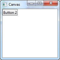
As you can see, even though we have two buttons, they are both placed in the exact same place, so only the last one is visible. The Canvas does absolutely nothing until you start giving coordinates to the child controls. This is done using the Left, Right, Top and Bottom attached properties from the Canvas control.
These properties allow you to specify the position relative to the four edges of the Canvas. By default, they are all set to NaN (Not a Number), which will make the Canvas place them in the upper left corner, but as mentioned, you can easily change this:
<Window x:Class="WpfTutorialSamples.Panels.Canvas"
        xmlns="http://schemas.microsoft.com/winfx/2006/xaml/presentation"
        xmlns:x="http://schemas.microsoft.com/winfx/2006/xaml"
        Title="Canvas" Height="200" Width="200">
        <Canvas>
                <Button Canvas.Left="10">Top left</Button>
                <Button Canvas.Right="10">Top right</Button>
                <Button Canvas.Left="10" Canvas.Bottom="10">Bottom left</Button>
                <Button Canvas.Right="10" Canvas.Bottom="10">Bottom right</Button>
        </Canvas>
</Window>
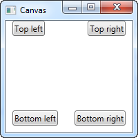
Notice how I only set the property or properties that I need. For the first two buttons, I only wish to specify a value for the X axis, so I use the Left and Right properties to push the buttons towards the center, from each direction.
For the bottom buttons, I use both Left/Right and Bottom to push them towards the center in both directions. You will usually specify either a Top or a Bottom value and/or a Left or a Right value.
As mentioned, since the Canvas gives you complete control of positions, it won't really care whether or not there's enough room for all your controls or if one is on top of another. This makes it a bad choice for pretty much any kind of dialog design, but the Canvas is, as the name implies, great for at least one thing: Painting. WPF has a bunch of controls that you can place inside a Canvas, to make nice illustrations.
Z-Index
In the next example, we'll use a couple of the shape related controls of WPF to illustrate another very important concept when using the Canvas: Z-Index. Normally, if two controls within a Canvas overlaps, the one defined last in the markup will take precedence and overlap the other(s). However, by using the attached ZIndex property on the Panel class, this can easily be changed.First, an example where we don't use z-index at all:
<Window x:Class="WpfTutorialSamples.Panels.CanvasZIndex"
        xmlns="http://schemas.microsoft.com/winfx/2006/xaml/presentation"
        xmlns:x="http://schemas.microsoft.com/winfx/2006/xaml"
        Title="CanvasZIndex" Height="275" Width="260">
    <Canvas>
        <Ellipse Fill="Gainsboro" Canvas.Left="25" Canvas.Top="25" Width="200" Height="200" />
        <Rectangle Fill="LightBlue" Canvas.Left="25" Canvas.Top="25" Width="50" Height="50" />
        <Rectangle Fill="LightCoral" Canvas.Left="50" Canvas.Top="50" Width="50" Height="50" />
        <Rectangle Fill="LightCyan" Canvas.Left="75" Canvas.Top="75" Width="50" Height="50" />
    </Canvas>
</Window>
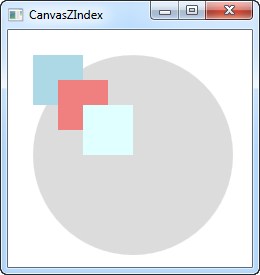
Notice that because each of the rectangles are defined after the circle, they all overlap the circle, and each of them will overlap the previously defined one. Let's try changing that:
<Window x:Class="WpfTutorialSamples.Panels.CanvasZIndex"
        xmlns="http://schemas.microsoft.com/winfx/2006/xaml/presentation"
        xmlns:x="http://schemas.microsoft.com/winfx/2006/xaml"
        Title="CanvasZIndex" Height="275" Width="260">
    <Canvas>
        <Ellipse Panel.ZIndex="2" Fill="Gainsboro" Canvas.Left="25" Canvas.Top="25" Width="200" Height="200" />
        <Rectangle Panel.ZIndex="3" Fill="LightBlue" Canvas.Left="25" Canvas.Top="25" Width="50" Height="50" />
        <Rectangle Panel.ZIndex="2" Fill="LightCoral" Canvas.Left="50" Canvas.Top="50" Width="50" Height="50" />
        <Rectangle Panel.ZIndex="4" Fill="LightCyan" Canvas.Left="75" Canvas.Top="75" Width="50" Height="50" />
    </Canvas>
</Window>
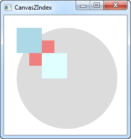
The default ZIndex value is 0, but we assign a new one to each of the shapes. The rule is that the element with the higher z-index overlaps the ones with the lower values. If two values are identical, the last defined element "wins". As you can see from the screenshot, changing the ZIndex property gives quite another look.
The WrapPanel control
The WrapPanel will position each of its child controls next to the other, horizontally (default) or vertically, until there is no more room, where it will wrap to the next line and then continue. Use it when you want a vertical or horizontal list controls that automatically wraps when there's no more room.When the WrapPanel uses the Horizontal orientation, the child controls will be given the same height, based on the tallest item. When the WrapPanel is the Vertical orientation, the child controls will be given the same width, based on the widest item.
In the first example, we'll check out a WrapPanel with the default (Horizontal) orientation:
<Window x:Class="WpfTutorialSamples.Panels.WrapPanel"
        xmlns="http://schemas.microsoft.com/winfx/2006/xaml/presentation"
        xmlns:x="http://schemas.microsoft.com/winfx/2006/xaml"
        Title="WrapPanel" Height="300" Width="300">
        <WrapPanel>
                <Button>Test button 1</Button>
                <Button>Test button 2</Button>
                <Button>Test button 3</Button>
                <Button Height="40">Test button 4</Button>
                <Button>Test button 5</Button>
                <Button>Test button 6</Button>
        </WrapPanel>
</Window>
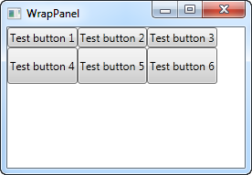 Notice how I set a specific height on one of the buttons in the
second row. In the resulting screenshot, you will see that this causes
the entire row of buttons to have the same height instead of the height
required, as seen on the first row. You will also notice that the panel
does exactly what the name implies: It wraps the content when it can't
fit any more of it in. In this case, the fourth button couldn't fit in
on the first line, so it automatically wraps to the next line.
Notice how I set a specific height on one of the buttons in the
second row. In the resulting screenshot, you will see that this causes
the entire row of buttons to have the same height instead of the height
required, as seen on the first row. You will also notice that the panel
does exactly what the name implies: It wraps the content when it can't
fit any more of it in. In this case, the fourth button couldn't fit in
on the first line, so it automatically wraps to the next line.Should you make the window, and thereby the available space, smaller, you will see how the panel immediately adjusts to it:
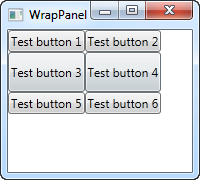 All of this behavior is also true when you set the Orientation to
Vertical. Here's the exact same example as before, but with a Vertical
WrapPanel:
All of this behavior is also true when you set the Orientation to
Vertical. Here's the exact same example as before, but with a Vertical
WrapPanel:<Window x:Class="WpfTutorialSamples.Panels.WrapPanel" xmlns="http://schemas.microsoft.com/winfx/2006/xaml/presentation" xmlns:x="http://schemas.microsoft.com/winfx/2006/xaml" Title="WrapPanel" Height="120" Width="300"> <WrapPanel Orientation="Vertical"> <Button>Test button 1</Button> <Button>Test button 2</Button> <Button>Test button 3</Button> <Button Width="140">Test button 4</Button> <Button>Test button 5</Button> <Button>Test button 6</Button> </WrapPanel> </Window>
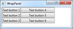 You can see how the buttons go vertical instead of horizontal, before
they wrap because they reach the bottom of the window. In this case, I
gave a wider width to the fourth button, and you will see that the
buttons in the same column also gets the same width, just like we saw
with the button height in the Horizontal example.
You can see how the buttons go vertical instead of horizontal, before
they wrap because they reach the bottom of the window. In this case, I
gave a wider width to the fourth button, and you will see that the
buttons in the same column also gets the same width, just like we saw
with the button height in the Horizontal example.Please be aware that while the Horizontal WrapPanel will match the height in the same row and the Vertical WrapPanel will match the width in the same column, height is not matched in a Vertical WrapPanel and width is not matched in a Horizontal WrapPanel. Take a look in this example, which is the Vertical WrapPanel but where the fourth button gets a custom width AND height:
<Button Width="140" Height="44">Test button 4</Button>It will look like this:
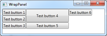 Notice how button 5 only uses the width - it doesn't care about the
height, although it causes the sixth button to be pushed to a new
column.
Notice how button 5 only uses the width - it doesn't care about the
height, although it causes the sixth button to be pushed to a new
column.The StackPanel control
The StackPanel is very similar to the WrapPanel, but with at least one important difference: The StackPanel doesn't wrap the content. Instead it stretches it content in one direction, allowing you to stack item after item on top of each other. Let's first try a very simple example, much like we did with the WrapPanel:<Window x:Class="WpfTutorialSamples.Panels.StackPanel" xmlns="http://schemas.microsoft.com/winfx/2006/xaml/presentation" xmlns:x="http://schemas.microsoft.com/winfx/2006/xaml" Title="StackPanel" Height="160" Width="300"> <StackPanel> <Button>Button 1</Button> <Button>Button 2</Button> <Button>Button 3</Button> <Button>Button 4</Button> <Button>Button 5</Button> <Button>Button 6</Button> </StackPanel> </Window>
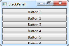
The first thing you should notice is how the StackPanel doesn't really care whether or not there's enough room for the content. It doesn't wrap the content in any way and it doesn't automatically provide you with the ability to scroll (you can use a ScrollViewer control for that though - more on that in a later chapter).
You might also notice that the default orientation of the StackPanel is Vertical, unlike the WrapPanel where the default orientation is Horizontal. But just like for the WrapPanel, this can easily be changed, using the Orientation property:
<StackPanel Orientation="Horizontal">
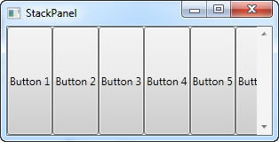
Another thing you will likely notice is that the StackPanel stretches its child control by default. On a vertically aligned StackPanel, like the one in the first example, all child controls get stretched horizontally. On a horizontally aligned StackPanel, all child controls get stretched vertically, as seen above. The StackPanel does this by setting the HorizontalAlignment or VerticalAlignment property on its child controls to Stretch, but you can easily override this if you want to. Have a look at the next example, where we use the same markup as we did in the previous example, but this time we assign values to the VerticalAlignment property for all the child controls:
<Window x:Class="WpfTutorialSamples.Panels.StackPanel"
        xmlns="http://schemas.microsoft.com/winfx/2006/xaml/presentation"
        xmlns:x="http://schemas.microsoft.com/winfx/2006/xaml"
        Title="StackPanel" Height="160" Width="300">
        <StackPanel Orientation="Horizontal">
                <Button VerticalAlignment="Top">Button 1</Button>
                <Button VerticalAlignment="Center">Button 2</Button>
                <Button VerticalAlignment="Bottom">Button 3</Button>
                <Button VerticalAlignment="Bottom">Button 4</Button>
                <Button VerticalAlignment="Center">Button 5</Button>
                <Button VerticalAlignment="Top">Button 6</Button>
        </StackPanel>
</Window>
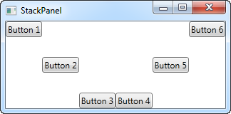
We use the Top, Center and Bottom values to place the buttons in a nice pattern, just for kicks. The same can of course be done for a vertically aligned StackPanel, where you would use the HorizontalAlignment on the child controls:
<Window x:Class="WpfTutorialSamples.Panels.StackPanel"
        xmlns="http://schemas.microsoft.com/winfx/2006/xaml/presentation"
        xmlns:x="http://schemas.microsoft.com/winfx/2006/xaml"
        Title="StackPanel" Height="160" Width="300">
        <StackPanel Orientation="Vertical">
                <Button HorizontalAlignment="Left">Button 1</Button>
                <Button HorizontalAlignment="Center">Button 2</Button>
                <Button HorizontalAlignment="Right">Button 3</Button>
                <Button HorizontalAlignment="Right">Button 4</Button>
                <Button HorizontalAlignment="Center">Button 5</Button>
                <Button HorizontalAlignment="Left">Button 6</Button>
        </StackPanel>
</Window>
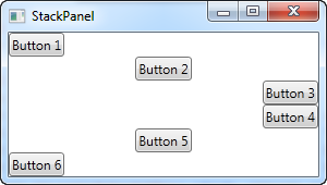
As you can see, the controls still go from top to bottom, but instead of having the same width, each control is aligned to the left, the right or center.
The DockPanel control
The DockPanel makes it easy to dock content in all four directions (top, bottom, left and right). This makes it a great choice in many situations, where you want to divide the window into specific areas, especially because by default, the last element inside the DockPanel, unless this feature is specifically disabled, will automatically fill the rest of the space (center).As we've seen with many of the other panels in WPF, you start taking advantage of the panel possibilities by using an attached property of it, in this case the DockPanel.Dock property, which decides in which direction you want the child control to dock to. If you don't use this, the first control(s) will be docked to the left, with the last one taking up the remaining space. Here's an example on how you use it:
<Window x:Class="WpfTutorialSamples.Panels.DockPanel"
        xmlns="http://schemas.microsoft.com/winfx/2006/xaml/presentation"
        xmlns:x="http://schemas.microsoft.com/winfx/2006/xaml"
        Title="DockPanel" Height="250" Width="250">
        <DockPanel>
                <Button DockPanel.Dock="Left">Left</Button>
                <Button DockPanel.Dock="Top">Top</Button>
                <Button DockPanel.Dock="Right">Right</Button>
                <Button DockPanel.Dock="Bottom">Bottom</Button>
                <Button>Center</Button>
        </DockPanel>
</Window>
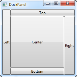 As already mentioned, we don't assign a dock position for the last
child, because it automatically centers the control, allowing it to fill
the remaining space. You will also notice that the controls around the
center only takes up the amount of space that they need - everything
else is left for the center position. That is also why you will see the
Right button take up a bit more space than the Left button - the extra
character in the text simply requires more pixels.
As already mentioned, we don't assign a dock position for the last
child, because it automatically centers the control, allowing it to fill
the remaining space. You will also notice that the controls around the
center only takes up the amount of space that they need - everything
else is left for the center position. That is also why you will see the
Right button take up a bit more space than the Left button - the extra
character in the text simply requires more pixels.The last thing that you will likely notice, is how the space is divided. For instance, the Top button doesn't get all of the top space, because the Left button takes a part of it. The DockPanel decides which control to favor by looking at their position in the markup. In this case, the Left button gets precedence because it's placed first in the markup. Fortunately, this also means that it's very easy to change, as we'll see in the next example, where we have also evened out the space a bit by assigning widths/heights to the child controls:
<Window x:Class="WpfTutorialSamples.Panels.DockPanel"
        xmlns="http://schemas.microsoft.com/winfx/2006/xaml/presentation"
        xmlns:x="http://schemas.microsoft.com/winfx/2006/xaml"
        Title="DockPanel" Height="250" Width="250">
        <DockPanel>
                <Button DockPanel.Dock="Top" Height="50">Top</Button>
                <Button DockPanel.Dock="Bottom" Height="50">Bottom</Button>
                <Button DockPanel.Dock="Left" Width="50">Left</Button>
                <Button DockPanel.Dock="Right" Width="50">Right</Button>
                <Button>Center</Button>
        </DockPanel>
</Window>
 The top and bottom controls now take precedence over the left and
right controls, and they're all taking up 50 pixels in either height or
width. If you make the window bigger or smaller, you will also see that
this static width/height remains the same no matter what - only the
center area increases or decreases in size as you resize the window.
 LastChildFill
As already mentioned, the default behavior is that the last child of the DockPanel takes up the rest of the space, but this can be disabled using the LastChildFill. Here's an example where we disable it, and at the same time we'll show the ability to dock more than one control to the same side:<Window x:Class="WpfTutorialSamples.Panels.DockPanel" xmlns="http://schemas.microsoft.com/winfx/2006/xaml/presentation" xmlns:x="http://schemas.microsoft.com/winfx/2006/xaml" Title="DockPanel" Height="300" Width="300"> <DockPanel LastChildFill="False"> <Button DockPanel.Dock="Top" Height="50">Top</Button> <Button DockPanel.Dock="Bottom" Height="50">Bottom</Button> <Button DockPanel.Dock="Left" Width="50">Left</Button> <Button DockPanel.Dock="Left" Width="50">Left</Button> <Button DockPanel.Dock="Right" Width="50">Right</Button> <Button DockPanel.Dock="Right" Width="50">Right</Button> </DockPanel> </Window>
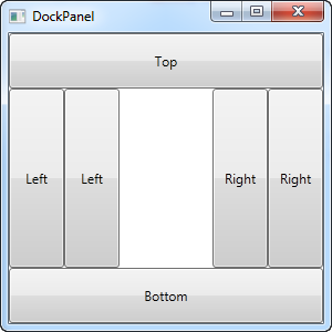 In this example, we dock two controls to the left and two controls to
the right, and at the same time, we turn off the LastChildFill
property. This leaves us with empty space in the center, which may be
preferable in some cases.
In this example, we dock two controls to the left and two controls to
the right, and at the same time, we turn off the LastChildFill
property. This leaves us with empty space in the center, which may be
preferable in some cases.The Grid Control
The Grid is probably the most complex of the panel types. A Grid can contain multiple rows and columns. You define a height for each of the rows and a width for each of the columns, in either an absolute amount of pixels, in a percentage of the available space or as auto, where the row or column will automatically adjust its size depending on the content. Use the Grid when the other panels doesn't do the job, e.g. when you need multiple columns and often in combination with the other panels.In its most basic form, the Grid will simply take all of the controls you put into it, stretch them to use the maximum available space and place it on top of each other:
<Window x:Class="WpfTutorialSamples.Panels.Grid"
        xmlns="http://schemas.microsoft.com/winfx/2006/xaml/presentation"
        xmlns:x="http://schemas.microsoft.com/winfx/2006/xaml"
        Title="Grid" Height="300" Width="300">
    <Grid>
                <Button>Button 1</Button>
                <Button>Button 2</Button>
        </Grid>
</Window>
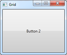 As you can see, the last control gets the top position, which in this
case means that you can't even see the first button. Not terribly
useful for most situations though, so let's try dividing the space,
which is what the grid does so well. We do that by using
ColumnDefinitions and RowDefinitions. In the first example, we'll stick
to columns:
As you can see, the last control gets the top position, which in this
case means that you can't even see the first button. Not terribly
useful for most situations though, so let's try dividing the space,
which is what the grid does so well. We do that by using
ColumnDefinitions and RowDefinitions. In the first example, we'll stick
to columns:<Window x:Class="WpfTutorialSamples.Panels.Grid" xmlns="http://schemas.microsoft.com/winfx/2006/xaml/presentation" xmlns:x="http://schemas.microsoft.com/winfx/2006/xaml" Title="Grid" Height="300" Width="300"> <Grid> <Grid.ColumnDefinitions> <ColumnDefinition Width="*" /> <ColumnDefinition Width="*" /> </Grid.ColumnDefinitions> <Button>Button 1</Button> <Button Grid.Column="1">Button 2</Button> </Grid> </Window>
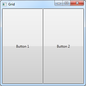 In this example, we have simply divided the available space into two
columns, which will share the space equally, using a "star width" (this
will be explained later). On the second button, I use a so-called
Attached property to place the button in the second column (0 is the
first column, 1 is the second and so on). I could have used this
property on the first button as well, but it automatically gets assigned
to the first column and the first row, which is exactly what we want
here.
In this example, we have simply divided the available space into two
columns, which will share the space equally, using a "star width" (this
will be explained later). On the second button, I use a so-called
Attached property to place the button in the second column (0 is the
first column, 1 is the second and so on). I could have used this
property on the first button as well, but it automatically gets assigned
to the first column and the first row, which is exactly what we want
here.As you can see, the controls take up all the available space, which is the default behavior when the grid arranges its child controls. It does this by setting the HorizontalAlignment and VerticalAlignment on its child controls to Stretch.
In some situations you may want them to only take up the space they need though and/or control how they are placed in the Grid. The easiest way to do this is to set the HorizontalAlignment and VerticalAlignment directly on the controls you wish to manipulate. Here's a modified version of the above example:
<Window x:Class="WpfTutorialSamples.Panels.Grid"
        xmlns="http://schemas.microsoft.com/winfx/2006/xaml/presentation"
        xmlns:x="http://schemas.microsoft.com/winfx/2006/xaml"
        Title="Grid" Height="300" Width="300">
    <Grid>
                <Grid.ColumnDefinitions>
                        <ColumnDefinition Width="*" />
                        <ColumnDefinition Width="*" />
                </Grid.ColumnDefinitions>
                <Button VerticalAlignment="Top" HorizontalAlignment="Center">Button 1</Button>
                <Button Grid.Column="1" VerticalAlignment="Center" HorizontalAlignment="Right">Button 2</Button>
        </Grid>
</Window>
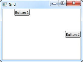 As you can see from the resulting screenshot, the first button is now
placed in the top and centered. The second button is placed in the
middle, aligned to the right.
As you can see from the resulting screenshot, the first button is now
placed in the top and centered. The second button is placed in the
middle, aligned to the right.The Grid - Rows & columns
In the last chapter, we introduced you to the great Grid panel and showed you a couple of basic examples on how to use it. In this chapter we will do some more advanced layouts, as this is where the Grid really shines. First of all, let's throw in more columns and even some rows, for a true tabular layout:<Window x:Class="WpfTutorialSamples.Panels.TabularGrid" xmlns="http://schemas.microsoft.com/winfx/2006/xaml/presentation" xmlns:x="http://schemas.microsoft.com/winfx/2006/xaml" Title="TabularGrid" Height="300" Width="300"> <Grid> <Grid.ColumnDefinitions> <ColumnDefinition Width="2*" /> <ColumnDefinition Width="1*" /> <ColumnDefinition Width="1*" /> </Grid.ColumnDefinitions> <Grid.RowDefinitions> <RowDefinition Height="2*" /> <RowDefinition Height="1*" /> <RowDefinition Height="1*" /> </Grid.RowDefinitions> <Button>Button 1</Button> <Button Grid.Column="1">Button 2</Button> <Button Grid.Column="2">Button 3</Button> <Button Grid.Row="1">Button 4</Button> <Button Grid.Column="1" Grid.Row="1">Button 5</Button> <Button Grid.Column="2" Grid.Row="1">Button 6</Button> <Button Grid.Row="2">Button 7</Button> <Button Grid.Column="1" Grid.Row="2">Button 8</Button> <Button Grid.Column="2" Grid.Row="2">Button 9</Button> </Grid> </Window>
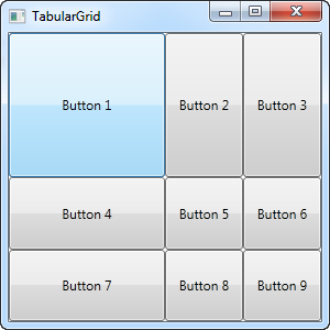 A total of nine buttons, each placed in their own cell in a grid
containing three rows and three columns. We once again use a star based
width, but this time we assign a number as well - the first row and the
first column has a width of 2*, which basically means that it uses twice
the amount of space as the rows and columns with a width of 1* (or just
* - that's the same).
 You will also notice that I use the Attached properties Grid.Row and Grid.Column to place the controls in the grid, and once again you will notice that I have omitted these properties on the controls where I want to use either the first row or the first column (or both). This is essentially the same as specifying a zero. This saves a bit of typing, but you might prefer to assign them anyway for a better overview - that's totally up to you!
The Grid - Units
So far we have mostly used the star width/height, which specifies that a row or a column should take up a certain percentage of the combined space. However, there are two other ways of specifying the width or height of a column or a row: Absolute units and the Auto width/height. Let's try creating a Grid where we mix these:<Window x:Class="WpfTutorialSamples.Panels.GridUnits" xmlns="http://schemas.microsoft.com/winfx/2006/xaml/presentation" xmlns:x="http://schemas.microsoft.com/winfx/2006/xaml" Title="GridUnits" Height="200" Width="400"> <Grid> <Grid.ColumnDefinitions> <ColumnDefinition Width="1*" /> <ColumnDefinition Width="Auto" /> <ColumnDefinition Width="100" /> </Grid.ColumnDefinitions> <Button>Button 1</Button> <Button Grid.Column="1">Button 2 with long text</Button> <Button Grid.Column="2">Button 3</Button> </Grid> </Window>
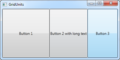 In this example, the first button has a star width, the second one
has its width set to Auto and the last one has a static width of 100
pixels.
 The result can be seen on the screenshot, where the second button only takes exactly the amount of space it needs to render its longer text, the third button takes exactly the 100 pixels it was promised and the first button, with the variable width, takes the rest.
In a Grid where one or several columns (or rows) have a variable (star) width, they automatically get to share the width/height not already used by the columns/rows which uses an absolute or Auto width/height. This becomes more obvious when we resize the window:
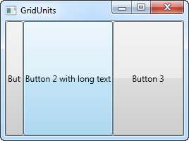
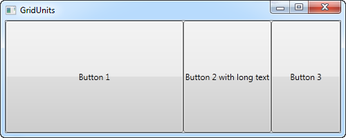 On the first screenshot, you will see that the Grid reserves the
space for the last two buttons, even though it means that the first one
doesn't get all the space it needs to render properly. On the second
screenshot, you will see the last two buttons keeping the exact same
amount of space, leaving the surplus space to the first button.
On the first screenshot, you will see that the Grid reserves the
space for the last two buttons, even though it means that the first one
doesn't get all the space it needs to render properly. On the second
screenshot, you will see the last two buttons keeping the exact same
amount of space, leaving the surplus space to the first button.This can be a very useful technique when designing a wide range of dialogs. For instance, consider a simple contact form where the user enters a name, an e-mail address and a comment. The first two fields will usually have a fixed height, while the last one might as well take up as much space as possible, leaving room to type a longer comment. In the next chapter, we will try building a contact form, using the grid and rows and columns of different heights and widths.
The Grid - Spanning
The default Grid behavior is that each control takes up one cell, but sometimes you want a certain control to take up more rows or columns. Fortunately the Grid makes this very easy, with the Attached properties ColumnSpan and RowSpan. The default value for this property is obviously 1, but you can specify a bigger number to make the control span more rows or columns.Here's a very simple example, where we use the ColumnSpan property:
<Window x:Class="WpfTutorialSamples.Panels.GridColRowSpan"
        xmlns="http://schemas.microsoft.com/winfx/2006/xaml/presentation"
        xmlns:x="http://schemas.microsoft.com/winfx/2006/xaml"
        Title="GridColRowSpan" Height="110" Width="300">
        <Grid>
                <Grid.ColumnDefinitions>
                        <ColumnDefinition Width="1*" />
                        <ColumnDefinition Width="1*" />
                </Grid.ColumnDefinitions>
                <Grid.RowDefinitions>
                        <RowDefinition Height="*" />
                        <RowDefinition Height="*" />
                </Grid.RowDefinitions>
                <Button>Button 1</Button>
                <Button Grid.Column="1">Button 2</Button>
                <Button Grid.Row="1" Grid.ColumnSpan="2">Button 3</Button>
        </Grid>
</Window>
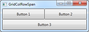 We just define two columns and two rows, all of them taking up their
equal share of the place. The first two buttons just use the columns
normally, but with the third button, we make it take up two columns of
space on the second row, using the ColumnSpan attribute.
We just define two columns and two rows, all of them taking up their
equal share of the place. The first two buttons just use the columns
normally, but with the third button, we make it take up two columns of
space on the second row, using the ColumnSpan attribute.This is all so simple that we could have just used a combination of panels to achieve the same effect, but for just slightly more advanced cases, this is really useful. Let's try something which better shows how powerful this is:
<Window x:Class="WpfTutorialSamples.Panels.GridColRowSpanAdvanced"
        xmlns="http://schemas.microsoft.com/winfx/2006/xaml/presentation"
        xmlns:x="http://schemas.microsoft.com/winfx/2006/xaml"
        Title="GridColRowSpanAdvanced" Height="300" Width="300">
    <Grid>
                <Grid.ColumnDefinitions>
                        <ColumnDefinition Width="*" />
                        <ColumnDefinition Width="*" />
                        <ColumnDefinition Width="*" />
                </Grid.ColumnDefinitions>
                <Grid.RowDefinitions>
                        <RowDefinition Height="*" />
                        <RowDefinition Height="*" />
                        <RowDefinition Height="*" />
                </Grid.RowDefinitions>
                <Button Grid.ColumnSpan="2">Button 1</Button>
                <Button Grid.Column="3">Button 2</Button>
                <Button Grid.Row="1">Button 3</Button>
                <Button Grid.Column="1" Grid.Row="1" Grid.RowSpan="2" Grid.ColumnSpan="2">Button 4</Button>
                <Button Grid.Column="0" Grid.Row="2">Button 5</Button>
        </Grid>
</Window>
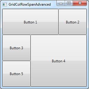 With three columns and three rows we would normally have nine cells,
but in this example, we use a combination of row and column spanning to
fill all the available space with just five buttons. As you can see, a
control can span either extra columns, extra rows or in the case of
button 4: both.
 So as you can see, spanning multiple columns and/or rows in a Grid is very easy. In a later article, we will use the spanning, along with all the other Grid techniques in a more practical example.
The GridSplitter
As you saw in the previous articles, the Grid panel makes it very easy to divide up the available space into individual cells. Using column and row definitions, you can easily decide how much space each row or column should take up, but what if you want to allow the user to change this? This is where the GridSplitter control comes into play.The GridSplitter is used simply by adding it to a column or a row in a Grid, with the proper amount of space for it, e.g. 5 pixels. It will then allow the user to drag it from side to side or up and down, while changing the size of the column or row on each of the sides of it. Here's an example:
<Window x:Class="WpfTutorialSamples.Panels.GridSplitterSample"
        xmlns="http://schemas.microsoft.com/winfx/2006/xaml/presentation"
        xmlns:x="http://schemas.microsoft.com/winfx/2006/xaml"
        Title="GridSplitterSample" Height="300" Width="300">
    <Grid>
        <Grid.ColumnDefinitions>
            <ColumnDefinition Width="*" />
            <ColumnDefinition Width="5" />
            <ColumnDefinition Width="*" />
        </Grid.ColumnDefinitions>
        <TextBlock FontSize="55" HorizontalAlignment="Center" VerticalAlignment="Center" TextWrapping="Wrap">Left side</TextBlock>
        <GridSplitter Grid.Column="1" Width="5" HorizontalAlignment="Stretch" />
        <TextBlock Grid.Column="2" FontSize="55" HorizontalAlignment="Center" VerticalAlignment="Center" TextWrapping="Wrap">Right side</TextBlock>
    </Grid>
</Window>
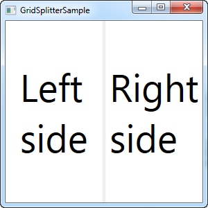
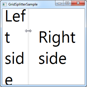
As you can see, I've simply created a Grid with two equally wide columns, with a 5 pixel column in the middle. Each of the sides are just a TextBlock control to illustrate the point. As you can see from the screenshots, the GridSplitter is rendered as a dividing line between the two columns and as soon as the mouse is over it, the cursor is changed to reflect that it can be resized.
Horizontal GridSplitter
The GridSplitter is very easy to use and of course it supports horizontal splits as well. In fact, you hardly have to change anything to make it work horizontally instead of vertically, as the next example will show:<Window x:Class="WpfTutorialSamples.Panels.GridSplitterHorizontalSample" xmlns="http://schemas.microsoft.com/winfx/2006/xaml/presentation" xmlns:x="http://schemas.microsoft.com/winfx/2006/xaml" Title="GridSplitterHorizontalSample" Height="300" Width="300"> <Grid> <Grid.RowDefinitions> <RowDefinition Height="*" /> <RowDefinition Height="5" /> <RowDefinition Height="*" /> </Grid.RowDefinitions> <TextBlock FontSize="55" HorizontalAlignment="Center" VerticalAlignment="Center" TextWrapping="Wrap">Top</TextBlock> <GridSplitter Grid.Row="1" Height="5" HorizontalAlignment="Stretch" /> <TextBlock Grid.Row="2" FontSize="55" HorizontalAlignment="Center" VerticalAlignment="Center" TextWrapping="Wrap">Bottom</TextBlock> </Grid> </Window>
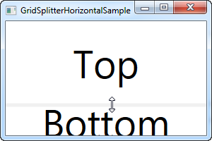
As you can see, I simply changed the columns into rows and on the GridSplitter, I defined a Height instead of a Width. The GridSplitter figures out the rest on its own, but in case it doesn't, you can use the ResizeDirection property on it to force it into either Rows or Columns mode.
Using the Grid: A contact form
In the last couple of chapters we went through a lot of theoretic information, each with some very theoretic examples. In this chapter we will combine what we have learned about the Grid so far, into an example that can be used in the real world: A simple contact form.The good thing about the contact form is that it's just an example of a commonly used dialog - you can take the techniques used and apply them to almost any type of dialog that you need to create.
The first take on this task is very simple and will show you a very basic contact form. It uses three rows, two of them with Auto heights and the last one with star height, so it consumes the rest of the available space:
<Window x:Class="WpfTutorialSamples.Panels.GridContactForm"
        xmlns="http://schemas.microsoft.com/winfx/2006/xaml/presentation"
        xmlns:x="http://schemas.microsoft.com/winfx/2006/xaml"
        Title="GridContactForm" Height="300" Width="300">
    <Grid>
                <Grid.RowDefinitions>
                        <RowDefinition Height="Auto" />
                        <RowDefinition Height="Auto" />
                        <RowDefinition Height="*" />
                </Grid.RowDefinitions>
                <TextBox>Name</TextBox>
                <TextBox Grid.Row="1">E-mail</TextBox>
                <TextBox Grid.Row="2" AcceptsReturn="True">Comment</TextBox>
        </Grid>
</Window>
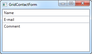 As you can see, the last TextBox simply takes up the remaining space,
while the first two only takes up the space they require. Try resizing
the window and you will see the comment TextBox resize with it.
 In this very simple example, there are no labels to designate what each of the fields are for. Instead, the explanatory text is inside the TextBox, but this is not generally how a Windows dialog looks. Let's try improving the look and usability a bit:
<Window x:Class="WpfTutorialSamples.Panels.GridContactFormTake2"
        xmlns="http://schemas.microsoft.com/winfx/2006/xaml/presentation"
        xmlns:x="http://schemas.microsoft.com/winfx/2006/xaml"
        Title="GridContactFormTake2" Height="300" Width="300">
        <Grid Margin="10">
                <Grid.ColumnDefinitions>
                        <ColumnDefinition Width="Auto" />
                        <ColumnDefinition Width="*" />
                </Grid.ColumnDefinitions>
                <Grid.RowDefinitions>
                        <RowDefinition Height="Auto" />
                        <RowDefinition Height="Auto" />
                        <RowDefinition Height="*" />
                </Grid.RowDefinitions>
                <Label>Name: </Label>
                <TextBox Grid.Column="1" Margin="0,0,0,10" />
                <Label Grid.Row="1">E-mail: </Label>
                <TextBox Grid.Row="1" Grid.Column="1" Margin="0,0,0,10" />
                <Label Grid.Row="2">Comment: </Label>
                <TextBox Grid.Row="2" Grid.Column="1" AcceptsReturn="True" />
        </Grid>
</Window>
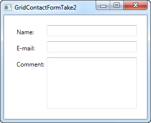 But perhaps you're in a situation where the comment field is pretty
self-explanatory? In that case, let's skip the label and use ColumnSpan
to get even more space for the comment TextBox:
 <TextBox Grid.ColumnSpan="2" Grid.Row="2" AcceptsReturn="True" />
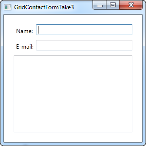 So as you can see, the Grid is a very powerful panel. Hopefully you
can use all of these techniques when designing your own dialogs.
So as you can see, the Grid is a very powerful panel. Hopefully you
can use all of these techniques when designing your own dialogs.Introduction to WPF data binding
Wikipedia describes the concept of data binding very well:Data binding is general technique that binds two data/information sources together and maintains synchronization of data.
With WPF, Microsoft has put data binding in the front seat and once you start learning WPF, you will realize that it's an important aspect of pretty much everything you do. If you come from the world of WinForms, then the huge focus on data binding might scare you a bit, but once you get used to it, you will likely come to love it, as it makes a lot of things cleaner and easier to maintain.
Data binding in WPF is the preferred way to bring data from your code to the UI layer. Sure, you can set properties on a control manually or you can populate a ListBox by adding items to it from a loop, but the cleanest and purest WPF way is to add a binding between the source and the destination UI element.
Summary
In the next chapter, we'll look into a simple example where data binding is used and after that, we'll talk some more about all the possibilities. The concept of data binding is included pretty early in this tutorial, because it's such an integral part of using WPF, which you will see once you explore the rest of the chapters, where it's used almost all of the time.However, the more theoretical part of data binding might be too heavy if you just want to get started building a simple WPF application. In that case I suggest that you have a look at the "Hello, bound world!" article to get a glimpse of how data binding works, and then save the rest of the data binding articles for later, when you're ready to get some more theory.
Hello, bound world!
Just like we started this tutorial with the classic "Hello, world!" example, we'll show you how easy it is to use data binding in WPF with a "Hello, bound world!" example. Let's jump straight into it and then I'll explain it afterwards:<Window x:Class="WpfTutorialSamples.DataBinding.HelloBoundWorldSample" xmlns="http://schemas.microsoft.com/winfx/2006/xaml/presentation" xmlns:x="http://schemas.microsoft.com/winfx/2006/xaml" Title="HelloBoundWorldSample" Height="110" Width="280"> <StackPanel Margin="10"> <TextBox Name="txtValue" /> <WrapPanel Margin="0,10"> <TextBlock Text="Value: " FontWeight="Bold" /> <TextBlock Text="{Binding Path=Text, ElementName=txtValue}" /> </WrapPanel> </StackPanel> </Window>
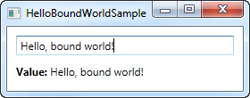
This simple example shows how we bind the value of the TextBlock to match the Text property of the TextBox. As you can see from the screenshot, the TextBlock is automatically updated when you enter text into the TextBox. In a non-bound world, this would require us to listen to an event on the TextBox and then update the TextBlock each time the text changes, but with data binding, this connection can be established just by using markup.
The syntax of a Binding
All the magic happens between the curly braces, which in XAML encapsulates a Markup Extension. For data binding, we use the Binding extension, which allows us to describe the binding relationship for the Text property. In its most simple form, a binding can look like this:{Binding}
This simply returns the current data context (more about that later). This can definitely be useful, but in the most common situations, you would want to bind a property to another property on the data context. A binding like that would look like this:
{Binding Path=NameOfProperty}
The Path notes the property that you want to bind to, however, since Path is the default property of a binding, you may leave it out if you want to, like this:
{Binding NameOfProperty}
You will see many different examples, some of them where Path is explicitly defined and some where it's left out. In the end it's really up to you though.
A binding has many other properties though, one of them being the ElementName which we use in our example. This allows us to connect directly to another UI element as the source. Each property that we set in the binding is separated by a comma:
{Binding Path=Text, ElementName=txtValue}
Summary
This was just a glimpse of all the binding possibilities of WPF. In the next chapters, we'll discover more of them, to show you just how powerful data binding is.Using the DataContext
The DataContext property is the default source of your bindings, unless you specifically declare another source, like we did in the previous chapter with the ElementName property. It's defined on the FrameworkElement class, which most UI controls, including the WPF Window, inherits from. Simply put, it allows you to specify a basis for your bindingsThere's no default source for the DataContext property (it's simply null from the start), but since a DataContext is inherited down through the control hierarchy, you can set a DataContext for the Window itself and then use it throughout all of the child controls. Let's try illustrating that with a simple example:
<Window x:Class="WpfTutorialSamples.DataBinding.DataContextSample"
        xmlns="http://schemas.microsoft.com/winfx/2006/xaml/presentation"
        xmlns:x="http://schemas.microsoft.com/winfx/2006/xaml"
        Title="DataContextSample" Height="130" Width="280">
        <StackPanel Margin="15">
                <WrapPanel>
                        <TextBlock Text="Window title:  " />
                        <TextBox Text="{Binding Title, UpdateSourceTrigger=PropertyChanged}" Width="150" />
                </WrapPanel>
                <WrapPanel Margin="0,10,0,0">
                        <TextBlock Text="Window dimensions: " />
                        <TextBox Text="{Binding Width}" Width="50" />
                        <TextBlock Text=" x " />
                        <TextBox Text="{Binding Height}" Width="50" />
                </WrapPanel>
        </StackPanel>
</Window>
using System;
using System.Windows;
namespace WpfTutorialSamples.DataBinding
{
        public partial class DataContextSample : Window
        {
                public DataContextSample()
                {
                        InitializeComponent();
                        this.DataContext = this;
                }
        }
}
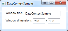
The Code-behind for this example only adds one line of interesting code: After the standard InitalizeComponent() call, we assign the "this" reference to the DataContext, which basically just tells the Window that we want itself to be the data context.
In the XAML, we use this fact to bind to several of the Window properties, including Title, Width and Height. Since the window has a DataContext, which is passed down to the child controls, we don't have to define a source on each of the bindings - we just use the values as if they were globally available.
Try running the example and resize the window - you will see that the dimension changes are immediately reflected in the textboxes. You can also try writing a different title in the first textbox, but you might be surprised to see that this change is not reflected immediately. Instead, you have to move the focus to another control before the change is applied. Why? Well, that's the subject for the next chapter.
Summary
Using the DataContext property is like setting the basis of all bindings down through the hierarchy of controls. This saves you the hassle of manually defining a source for each binding, and once you really start using data bindings, you will definitely appreciate the time and typing saved.However, this doesn't mean that you have to use the same DataContext for all controls within a Window. Since each control has its own DataContext property, you can easily break the chain of inheritance and override the DataContext with a new value. This allows you to do stuff like having a global DataContext on the window and then a more local and specific DataContext on e.g. a panel holding a separate form or something along those lines.
The UpdateSourceTrigger property
In the previous article we saw how changes in a TextBox was not immediately sent back to the source. Instead, the source was updated only after focus was lost on the TextBox. This behavior is controlled by a property on the binding called UpdateSourceTrigger. It defaults to the value "Default", which basically means that the source is updated based on the property that you bind to. As of writing, all properties except for the Text property, is updated as soon as the property changes (PropertyChanged), while the Text property is updated when focus on the destination element is lost (LostFocus).Default is, obviously, the default value of the UpdateSourceTrigger. The other options are PropertyChanged, LostFocus and Explicit. The first two has already been described, while the last one simply means that the update has to be pushed manually through to occur, using a call to UpdateSource on the Binding.
To see how all of these options work, I have updated the example from the previous chapter to show you all of them:
<Window x:Class="WpfTutorialSamples.DataBinding.DataContextSample"
        xmlns="http://schemas.microsoft.com/winfx/2006/xaml/presentation"
        xmlns:x="http://schemas.microsoft.com/winfx/2006/xaml"
        Title="DataContextSample" Height="130" Width="310">
        <StackPanel Margin="15">
                <WrapPanel>
                        <TextBlock Text="Window title:  " />
                        <TextBox Name="txtWindowTitle" Text="{Binding Title, UpdateSourceTrigger=Explicit}" Width="150" />
                        <Button Name="btnUpdateSource" Click="btnUpdateSource_Click" Margin="5,0" Padding="5,0">*</Button>
                </WrapPanel>
                <WrapPanel Margin="0,10,0,0">
                        <TextBlock Text="Window dimensions: " />
                        <TextBox Text="{Binding Width, UpdateSourceTrigger=LostFocus}" Width="50" />
                        <TextBlock Text=" x " />
                        <TextBox Text="{Binding Height, UpdateSourceTrigger=PropertyChanged}" Width="50" />
                </WrapPanel>
        </StackPanel>
</Window>
using System;
using System.Windows;
using System.Windows.Controls;
using System.Windows.Data;
namespace WpfTutorialSamples.DataBinding
{
        public partial class DataContextSample : Window
        {
                public DataContextSample()
                {
                        InitializeComponent();
                        this.DataContext = this;
                }

                private void btnUpdateSource_Click(object sender, RoutedEventArgs e)
                {
                        BindingExpression binding = txtWindowTitle.GetBindingExpression(TextBox.TextProperty);
                        binding.UpdateSource();
                }
        }
}
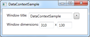
As you can see, each of the three textboxes now uses a different UpdateSourceTrigger.
The first one is set to Explicit, which basically means that the source won't be updated unless you manually do it. For that reason, I have added a button next to the TextBox, which will update the source value on demand. In the Code-behind, you will find the Click handler, where we use a couple of lines of code to get the binding from the destination control and then call the UpdateSource() method on it.
The second TextBox uses the LostFocus value, which is actually the default for a Text binding. It means that the source value will be updated each time the destination control loses focus.
The third and last TextBox uses the PropertyChanged value, which means that the source value will be updated each time the bound property changes, which it does in this case as soon as the text changes.
Try running the example on your own machine and see how the three textboxes act completely different: The first value doesn't update before you click the button, the second value isn't updated until you leave the TextBox, while the third value updates automatically on each keystroke, text change etc.
Summary
The UpdateSourceTrigger property of a binding controls how and when a changed value is sent back to the source. However, since WPF is pretty good at controlling this for you, the default value should suffice for most cases, where you will get the best mix of a constantly updated UI and good performance.For those situations where you need more control of the process, this property will definitely help though. Just make sure that you don't update the source value more often than you actually need to. If you want the full control, you can use the Explicit value and then do the updates manually, but this does take a bit of the fun out of working with data bindings.
Responding to changes
So far in this tutorial, we have mostly created bindings between UI elements and existing classes, but in real life applications, you will obviously be binding to your own data objects. This is just as easy, but once you start doing it, you might discover something that disappoints you: Changes are not automatically reflected, like they were in previous examples. As you will learn in this article, you need just a bit of extra work for this to happen, but fortunately, WPF makes this pretty easy.Responding to data source changes
There are two different scenarios that you may or may not want to handle when dealing with data source changes: Changes to the list of items and changes in the bound properties in each of the data objects. How to handle them may vary, depending on what you're doing and what you're looking to accomplish, but WPF comes with two very easy solutions that you can use: The ObservableCollection and the INotifyPropertyChanged interface.The following example will show you why we need these two things:
<Window x:Class="WpfTutorialSamples.DataBinding.ChangeNotificationSample"
        xmlns="http://schemas.microsoft.com/winfx/2006/xaml/presentation"
        xmlns:x="http://schemas.microsoft.com/winfx/2006/xaml"
        Title="ChangeNotificationSample" Height="150" Width="300">
        <DockPanel Margin="10">
                <StackPanel DockPanel.Dock="Right" Margin="10,0,0,0">
                        <Button Name="btnAddUser" Click="btnAddUser_Click">Add user</Button>
                        <Button Name="btnChangeUser" Click="btnChangeUser_Click" Margin="0,5">Change user</Button>
                        <Button Name="btnDeleteUser" Click="btnDeleteUser_Click">Delete user</Button>
                </StackPanel>
                <ListBox Name="lbUsers" DisplayMemberPath="Name"></ListBox>
        </DockPanel>
</Window>
using System;
using System.Collections.Generic;
using System.Windows;
namespace WpfTutorialSamples.DataBinding
{
        public partial class ChangeNotificationSample : Window
        {
                private List<User> users = new List<User>();

                public ChangeNotificationSample()
                {
                        InitializeComponent();

                        users.Add(new User() { Name = "John Doe" });
                        users.Add(new User() { Name = "Jane Doe" });

                        lbUsers.ItemsSource = users;
                }

                private void btnAddUser_Click(object sender, RoutedEventArgs e)
                {
                        users.Add(new User() { Name = "New user" });
                }

                private void btnChangeUser_Click(object sender, RoutedEventArgs e)
                {
                        if(lbUsers.SelectedItem != null)
                                (lbUsers.SelectedItem as User).Name = "Random Name";
                }

                private void btnDeleteUser_Click(object sender, RoutedEventArgs e)
                {
                        if(lbUsers.SelectedItem != null)
                                users.Remove(lbUsers.SelectedItem as User);
                }
        }

        public class User
        {
                public string Name { get; set; }
        }
}
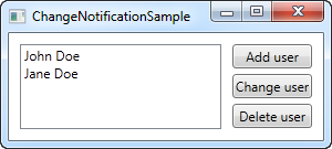
Try running it for yourself and watch how even though you add something to the list or change the name of one of the users, nothing in the UI is updated. The example is pretty simple, with a User class that will keep the name of the user, a ListBox to show them in and some buttons to manipulate both the list and its contents. The ItemsSource of the list is assigned to a quick list of a couple of users that we create in the window constructor. The problem is that none of the buttons seems to work. Let's fix that, in two easy steps.
Reflecting changes in the list data source
The first step is to get the UI to respond to changes in the list source (ItemsSource), like when we add or delete a user. What we need is a list that notifies any destinations of changes to its content, and fortunately, WPF provides a type of list that will do just that. It's called ObservableCollection, and you use it much like a regular List<T>, with only a few differences.In the final example, which you will find below, we have simply replaced the List<User> with an ObservableCollection<User> - that's all it takes! This will make the Add and Delete button work, but it won't do anything for the "Change name" button, because the change will happen on the bound data object itself and not the source list - the second step will handle that scenario though.
Reflecting changes in the data objects
The second step is to let our custom User class implement the INotifyPropertyChanged interface. By doing that, our User objects are capable of alerting the UI layer of changes to its properties. This is a bit more cumbersome than just changing the list type, like we did above, but it's still one of the simplest way to accomplish these automatic updates.The final and working example
With the two changes described above, we now have an example that WILL reflect changes in the data source. It looks like this:<Window x:Class="WpfTutorialSamples.DataBinding.ChangeNotificationSample" xmlns="http://schemas.microsoft.com/winfx/2006/xaml/presentation" xmlns:x="http://schemas.microsoft.com/winfx/2006/xaml" Title="ChangeNotificationSample" Height="135" Width="300"> <DockPanel Margin="10"> <StackPanel DockPanel.Dock="Right" Margin="10,0,0,0"> <Button Name="btnAddUser" Click="btnAddUser_Click">Add user</Button> <Button Name="btnChangeUser" Click="btnChangeUser_Click" Margin="0,5">Change user</Button> <Button Name="btnDeleteUser" Click="btnDeleteUser_Click">Delete user</Button> </StackPanel> <ListBox Name="lbUsers" DisplayMemberPath="Name"></ListBox> </DockPanel> </Window>
using System;
using System.Collections.Generic;
using System.Windows;
using System.ComponentModel;
using System.Collections.ObjectModel;
namespace WpfTutorialSamples.DataBinding
{
        public partial class ChangeNotificationSample : Window
        {
                private ObservableCollection<User> users = new ObservableCollection<User>();

                public ChangeNotificationSample()
                {
                        InitializeComponent();

                        users.Add(new User() { Name = "John Doe" });
                        users.Add(new User() { Name = "Jane Doe" });

                        lbUsers.ItemsSource = users;
                }

                private void btnAddUser_Click(object sender, RoutedEventArgs e)
                {
                        users.Add(new User() { Name = "New user" });
                }

                private void btnChangeUser_Click(object sender, RoutedEventArgs e)
                {
                        if(lbUsers.SelectedItem != null)
                                (lbUsers.SelectedItem as User).Name = "Random Name";
                }

                private void btnDeleteUser_Click(object sender, RoutedEventArgs e)
                {
                        if(lbUsers.SelectedItem != null)
                                users.Remove(lbUsers.SelectedItem as User);
                }
        }

        public class User : INotifyPropertyChanged
        {
                private string name;
                public string Name {
                        get { return this.name; }
                        set
                        {
                                if(this.name != value)
                                {
                                        this.name = value;
                                        this.NotifyPropertyChanged("Name");
                                }
                        }
                }

                public event PropertyChangedEventHandler PropertyChanged;

                public void NotifyPropertyChanged(string propName)
                {
                        if(this.PropertyChanged != null)
                                this.PropertyChanged(this, new PropertyChangedEventArgs(propName));
                }
        }
}
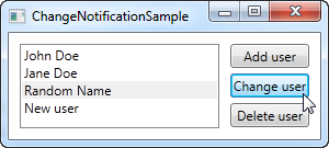
Summary
As you can see, implementing INotifyPropertyChanged is pretty easy, but it does create a bit of extra code on your classes, and adds a bit of extra logic to your properties. This is the price you will have to pay if you want to bind to your own classes and have the changes reflected in the UI immediately. Obviously you only have to call NotifyPropertyChanged in the setter's of the properties that you bind to - the rest can remain the way they are.The ObservableCollection on the other hand is very easy to deal with - it simply requires you to use this specific list type in those situations where you want changes to the source list reflected in a binding destination.
Are you looking to make cash from your websites/blogs by running popup ads?
ReplyDeleteIf so, did you ever use Pop Ads?