Value conversion with IValueConverter
So far we have used some simple data bindings, where the sending and receiving property was always compatible. However, you will soon run into situations where you want to use a bound value of one type and then present it slightly differently.When to use a value converter
Value converters are very frequently used with data bindings. Here are some basic examples:- You have a numeric value but you want to show zero values in one way and positive numbers in another way
- You want to check a CheckBox based on a value, but the value is a string like "yes" or "no" instead of a Boolean value
- You have a file size in bytes but you wish to show it as bytes, kilobytes, megabytes or gigabytes based on how big it is
For cases like this, you can use a value converter. These small classes, which implement the IValueConverter interface, will act like middlemen and translate a value between the source and the destination. So, in any situation where you need to transform a value before it reaches its destination or back to its source again, you likely need a converter.
Implementing a simple value converter
As mentioned, a WPF value converter needs to implement the IValueConverter interface, or alternatively, the IMultiValueConverter interface (more about that one later). Both interfaces just requires you to implement two methods: Convert() and ConvertBack(). As the name implies, these methods will be used to convert the value to the destination format and then back again.Let's implement a simple converter which takes a string as input and then returns a Boolean value, as well as the other way around. If you're new to WPF, and you likely are since you're reading this tutorial, then you might not know all of the concepts used in the example, but don't worry, they will all be explained after the code listings:
<Window x:Class="WpfTutorialSamples.DataBinding.ConverterSample"
        xmlns="http://schemas.microsoft.com/winfx/2006/xaml/presentation"
        xmlns:x="http://schemas.microsoft.com/winfx/2006/xaml"
                xmlns:local="clr-namespace:WpfTutorialSamples.DataBinding"
        Title="ConverterSample" Height="140" Width="250">
        <Window.Resources>
                <local:YesNoToBooleanConverter x:Key="YesNoToBooleanConverter" />
        </Window.Resources>
        <StackPanel Margin="10">
                <TextBox Name="txtValue" />
                <WrapPanel Margin="0,10">
                        <TextBlock Text="Current value is: " />
                        <TextBlock Text="{Binding ElementName=txtValue, Path=Text, Converter={StaticResource YesNoToBooleanConverter}}"></TextBlock>
                </WrapPanel>
                <CheckBox IsChecked="{Binding ElementName=txtValue, Path=Text, Converter={StaticResource YesNoToBooleanConverter}}" Content="Yes" />
        </StackPanel>
</Window>
using System;
using System.Windows;
using System.Windows.Data;
namespace WpfTutorialSamples.DataBinding
{
        public partial class ConverterSample : Window
        {
                public ConverterSample()
                {
                        InitializeComponent();
                }
        }

        public class YesNoToBooleanConverter : IValueConverter
        {
                public object Convert(object value, Type targetType, object parameter, System.Globalization.CultureInfo culture)
                {
                        switch(value.ToString().ToLower())
                        {
                                case "yes":
                                case "oui":
                                        return true;
                                case "no":
                                case "non":
                                        return false;
                        }
                        return false;
                }

                public object ConvertBack(object value, Type targetType, object parameter, System.Globalization.CultureInfo culture)
                {
                        if(value is bool)
                        {
                                if((bool)value == true)
                                        return "yes";
                                else
                                        return "no";
                        }
                        return "no";
                }
        }
}
Code-behind
So, let's start from the back and then work our way through the example. We have implemented a converter in the Code-behind file called YesNoToBooleanConverter. As advertised, it just implements the two required methods, called Convert() and ConvertBack(). The Convert() methods assumes that it receives a string as the input (the value parameter) and then converts it to a Boolean true or false value, with a fallback value of false. For fun, I added the possibility to do this conversion from French words as well.The ConvertBack() method obviously does the opposite: It assumes an input value with a Boolean type and then returns the English word "yes" or "no" in return, with a fallback value of "no".
You may wonder about the additional parameters that these two methods take, but they're not needed in this example. We'll use them in one of the next chapters, where they will be explained.
XAML
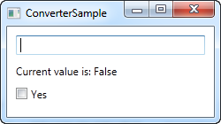
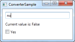
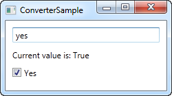
In the XAML part of the program, we start off by declaring an instance of our converter as a resource for the window. We then have a TextBox, a couple of TextBlocks and a CheckBox control and this is where the interesting things are happening: We bind the value of the TextBox to the TextBlock and the CheckBox control and using the Converter property and our own converter reference, we juggle the values back and forth between a string and a Boolean value, depending on what's needed.If you try to run this example, you will be able to change the value in two places: By writing "yes" in the TextBox (or any other value, if you want false) or by checking the CheckBox. No matter what you do, the change will be reflected in the other control as well as in the TextBlock.
Summary
This was an example of a simple value converter, made a bit longer than needed for illustrational purposes. In the next chapter we'll look into a more advanced example, but before you go out and write your own converter, you might want to check if WPF already includes one for the purpose. As of writing, there are more than 20 built-in converters that you may take advantage of, but you need to know their name. I found the following list which might come in handy for you: http://stackoverflow.com/questions/505397/built-in-wpf-ivalueconvertersThe StringFormat property
As we saw in the previous chapters, the way to manipulate the output of a binding before is shown is typically through the use of a converter. The cool thing about the converters is that they allow you to convert any data type into a completely different data type. However, for more simple usage scenarios, where you just want to change the way a certain value is shown and not necessarily convert it into a different type, the StringFormat property might very well be enough.Using the StringFormat property of a binding, you lose some of the flexibility you get when using a converter, but in return, it's much simpler to use and doesn't involve the creation of a new class in a new file.
The StringFormat property does exactly what the name implies: It formats the output string, simply by calling the String.Format method. Sometimes an example says more than a thousand words, so before I hit that word count, let's jump straight into an example:
<Window x:Class="WpfTutorialSamples.DataBinding.StringFormatSample"
        xmlns="http://schemas.microsoft.com/winfx/2006/xaml/presentation"
        xmlns:x="http://schemas.microsoft.com/winfx/2006/xaml"
                xmlns:system="clr-namespace:System;assembly=mscorlib"
        Title="StringFormatSample" Height="150" Width="250"
                Name="wnd">
        <StackPanel Margin="10">
                <TextBlock Text="{Binding ElementName=wnd, Path=ActualWidth, StringFormat=Window width: {0:#,#.0}}" />
                <TextBlock Text="{Binding ElementName=wnd, Path=ActualHeight, StringFormat=Window height: {0:C}}" />
                <TextBlock Text="{Binding Source={x:Static system:DateTime.Now}, StringFormat=Date: {0:dddd, MMMM dd}}" />
                <TextBlock Text="{Binding Source={x:Static system:DateTime.Now}, StringFormat=Time: {0:HH:mm}}" />
        </StackPanel>
</Window>
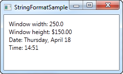
The first couple of TextBlock's gets their value by binding to the parent Window and getting its width and height. Through the StringFormat property, the values are formatted. For the width, we specify a custom formatting string and for the height, we ask it to use the currency format, just for fun. The value is saved as a double type, so we can use all the same format specifiers as if we had called double.ToString(). You can find a list of them here: http://msdn.microsoft.com/en-us/library/dwhawy9k.aspx
Also notice how I can include custom text in the StringFormat - this allows you to pre/post-fix the bound value with text as you please. When referencing the actual value inside the format string, we surround it by a set of curly braces, which includes two values: A reference to the value we want to format (value number 0, which is the first possible value) and the format string, separated by a colon.
For the last two values, we simply bind to the current date (DateTime.Now) and the output it first as a date, in a specific format, and then as the time (hours and minutes), again using our own, pre-defined format. You can read more about DateTime formatting here: http://msdn.microsoft.com/en-us/library/az4se3k1.aspx
Formatting without extra text
Please be aware that if you specify a format string that doesn't include any custom text, which all of the examples above does, then you need to add an extra set of curly braces, when defining it in XAML. The reason is that WPF may otherwise confuse the syntax with the one used for Markup Extensions. Here's an example:<Window x:Class="WpfTutorialSamples.DataBinding.StringFormatSample" xmlns="http://schemas.microsoft.com/winfx/2006/xaml/presentation" xmlns:x="http://schemas.microsoft.com/winfx/2006/xaml" xmlns:system="clr-namespace:System;assembly=mscorlib" Title="StringFormatSample" Height="150" Width="250" Name="wnd"> <WrapPanel Margin="10"> <TextBlock Text="Width: " /> <TextBlock Text="{Binding ElementName=wnd, Path=ActualWidth, StringFormat={}{0:#,#.0}}" /> </WrapPanel> </Window>
Using a specific Culture
If you need to output a bound value in accordance with a specific culture, that's no problem. The Binding will use the language specified for the parent element, or you can specify it directly for the binding, using the ConverterCulture property. Here's an example:<Window x:Class="WpfTutorialSamples.DataBinding.StringFormatCultureSample" xmlns="http://schemas.microsoft.com/winfx/2006/xaml/presentation" xmlns:x="http://schemas.microsoft.com/winfx/2006/xaml" xmlns:system="clr-namespace:System;assembly=mscorlib" Title="StringFormatCultureSample" Height="120" Width="300"> <StackPanel Margin="10"> <TextBlock Text="{Binding Source={x:Static system:DateTime.Now}, ConverterCulture='de-DE', StringFormat=German date: {0:D}}" /> <TextBlock Text="{Binding Source={x:Static system:DateTime.Now}, ConverterCulture='en-US', StringFormat=American date: {0:D}}" /> <TextBlock Text="{Binding Source={x:Static system:DateTime.Now}, ConverterCulture='ja-JP', StringFormat=Japanese date: {0:D}}" /> </StackPanel> </Window>
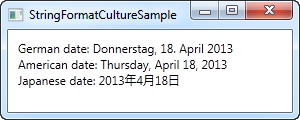
It's pretty simple: By combining the StringFormat property, which uses the D specifier (Long date pattern) and the ConverterCulture property, we can output the bound values in accordance with a specific culture. Pretty nifty!
Debugging data bindings
Since data bindings are evaluated at runtime, and no exceptions are thrown when they fail, a bad binding can sometimes be very hard to track down. These problems can occur in several different situations, but a common issue is when you try to bind to a property that doesn't exist, either because you remembered its name wrong or because you simply misspelled it. Here's an example:<Window x:Class="WpfTutorialSamples.DataBinding.DataBindingDebuggingSample" xmlns="http://schemas.microsoft.com/winfx/2006/xaml/presentation" xmlns:x="http://schemas.microsoft.com/winfx/2006/xaml" Title="DataBindingDebuggingSample" Height="100" Width="200"> <Grid Margin="10" Name="pnlMain"> <TextBlock Text="{Binding NonExistingProperty, ElementName=pnlMain}" /> </Grid> </Window>
The Output window
The first place you will want to look is the Visual Studio Output window. It should be at the bottom of your Visual Studio window, or you can activate it by using the [Ctrl+Alt+O] shortcut. There will be loads of output from the debugger, but somewhere you should find a line like this, when running the above example:System.Windows.Data Error: 40 : BindingExpression path error: 'NonExistingProperty' property not found on 'object' ''Grid' (Name='pnlMain')'. BindingExpression:Path=NonExistingProperty; DataItem='Grid' (Name='pnlMain'); target element is 'TextBlock' (Name=''); target property is 'Text' (type 'String')
This might seem a bit overwhelming, mainly because no linebreaks are used in this long message, but the important part is this:
'NonExistingProperty' property not found on 'object' ''Grid' (Name='pnlMain')'.
It tells you that you have tried to use a property called "NonExistingProperty" on an object of the type Grid, with the name pnlMain. That's actually pretty concise and should help you correct the name of the property or bind to the real object, if that's the problem.
Adjusting the trace level
The above example was easy to fix, because it was clear to WPF what we were trying to do and why it didn't work. Consider this next example though:<Window x:Class="WpfTutorialSamples.DataBinding.DataBindingDebuggingSample" xmlns="http://schemas.microsoft.com/winfx/2006/xaml/presentation" xmlns:x="http://schemas.microsoft.com/winfx/2006/xaml" Title="DataBindingDebuggingSample" Height="100" Width="200"> <Grid Margin="10"> <TextBlock Text="{Binding Title}" /> </Grid> </Window>I'm trying to bind to the property "Title", but on which object? As stated in the article on data contexts, WPF will use the DataContext property on the TextBlock here, which may be inherited down the control hierarchy, but in this example, I forgot to assign a data context. This basically means that I'm trying to get a property on a NULL object. WPF will gather that this might be a perfectly valid binding, but that the object just hasn't been initialized yet, and therefore it won't complain about it. If you run this example and look in the Output window, you won't see any binding errors.
However, for the cases where this is not the behavior that you're expecting, there is a way to force WPF into telling you about all the binding problems it runs into. It can be done by setting the TraceLevel on the PresentationTraceSources object, which can be found in the System.Diagnostics namespace:
<Window x:Class="WpfTutorialSamples.DataBinding.DataBindingDebuggingSample"
        xmlns="http://schemas.microsoft.com/winfx/2006/xaml/presentation"
        xmlns:x="http://schemas.microsoft.com/winfx/2006/xaml"
        xmlns:diag="clr-namespace:System.Diagnostics;assembly=WindowsBase"
        Title="DataBindingDebuggingSample" Height="100" Width="200">
    <Grid Margin="10">
                <TextBlock Text="{Binding Title, diag:PresentationTraceSources.TraceLevel=High}" />
        </Grid>
</Window>
Notice that I have added a reference to the System.Diagnostics namespace in the top, and then used the property on the binding. WPF will now give you loads of information about this specific binding in the Output window:
System.Windows.Data Warning: 55 : Created BindingExpression (hash=2902278) for Binding (hash=52760599)
System.Windows.Data Warning: 57 :   Path: 'Title'
System.Windows.Data Warning: 59 : BindingExpression (hash=2902278): Default mode resolved to OneWay
System.Windows.Data Warning: 60 : BindingExpression (hash=2902278): Default update trigger resolved to PropertyChanged
System.Windows.Data Warning: 61 : BindingExpression (hash=2902278): Attach to System.Windows.Controls.TextBlock.Text (hash=18876224)
System.Windows.Data Warning: 66 : BindingExpression (hash=2902278): Resolving sourceSystem.Windows.Data Warning: 69 : BindingExpression (hash=2902278): Found data context element: TextBlock (hash=18876224) (OK)
System.Windows.Data Warning: 70 : BindingExpression (hash=2902278): DataContext is null
System.Windows.Data Warning: 64 : BindingExpression (hash=2902278): Resolve source deferredSystem.Windows.Data Warning: 66 : BindingExpression (hash=2902278): Resolving sourceSystem.Windows.Data Warning: 69 : BindingExpression (hash=2902278): Found data context element: TextBlock (hash=18876224) (OK)
System.Windows.Data Warning: 70 : BindingExpression (hash=2902278): DataContext is null
System.Windows.Data Warning: 66 : BindingExpression (hash=2902278): Resolving sourceSystem.Windows.Data Warning: 69 : BindingExpression (hash=2902278): Found data context element: TextBlock (hash=18876224) (OK)
System.Windows.Data Warning: 70 : BindingExpression (hash=2902278): DataContext is null
System.Windows.Data Warning: 66 : BindingExpression (hash=2902278): Resolving sourceSystem.Windows.Data Warning: 69 : BindingExpression (hash=2902278): Found data context element: TextBlock (hash=18876224) (OK)
System.Windows.Data Warning: 70 : BindingExpression (hash=2902278): DataContext is null
System.Windows.Data Warning: 66 : BindingExpression (hash=2902278): Resolving source  (last chance)
System.Windows.Data Warning: 69 : BindingExpression (hash=2902278): Found data context element: TextBlock (hash=18876224) (OK)
System.Windows.Data Warning: 77 : BindingExpression (hash=2902278): Activate with root item <null>
System.Windows.Data Warning: 105 : BindingExpression (hash=2902278):   Item at level 0 is null - no accessorSystem.Windows.Data Warning: 79 : BindingExpression (hash=2902278): TransferValue - got raw value {DependencyProperty.UnsetValue}
System.Windows.Data Warning: 87 : BindingExpression (hash=2902278): TransferValue - using fallback/default value ''
System.Windows.Data Warning: 88 : BindingExpression (hash=2902278): TransferValue - using final value ''
By reading through the list, you can actually see the entire process that WPF goes through to try to find a proper value for your TextBlock control. Several times you will see it being unable to find a proper DataContext, and in the end, it uses the default {DependencyProperty.UnsetValue} which translates into an empty string.
Using the real debugger
The above trick can be great for diagnosing a bad binding, but for some cases, it's easier and more pleasant to work with the real debugger. Bindings doesn't natively support this, since they are being handled deep inside of WPF, but using a Converter, like shown in a previous article, you can actually jump into this process and step through it. You don't really need a Converter that does anything useful, you just need a way into the binding process, and a dummy converter will get you there:<Window x:Class="WpfTutorialSamples.DataBinding.DataBindingDebuggingSample" xmlns="http://schemas.microsoft.com/winfx/2006/xaml/presentation" xmlns:x="http://schemas.microsoft.com/winfx/2006/xaml" xmlns:self="clr-namespace:WpfTutorialSamples.DataBinding" Title="DataBindingDebuggingSample" Name="wnd" Height="100" Width="200"> <Window.Resources> <self:DebugDummyConverter x:Key="DebugDummyConverter" /> </Window.Resources> <Grid Margin="10"> <TextBlock Text="{Binding Title, ElementName=wnd, Converter={StaticResource DebugDummyConverter}}" /> </Grid> </Window>
using System;
using System.Windows;
using System.Windows.Data;
using System.Diagnostics;
namespace WpfTutorialSamples.DataBinding
{
        public partial class DataBindingDebuggingSample : Window
        {
                public DataBindingDebuggingSample()
                {
                        InitializeComponent();
                }
        }

        public class DebugDummyConverter : IValueConverter
        {
                public object Convert(object value, Type targetType, object parameter, System.Globalization.CultureInfo culture)
                {
                        Debugger.Break();
                        return value;
                }

                public object ConvertBack(object value, Type targetType, object parameter, System.Globalization.CultureInfo culture)
                {
                        Debugger.Break();
                        return value;
                }
        }
}
In the Code-behind file, we define a DebugDummyConverter. In the Convert() and ConvertBack() methods, we call Debugger.Break(), which has the same effect as setting a breakpoint in Visual Studio, and then return the value that was given to us untouched.
In the markup, we add a reference to our converter in the window resources and then we use it in our binding. In a real world application, you should define the converter in a file of its own and then add the reference to it in App.xaml, so that you may use it all over the application without having to create a new reference to it in each window, but for this example, the above should do just fine.
If you run the example, you will see that the debugger breaks as soon as WPF tries to fetch the value for the title of the window. You can now inspect the values given to the Convert() method, or even change them before proceeding, using the standard debugging capabilities of Visual Studio.
If the debugger never breaks, it means that the converter is not used. This usually indicates that you have an invalid binding expression, which can be diagnosed and fixed using the methods described in the start of this article. The dummy-converter trick is only for testing valid binding expressions.
The ItemsControl
WPF has a wide range of controls for displaying a list of data. They come in several shapes and forms and vary in how complex they are and how much work they perform for you. The simplest variant is the ItemsControl, which is pretty much just a markup-based loop - you need to apply all the styling and templating, but in many cases, that's just what you need.A simple ItemsControl example
Let's kick off with a very simple example, where we hand-feed the ItemsControl with a set of items. This should show you just how simple the ItemsControl is:<Window x:Class="WpfTutorialSamples.ItemsControl.ItemsControlSample" xmlns="http://schemas.microsoft.com/winfx/2006/xaml/presentation" xmlns:x="http://schemas.microsoft.com/winfx/2006/xaml" xmlns:system="clr-namespace:System;assembly=mscorlib" Title="ItemsControlSample" Height="150" Width="200"> <Grid Margin="10"> <ItemsControl> <system:String>ItemsControl Item #1</system:String> <system:String>ItemsControl Item #2</system:String> <system:String>ItemsControl Item #3</system:String> <system:String>ItemsControl Item #4</system:String> <system:String>ItemsControl Item #5</system:String> </ItemsControl> </Grid> </Window>
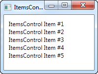
As you can see, there is nothing that shows that we're using a control for repeating the items instead of just manually adding e.g. 5 TextBlock controls - the ItemsControl is completely lookless by default. If you click on one of the items, nothing happens, because there's no concept of selected item(s) or anything like that.
ItemsControl with data binding
Of course the ItemsControl is not meant to be used with items defined in the markup, like we did in the first example. Like pretty much any other control in WPF, the ItemsControl is made for data binding, where we use a template to define how our code-behind classes should be presented to the user.To demonstrate that, I've whipped up an example where we display a TODO list to the user, and to show you just how flexible everything gets once you define your own templates, I've used a ProgressBar control to show you the current completion percentage. First some code, then a screenshot and then an explanation of it all:
<Window x:Class="WpfTutorialSamples.ItemsControl.ItemsControlDataBindingSample"
        xmlns="http://schemas.microsoft.com/winfx/2006/xaml/presentation"
        xmlns:x="http://schemas.microsoft.com/winfx/2006/xaml"
        Title="ItemsControlDataBindingSample" Height="150" Width="300">
    <Grid Margin="10">
                <ItemsControl Name="icTodoList">
                        <ItemsControl.ItemTemplate>
                                <DataTemplate>
                                        <Grid Margin="0,0,0,5">
                                                <Grid.ColumnDefinitions>
                                                        <ColumnDefinition Width="*" />
                                                        <ColumnDefinition Width="100" />
                                                </Grid.ColumnDefinitions>
                                                <TextBlock Text="{Binding Title}" />
                                                <ProgressBar Grid.Column="1" Minimum="0" Maximum="100" Value="{Binding Completion}" />
                                        </Grid>
                                </DataTemplate>
                        </ItemsControl.ItemTemplate>
                </ItemsControl>
        </Grid>
</Window>
using System;
using System.Windows;
using System.Collections.Generic;
namespace WpfTutorialSamples.ItemsControl
{
        public partial class ItemsControlDataBindingSample : Window
        {
                public ItemsControlDataBindingSample()
                {
                        InitializeComponent();

                        List<TodoItem> items = new List<TodoItem>();
                        items.Add(new TodoItem() { Title = "Complete this WPF tutorial", Completion = 45 });
                        items.Add(new TodoItem() { Title = "Learn C#", Completion = 80 });
                        items.Add(new TodoItem() { Title = "Wash the car", Completion = 0 });

                        icTodoList.ItemsSource = items;
                }
        }

        public class TodoItem
        {
                public string Title { get; set; }
                public int Completion { get; set; }
        }
}
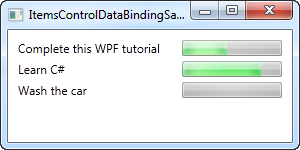
The most important part of this example is the template that we specify inside of the ItemsControl, using a DataTemplate tag inside of the ItemsControl.ItemTemplate. We add a Grid panel, to get two columns: In the first we have a TextBlock, which will show the title of the TODO item, and in the second column we have a ProgressBar control, which value we bind to the Completion property.
The template now represents a TodoItem, which we declare in the Code-behind file, where we also instantiate a number of them and add them to a list. In the end, this list is assigned to the ItemsSource property of our ItemsControl, which then does the rest of the job for us. Each item in the list is displayed by using our template, as you can see from the resulting screenshot.
The ItemsPanelTemplate property
In the above examples, all items are rendered from top to bottom, with each item taking up the full row. This happens because the ItemsControl throw all of our items into a vertically aligned StackPanel by default. It's very easy to change though, since the ItemsControl allows you to change which panel type is used to hold all the items. Here's an example:<Window x:Class="WpfTutorialSamples.ItemsControl.ItemsControlPanelSample" xmlns="http://schemas.microsoft.com/winfx/2006/xaml/presentation" xmlns:x="http://schemas.microsoft.com/winfx/2006/xaml" xmlns:system="clr-namespace:System;assembly=mscorlib" Title="ItemsControlPanelSample" Height="150" Width="250"> <Grid Margin="10"> <ItemsControl> <ItemsControl.ItemsPanel> <ItemsPanelTemplate> <WrapPanel /> </ItemsPanelTemplate> </ItemsControl.ItemsPanel> <ItemsControl.ItemTemplate> <DataTemplate> <Button Content="{Binding}" Margin="0,0,5,5" /> </DataTemplate> </ItemsControl.ItemTemplate> <system:String>Item #1</system:String> <system:String>Item #2</system:String> <system:String>Item #3</system:String> <system:String>Item #4</system:String> <system:String>Item #5</system:String> </ItemsControl> </Grid> </Window>
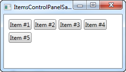
We specify that the ItemsControl should use a WrapPanel as its template by declaring one in the ItemsPanelTemplate property and just for fun, we throw in an ItemTemplate that causes the strings to be rendered as buttons. You can use any of the WPF panels, but some are more useful than others.
Another good example is the UniformGrid panel, where we can define a number of columns and then have our items neatly shown in equally-wide columns:
<Window x:Class="WpfTutorialSamples.ItemsControl.ItemsControlPanelSample"
        xmlns="http://schemas.microsoft.com/winfx/2006/xaml/presentation"
        xmlns:x="http://schemas.microsoft.com/winfx/2006/xaml"
                xmlns:system="clr-namespace:System;assembly=mscorlib"
        Title="ItemsControlPanelSample" Height="150" Width="250">
        <Grid Margin="10">
                <ItemsControl>
                        <ItemsControl.ItemsPanel>
                                <ItemsPanelTemplate>
                                        <UniformGrid Columns="2" />
                                </ItemsPanelTemplate>
                        </ItemsControl.ItemsPanel>
                        <ItemsControl.ItemTemplate>
                                <DataTemplate>
                                        <Button Content="{Binding}" Margin="0,0,5,5" />
                                </DataTemplate>
                        </ItemsControl.ItemTemplate>
                        <system:String>Item #1</system:String>
                        <system:String>Item #2</system:String>
                        <system:String>Item #3</system:String>
                        <system:String>Item #4</system:String>
                        <system:String>Item #5</system:String>
                </ItemsControl>
        </Grid>
</Window>

ItemsControl with scrollbars
Once you start using the ItemsControl, you might run into a very common problem: By default, the ItemsControl doesn't have any scrollbars, which means that if the content doesn't fit, it's just clipped. This can be seen by taking our first example from this article and resizing the window: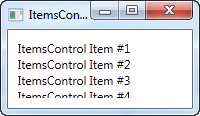
WPF makes this very easy to solve though. There are a number of possible solutions, for instance you can alter the template used by the ItemsControl to include a ScrollViewer control, but the easiest solution is to simply throw a ScrollViewer around the ItemsControl. Here's an example:
<Window x:Class="WpfTutorialSamples.ItemsControl.ItemsControlSample"
        xmlns="http://schemas.microsoft.com/winfx/2006/xaml/presentation"
        xmlns:x="http://schemas.microsoft.com/winfx/2006/xaml"
                xmlns:system="clr-namespace:System;assembly=mscorlib"
        Title="ItemsControlSample" Height="150" Width="200">
        <Grid Margin="10">
                <ScrollViewer VerticalScrollBarVisibility="Auto" HorizontalScrollBarVisibility="Auto">
                        <ItemsControl>
                                <system:String>ItemsControl Item #1</system:String>
                                <system:String>ItemsControl Item #2</system:String>
                                <system:String>ItemsControl Item #3</system:String>
                                <system:String>ItemsControl Item #4</system:String>
                                <system:String>ItemsControl Item #5</system:String>
                        </ItemsControl>
                </ScrollViewer>
        </Grid>
</Window>
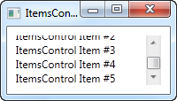
I set the two visibility options to Auto, to make them only visible when needed. As you can see from the screenshot, you can now scroll through the list of items.
Summary
The ItemsControl is great when you want full control of how your data is displayed, and when you don't need any of your content to be selectable. If you want the user to be able to select items from the list, then you're better off with one of the other controls, e.g. the ListBox or the ListView. They will be described in upcoming chapters.The ListBox control
In the last article, we had a look at the ItemsControl, which is probably the simplest list in WPF. The ListBox control is the next control in line, which adds a bit more functionality. One of the main differences is the fact that the ListBox control actually deals with selections, allowing the end-user to select one or several items from the list and automatically giving visual feedback for it.Here's an example of a very simple ListBox control:
<Window x:Class="WpfTutorialSamples.ListBox_control.ListBoxSample"
        xmlns="http://schemas.microsoft.com/winfx/2006/xaml/presentation"
        xmlns:x="http://schemas.microsoft.com/winfx/2006/xaml"
        Title="ListBoxSample" Height="120" Width="200">
    <Grid Margin="10">
                <ListBox>
                        <ListBoxItem>ListBox Item #1</ListBoxItem>
                        <ListBoxItem>ListBox Item #2</ListBoxItem>
                        <ListBoxItem>ListBox Item #3</ListBoxItem>
                </ListBox>
        </Grid>
</Window>
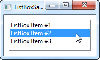
This is as simple as it gets: We declare a ListBox control, and inside of it, we declare three ListBoxItem's, each with its own text. However, since the ListBoxItem is actually a ContentControl, we can define custom content for it:
<Window x:Class="WpfTutorialSamples.ListBox_control.ListBoxSample"
        xmlns="http://schemas.microsoft.com/winfx/2006/xaml/presentation"
        xmlns:x="http://schemas.microsoft.com/winfx/2006/xaml"
        Title="ListBoxSample" Height="120" Width="200">
        <Grid Margin="10">
                <ListBox>
                        <ListBoxItem>
                                <StackPanel Orientation="Horizontal">
                                        <Image Source="/WpfTutorialSamples;component/Images/bullet_blue.png" />
                                        <TextBlock>ListBox Item #1</TextBlock>
                                </StackPanel>
                        </ListBoxItem>
                        <ListBoxItem>
                                <StackPanel Orientation="Horizontal">
                                        <Image Source="/WpfTutorialSamples;component/Images/bullet_green.png" />
                                        <TextBlock>ListBox Item #2</TextBlock>
                                </StackPanel>
                        </ListBoxItem>
                        <ListBoxItem>
                                <StackPanel Orientation="Horizontal">
                                        <Image Source="/WpfTutorialSamples;component/Images/bullet_red.png" />
                                        <TextBlock>ListBox Item #3</TextBlock>
                                </StackPanel>
                        </ListBoxItem>
                </ListBox>
        </Grid>
</Window>
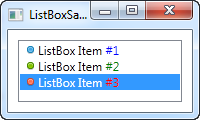
For each of the ListBoxItem's we now add a StackPanel, in which we add an Image and a TextBlock. This gives us full control of the content as well as the text rendering, as you can see from the screenshot, where different colors have been used for each of the numbers.
From the screenshot you might also notice another difference when comparing the ItemsControl to the ListBox: By default, a border is shown around the control, making it look like an actual control instead of just output.
Data binding the ListBox
Manually defining items for the ListBox makes for a fine first example, but most of the times, your ListBox controls will be filled with items from a data source using data binding. By default, if you bind a list of items to the ListBox, their ToString() method will be used to represent each item. This is rarely what you want, but fortunately, we can easily declare a template that will be used to render each item.I have re-used the TODO based example from the ItemsControl article, where we build a cool TODO list using a simple Code-behind class and, in this case, a ListBox control for the visual representation. Here's the example:
<Window x:Class="WpfTutorialSamples.ListBox_control.ListBoxDataBindingSample"
        xmlns="http://schemas.microsoft.com/winfx/2006/xaml/presentation"
        xmlns:x="http://schemas.microsoft.com/winfx/2006/xaml"
        Title="ListBoxDataBindingSample" Height="150" Width="300">
    <Grid Margin="10">
                <ListBox Name="lbTodoList" HorizontalContentAlignment="Stretch">
                        <ListBox.ItemTemplate>
                                <DataTemplate>
                                        <Grid Margin="0,2">
                                                <Grid.ColumnDefinitions>
                                                        <ColumnDefinition Width="*" />
                                                        <ColumnDefinition Width="100" />
                                                </Grid.ColumnDefinitions>
                                                <TextBlock Text="{Binding Title}" />
                                                <ProgressBar Grid.Column="1" Minimum="0" Maximum="100" Value="{Binding Completion}" />
                                        </Grid>
                                </DataTemplate>
                        </ListBox.ItemTemplate>
                </ListBox>
        </Grid>
</Window>
using System;
using System.Windows;
using System.Collections.Generic;
namespace WpfTutorialSamples.ListBox_control
{
        public partial class ListBoxDataBindingSample : Window
        {
                public ListBoxDataBindingSample()
                {
                        InitializeComponent();
                        List<TodoItem> items = new List<TodoItem>();
                        items.Add(new TodoItem() { Title = "Complete this WPF tutorial", Completion = 45 });
                        items.Add(new TodoItem() { Title = "Learn C#", Completion = 80 });
                        items.Add(new TodoItem() { Title = "Wash the car", Completion = 0 });

                        lbTodoList.ItemsSource = items;
                }
        }

        public class TodoItem
        {
                public string Title { get; set; }
                public int Completion { get; set; }
        }
}
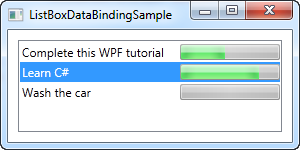
All the magic happens in the ItemTemplate that we have defined for the ListBox. In there, we specify that each ListBox item should consist of a Grid, divided into two columns, with a TextBlock showing the title in the first and a ProgressBar showing the completion status in the second column. To get the values out, we use some very simple data binding, which is all explained in the data binding part of this tutorial.
In the Code-behind file, we have declared a very simple TodoItem class to hold each of our TODO items. In the constructor of the window, we initialize a list, add three TODO items to it and then assign it to the ItemsSource of the ListBox. The combination of the ItemsSource and the ItemTemplate we specified in the XAML part, this is all WPF need to render all of the items as a TODO list.
Please notice the HorizontalContentAlignment property that I set to Stretch on the ListBox. The default content alignment for a ListBox item is Left, which means that each item only takes up as much horizontal space as it needs. The result? Well, not quite what we want:
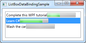
By using the Stretch alignment, each item is stretched to take up the full amount of available space, as you can see from the previous screenshot.
Working with ListBox selection
As mentioned, a key difference between the ItemsControl and the ListBox is that the ListBox handles and displays user selection for you. Therefore, a lot of ListBox question revolves around somehow working with the selection. To help with some of these questions, I have created a bigger example, showing you some selection related tricks:<Window x:Class="WpfTutorialSamples.ListBox_control.ListBoxSelectionSample" xmlns="http://schemas.microsoft.com/winfx/2006/xaml/presentation" xmlns:x="http://schemas.microsoft.com/winfx/2006/xaml" Title="ListBoxSelectionSample" Height="250" Width="450"> <DockPanel Margin="10"> <StackPanel DockPanel.Dock="Right" Margin="10,0"> <StackPanel.Resources> <Style TargetType="Button"> <Setter Property="Margin" Value="0,0,0,5" /> </Style> </StackPanel.Resources> <TextBlock FontWeight="Bold" Margin="0,0,0,10">ListBox selection</TextBlock> <Button Name="btnShowSelectedItem" Click="btnShowSelectedItem_Click">Show selected</Button> <Button Name="btnSelectLast" Click="btnSelectLast_Click">Select last</Button> <Button Name="btnSelectNext" Click="btnSelectNext_Click">Select next</Button> <Button Name="btnSelectCSharp" Click="btnSelectCSharp_Click">Select C#</Button> <Button Name="btnSelectAll" Click="btnSelectAll_Click">Select all</Button> </StackPanel> <ListBox Name="lbTodoList" HorizontalContentAlignment="Stretch" SelectionMode="Extended" SelectionChanged="lbTodoList_SelectionChanged"> <ListBox.ItemTemplate> <DataTemplate> <Grid Margin="0,2"> <Grid.ColumnDefinitions> <ColumnDefinition Width="*" /> <ColumnDefinition Width="100" /> </Grid.ColumnDefinitions> <TextBlock Text="{Binding Title}" /> <ProgressBar Grid.Column="1" Minimum="0" Maximum="100" Value="{Binding Completion}" /> </Grid> </DataTemplate> </ListBox.ItemTemplate> </ListBox> </DockPanel> </Window>
using System;
using System.Windows;
using System.Collections.Generic;
namespace WpfTutorialSamples.ListBox_control
{
        public partial class ListBoxSelectionSample : Window
        {
                public ListBoxSelectionSample()
                {
                        InitializeComponent();
                        List<TodoItem> items = new List<TodoItem>();
                        items.Add(new TodoItem() { Title = "Complete this WPF tutorial", Completion = 45 });
                        items.Add(new TodoItem() { Title = "Learn C#", Completion = 80 });
                        items.Add(new TodoItem() { Title = "Wash the car", Completion = 0 });

                        lbTodoList.ItemsSource = items;
                }

                private void lbTodoList_SelectionChanged(object sender, System.Windows.Controls.SelectionChangedEventArgs e)
                {
                        if(lbTodoList.SelectedItem != null)
                                this.Title = (lbTodoList.SelectedItem as TodoItem).Title;
                }

                private void btnShowSelectedItem_Click(object sender, RoutedEventArgs e)
                {
                        foreach(object o in lbTodoList.SelectedItems)
                                MessageBox.Show((o as TodoItem).Title);
                }

                private void btnSelectLast_Click(object sender, RoutedEventArgs e)
                {
                        lbTodoList.SelectedIndex = lbTodoList.Items.Count - 1;
                }

                private void btnSelectNext_Click(object sender, RoutedEventArgs e)
                {
                        int nextIndex = 0;
                        if((lbTodoList.SelectedIndex >= 0) && (lbTodoList.SelectedIndex < (lbTodoList.Items.Count - 1)))
                                nextIndex = lbTodoList.SelectedIndex + 1;
                        lbTodoList.SelectedIndex = nextIndex;
                }

                private void btnSelectCSharp_Click(object sender, RoutedEventArgs e)
                {
                        foreach(object o in lbTodoList.Items)
                        {
                                if((o is TodoItem) && ((o as TodoItem).Title.Contains("C#")))
                                {
                                        lbTodoList.SelectedItem = o;
                                        break;
                                }
                        }
                }

                private void btnSelectAll_Click(object sender, RoutedEventArgs e)
                {
                        foreach(object o in lbTodoList.Items)
                                lbTodoList.SelectedItems.Add(o);
                }


        }

        public class TodoItem
        {
                public string Title { get; set; }
                public int Completion { get; set; }
        }
}
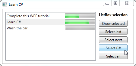
As you can see, I have defined a range of buttons to the right of the ListBox, to either get or manipulate the selection. I've also changed the SelectionMode to Extended, to allow for the selection of multiple items. This can be done either programmatically, as I do in the example, or by the end-user, by holding down [Ctrl] or [Shift] while clicking on the items.
For each of the buttons, I have defined a click handler in the Code-behind. Each action should be pretty self-explanatory and the C# code used is fairly simple, but if you're still in doubt, try running the example on your own machine and test out the various possibilities in the example.
Summary
The ListBox control is much like the ItemsControl and several of the same techniques can be used. The ListBox does offer a bit more functionality when compared to the ItemsControl, especially the selection handling. For even more functionality, like column headers, you should have a look at the ListView control, which is given a very thorough description later on in this tutorial with several articles explaining all the functionality.The ComboBox control
The ComboBox control is in many ways like the ListBox control, but takes up a lot less space, because the list of items is hidden when not needed. The ComboBox control is used many places in Windows, but to make sure that everyone knows how it looks and works, we'll jump straight into a simple example:<Window x:Class="WpfTutorialSamples.ComboBox_control.ComboBoxSample" xmlns="http://schemas.microsoft.com/winfx/2006/xaml/presentation" xmlns:x="http://schemas.microsoft.com/winfx/2006/xaml" Title="ComboBoxSample" Height="150" Width="200"> <StackPanel Margin="10"> <ComboBox> <ComboBoxItem>ComboBox Item #1</ComboBoxItem> <ComboBoxItem IsSelected="True">ComboBox Item #2</ComboBoxItem> <ComboBoxItem>ComboBox Item #3</ComboBoxItem> </ComboBox> </StackPanel> </Window>
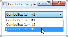
In the screenshot, I have activated the control by clicking it, causing the list of items to be displayed. As you can see from the code, the ComboBox, in its simple form, is very easy to use. All I've done here is manually add some items, making one of them the default selected item by setting the IsSelected property on it.
Custom content
In the first example we only showed text in the items, which is pretty common for the ComboBox control, but since the ComboBoxItem is a ContentControl, we can actually use pretty much anything as content. Let's try making a slightly more sophisticated list of items:<Window x:Class="WpfTutorialSamples.ComboBox_control.ComboBoxCustomContentSample" xmlns="http://schemas.microsoft.com/winfx/2006/xaml/presentation" xmlns:x="http://schemas.microsoft.com/winfx/2006/xaml" Title="ComboBoxCustomContentSample" Height="150" Width="200"> <StackPanel Margin="10"> <ComboBox> <ComboBoxItem> <StackPanel Orientation="Horizontal"> <Image Source="/WpfTutorialSamples;component/Images/bullet_red.png" /> <TextBlock Foreground="Red">Red</TextBlock> </StackPanel> </ComboBoxItem> <ComboBoxItem> <StackPanel Orientation="Horizontal"> <Image Source="/WpfTutorialSamples;component/Images/bullet_green.png" /> <TextBlock Foreground="Green">Green</TextBlock> </StackPanel> </ComboBoxItem> <ComboBoxItem> <StackPanel Orientation="Horizontal"> <Image Source="/WpfTutorialSamples;component/Images/bullet_blue.png" /> <TextBlock Foreground="Blue">Blue</TextBlock> </StackPanel> </ComboBoxItem> </ComboBox> </StackPanel> </Window>

For each of the ComboBoxItem's we now add a StackPanel, in which we add an Image and a TextBlock. This gives us full control of the content as well as the text rendering, as you can see from the screenshot, where both text color and image indicates a color value.
Data binding the ComboBox
As you can see from the first examples, manually defining the items of a ComboBox control is easy using XAML, but you will likely soon run into a situation where you need the items to come from some kind of data source, like a database or just an in-memory list. Using WPF data binding and a custom template, we can easily render a list of colors, including a preview of the color:<Window x:Class="WpfTutorialSamples.ComboBox_control.ComboBoxDataBindingSample" xmlns="http://schemas.microsoft.com/winfx/2006/xaml/presentation" xmlns:x="http://schemas.microsoft.com/winfx/2006/xaml" Title="ComboBoxDataBindingSample" Height="200" Width="200"> <StackPanel Margin="10"> <ComboBox Name="cmbColors"> <ComboBox.ItemTemplate> <DataTemplate> <StackPanel Orientation="Horizontal"> <Rectangle Fill="{Binding Name}" Width="16" Height="16" Margin="0,2,5,2" /> <TextBlock Text="{Binding Name}" /> </StackPanel> </DataTemplate> </ComboBox.ItemTemplate> </ComboBox> </StackPanel> </Window>
using System;
using System.Collections.Generic;
using System.Windows;
using System.Windows.Media;
namespace WpfTutorialSamples.ComboBox_control
{
        public partial class ComboBoxDataBindingSample : Window
        {
                public ComboBoxDataBindingSample()
                {
                        InitializeComponent();
                        cmbColors.ItemsSource = typeof(Colors).GetProperties();
                }
        }
}
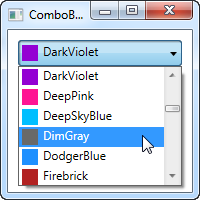
It's actually quite simple: In the Code-behind, I obtain a list of all the colors using a Reflection based approach with the Colors class. I assign it to the ItemsSource property of the ComboBox, which then renders each color using the template I have defined in the XAML part.
Each item, as defined by the ItemTemplate, consists of a StackPanel with a Rectangle and a TextBlock, each bound to the color value. This gives us a complete list of colors, with minimal effort - and it looks pretty good too, right?
IsEditable
In the first examples, the user was only able to select from our list of items, but one of the cool things about the ComboBox is that it supports the possibility of letting the user both select from a list of items or enter their own value. This is extremely useful in situations where you want to help the user by giving them a pre-defined set of options, while still giving them the option to manually enter the desired value. This is all controlled by the IsEditable property, which changes the behavior and look of the ComboBox quite a bit:<Window x:Class="WpfTutorialSamples.ComboBox_control.ComboBoxEditableSample" xmlns="http://schemas.microsoft.com/winfx/2006/xaml/presentation" xmlns:x="http://schemas.microsoft.com/winfx/2006/xaml" Title="ComboBoxEditableSample" Height="150" Width="200"> <StackPanel Margin="10"> <ComboBox IsEditable="True"> <ComboBoxItem>ComboBox Item #1</ComboBoxItem> <ComboBoxItem>ComboBox Item #2</ComboBoxItem> <ComboBoxItem>ComboBox Item #3</ComboBoxItem> </ComboBox> </StackPanel> </Window>
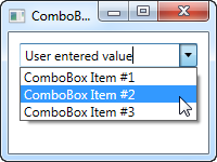
As you can see, I can enter a completely different value or pick one from the list. If picked from the list, it simply overwrites the text of the ComboBox.
As a lovely little bonus, the ComboBox will automatically try to help the user select an existing value when the user starts typing, as you can see from the next screenshot, where I just started typing "Co":
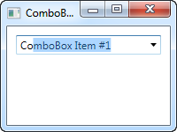
By default, the matching is not case-sensitive but you can make it so by setting the IsTextSearchCaseSensitive to True. If you don't want this auto complete behavior at all, you can disable it by setting the IsTextSearchEnabled to False.
Working with ComboBox selection
A key part of using the ComboBox control is to be able to read the user selection, and even control it with code. In the next example, I've re-used the data bound ComboBox example, but added some buttons for controlling the selection. I've also used the SelectionChanged event to capture when the selected item is changed, either by code or by the user, and act on it.Here's the sample:
<Window x:Class="WpfTutorialSamples.ComboBox_control.ComboBoxSelectionSample"
        xmlns="http://schemas.microsoft.com/winfx/2006/xaml/presentation"
        xmlns:x="http://schemas.microsoft.com/winfx/2006/xaml"
        Title="ComboBoxSelectionSample" Height="125" Width="250">
    <StackPanel Margin="10">
        <ComboBox Name="cmbColors" SelectionChanged="cmbColors_SelectionChanged">
            <ComboBox.ItemTemplate>
                <DataTemplate>
                    <StackPanel Orientation="Horizontal">
                        <Rectangle Fill="{Binding Name}" Width="16" Height="16" Margin="0,2,5,2" />
                        <TextBlock Text="{Binding Name}" />
                    </StackPanel>
                </DataTemplate>
            </ComboBox.ItemTemplate>
        </ComboBox>
        <WrapPanel Margin="15" HorizontalAlignment="Center">
            <Button Name="btnPrevious" Click="btnPrevious_Click" Width="55">Previous</Button>
            <Button Name="btnNext" Click="btnNext_Click" Margin="5,0" Width="55">Next</Button>
            <Button Name="btnBlue" Click="btnBlue_Click" Width="55">Blue</Button>
        </WrapPanel>
    </StackPanel>
</Window>
using System;
using System.Collections.Generic;
using System.Reflection;
using System.Windows;
using System.Windows.Media;
namespace WpfTutorialSamples.ComboBox_control
{
        public partial class ComboBoxSelectionSample : Window
        {
                public ComboBoxSelectionSample()
                {
                        InitializeComponent();
                        cmbColors.ItemsSource = typeof(Colors).GetProperties();
                }

                private void btnPrevious_Click(object sender, RoutedEventArgs e)
                {
                        if(cmbColors.SelectedIndex > 0)
                                cmbColors.SelectedIndex = cmbColors.SelectedIndex - 1;
                }

                private void btnNext_Click(object sender, RoutedEventArgs e)
                {
                        if(cmbColors.SelectedIndex < cmbColors.Items.Count-1)
                                cmbColors.SelectedIndex = cmbColors.SelectedIndex + 1;
                }

                private void btnBlue_Click(object sender, RoutedEventArgs e)
                {
                        cmbColors.SelectedItem = typeof(Colors).GetProperty("Blue");
                }

                private void cmbColors_SelectionChanged(object sender, System.Windows.Controls.SelectionChangedEventArgs e)
                {
                        Color selectedColor = (Color)(cmbColors.SelectedItem as PropertyInfo).GetValue(null, null);
                        this.Background = new SolidColorBrush(selectedColor);
                }
        }
}
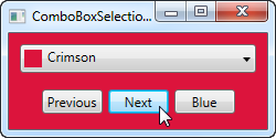
The interesting part of this example is the three event handlers for our three buttons, as well as the SelectionChanged event handler. In the first two, we select the previous or the next item by reading the SelectedIndex property and then subtracting or adding one to it. Pretty simple and easy to work with.
In the third event handler, we use the SelectedItem to select a specific item based on the value. I do a bit of extra work here (using .NET reflection), because the ComboBox is bound to a list of properties, each being a color, instead of a simple list of colors, but basically it's all about giving the value contained by one of the items to the SelectedItem property.
In the fourth and last event handler, I respond to the selected item being changed. When that happens, I read the selected color (once again using Reflection, as described above) and then use the selected color to create a new background brush for the Window. The effect can be seen on the screenshot.
If you're working with an editable ComboBox (IsEditable property set to true), you can read the Text property to know the value the user has entered or selected.
The WPF Menu control
One of the most common parts of a Windows application is the menu, sometimes referred to as the main menu because only one usually exists in the application. The menu is practical because it offers a lot of options, using only very little space, and even though Microsoft is pushing the Ribbon as a replacement for the good, old menu and toolbars, they definitely still have their place in every good developer's toolbox.WPF comes with a fine control for creating menus called... Menu. Adding items to it is very simple - you simply add MenuItem elements to it, and each MenuItem can have a range of sub-items, allowing you to create hierarchical menus as you know them from a lot of Windows applications. Let's jump straight to an example where we use the Menu:
<Window x:Class="WpfTutorialSamples.Common_interface_controls.MenuSample"
        xmlns="http://schemas.microsoft.com/winfx/2006/xaml/presentation"
        xmlns:x="http://schemas.microsoft.com/winfx/2006/xaml"
        Title="MenuSample" Height="200" Width="200">
    <DockPanel>
        <Menu DockPanel.Dock="Top">
            <MenuItem Header="_File">
                <MenuItem Header="_New" />
                <MenuItem Header="_Open" />
                <MenuItem Header="_Save" />
                <Separator />
                <MenuItem Header="_Exit" />
            </MenuItem>
        </Menu>
        <TextBox AcceptsReturn="True" />
    </DockPanel>
</Window>
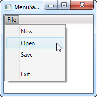
As in most Windows applications, my menu is placed in the top of the window, but in keeping with the enormous flexibility of WPF, you can actually place a Menu control wherever you like, and in any width or height that you may desire.
I have defined a single top-level item, with 4 child items and a separator. I use the Header property to define the label of the item, and you should notice the underscore before the first character of each label. It tells WPF to use that character as the accelerator key, which means that the user can press the Alt key followed by the given character, to activate the menu item. This works all the way from the top-level item and down the hierarchy, meaning that in this example I could press Alt, then F and then N, to activate the New item.
Icons and checkboxes
Two common features of a menu item is the icon, used to more easily identify the menu item and what it does, and the ability to have checkable menu items, which can toggle a specific feature on and off. The WPF MenuItem supports both, and it's very easy to use:<Window x:Class="WpfTutorialSamples.Common_interface_controls.MenuIconCheckableSample" xmlns="http://schemas.microsoft.com/winfx/2006/xaml/presentation" xmlns:x="http://schemas.microsoft.com/winfx/2006/xaml" Title="MenuIconCheckableSample" Height="150" Width="300"> <DockPanel> <Menu DockPanel.Dock="Top"> <MenuItem Header="_File"> <MenuItem Header="_Exit" /> </MenuItem> <MenuItem Header="_Tools"> <MenuItem Header="_Manage users"> <MenuItem.Icon> <Image Source="/WpfTutorialSamples;component/Images/user.png" /> </MenuItem.Icon> </MenuItem> <MenuItem Header="_Show groups" IsCheckable="True" IsChecked="True" /> </MenuItem> </Menu> <TextBox AcceptsReturn="True" /> </DockPanel> </Window>
For this example I've created a secondary top-level item, where I've added two items: One with an icon defined, using the Icon property with a standard Image control inside of it, and one where we use the IsCheckable property to allow the user to check and uncheck the item. I even used the IsChecked property to have it checked by default. From Code-behind, this is the same property that you can read to know whether a given menu item is checked or not.
Handling clicks
When the user clicks on a menu item, you will usually want something to happen. The easiest way is to simply add a click event handler to the MenuItem, like this:<MenuItem Header="_New" Click="mnuNew_Click" />In Code-behind you will then need to implement the mnuNew_Click method, like this:
private void mnuNew_Click(object sender, RoutedEventArgs e)
{
        MessageBox.Show("New");
}
This will suffice for the more simple applications, or when prototyping something, but the WPF way is to use a Command for this.
Keyboard shortcuts and Commands
You can easily handle the Click event of a menu item like we did above, but the more common approach is to use WPF commands. There's a lot of theory on using and creating commands, so they have their own category of articles here on the site, but for now, I can tell you that they have a couple of advantages when used in WPF, especially in combination with a Menu or a Toolbar.First of all, they ensure that you can have the same action on a toolbar, a menu and even a context menu, without having to implement the same code in multiple places. They also make the handling of keyboard shortcuts a whole lot easier, because unlike with WinForms, WPF is not listening for keyboard shortcuts automatically if you assign them to e.g. a menu item - you will have to do that manually.
However, when using commands, WPF is all ears and will respond to keyboard shortcuts automatically. The text (Header) of the menu item is also set automatically (although you can overwrite it if needed), and so is the InputGestureText, which shows the user which keyboard shortcut can be used to invoke the specific menu item. Let's jump straight to an example of combining the Menu with WPF commands:
<Window x:Class="WpfTutorialSamples.Common_interface_controls.MenuWithCommandsSample"
        xmlns="http://schemas.microsoft.com/winfx/2006/xaml/presentation"
        xmlns:x="http://schemas.microsoft.com/winfx/2006/xaml"
        Title="MenuWithCommandsSample" Height="200" Width="300">
    <Window.CommandBindings>
        <CommandBinding Command="New" CanExecute="NewCommand_CanExecute" Executed="NewCommand_Executed" />
    </Window.CommandBindings>
    <DockPanel>
        <Menu DockPanel.Dock="Top">
            <MenuItem Header="_File">
                <MenuItem Command="New" />
                <Separator />
                <MenuItem Header="_Exit" />
            </MenuItem>
            <MenuItem Header="_Edit">
                <MenuItem Command="Cut" />
                <MenuItem Command="Copy" />
                <MenuItem Command="Paste" />
            </MenuItem>
        </Menu>

        <TextBox AcceptsReturn="True" Name="txtEditor" />
    </DockPanel>
</Window>
using System;
using System.Windows;
using System.Windows.Input;
namespace WpfTutorialSamples.Common_interface_controls
{
        public partial class MenuWithCommandsSample : Window
        {
                public MenuWithCommandsSample()
                {
                        InitializeComponent();
                }

                private void NewCommand_CanExecute(object sender, CanExecuteRoutedEventArgs e)
                {
                        e.CanExecute = true;
                }

                private void NewCommand_Executed(object sender, ExecutedRoutedEventArgs e)
                {
                        txtEditor.Text = "";
                }
        }
}
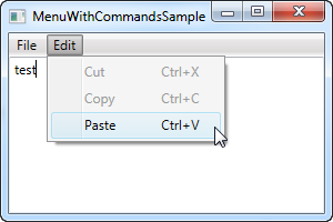
It might not be completely obvious, but by using commands, we just got a whole bunch of things for free: Keyboard shortcuts, text and InputGestureText on the items and WPF automatically enables/disables the items depending on the active control and its state. In this case, Cut and Copy are disabled because no text is selected, but Paste is enabled, because my clipboard is not empty!
And because WPF knows how to handle certain commands in combination with certain controls, in this case the Cut/Copy/Paste commands in combination with a text input control, we don't even have to handle their Execute events - they work right out of the box! We do have to handle it for theNew command though, since WPF has no way of guessing what we want it to do when the user activates it. This is done with the CommandBindings of the Window, all explained in detail in the chapter on commands.
Summary
Working with the WPF Menu control is both easy and fast, making it simple to create even complex menu hierarchies, and when combining it with WPF commands, you get so much functionality for free.The WPF ToolBar control
The toolbar is a row of commands, usually sitting right below the main menu of a standard Windows application. This could in fact be a simple panel with buttons on it, but by using the WPF ToolBar control, you get some extra goodies like automatic overflow handling and the possibility for the end-user to re-position your toolbars.A WPF ToolBar is usually placed inside of a ToolBarTray control. The ToolBarTray will handle stuff like placement and sizing, and you can have multiple ToolBar controls inside of the ToolBarTray element. Let's try a pretty basic example, to see what it all looks like:
<Window x:Class="WpfTutorialSamples.Common_interface_controls.ToolbarSample"
        xmlns="http://schemas.microsoft.com/winfx/2006/xaml/presentation"
        xmlns:x="http://schemas.microsoft.com/winfx/2006/xaml"
        Title="ToolbarSample" Height="200" Width="300">
    <Window.CommandBindings>
        <CommandBinding Command="New" CanExecute="CommonCommandBinding_CanExecute" />
        <CommandBinding Command="Open" CanExecute="CommonCommandBinding_CanExecute" />
        <CommandBinding Command="Save" CanExecute="CommonCommandBinding_CanExecute" />
    </Window.CommandBindings>
    <DockPanel>
        <ToolBarTray DockPanel.Dock="Top">
            <ToolBar>
                <Button Command="New" Content="New" />
                <Button Command="Open" Content="Open" />
                <Button Command="Save" Content="Save" />
            </ToolBar>
            <ToolBar>
                <Button Command="Cut" Content="Cut" />
                <Button Command="Copy" Content="Copy" />
                <Button Command="Paste" Content="Paste" />
            </ToolBar>
        </ToolBarTray>
        <TextBox AcceptsReturn="True" />
    </DockPanel>
</Window>
using System;
using System.Windows;
using System.Windows.Input;
namespace WpfTutorialSamples.Common_interface_controls
{
        public partial class ToolbarSample : Window
        {
                public ToolbarSample()
                {
                        InitializeComponent();
                }

                private void CommonCommandBinding_CanExecute(object sender, CanExecuteRoutedEventArgs e)
                {
                        e.CanExecute = true;
                }
        }
}
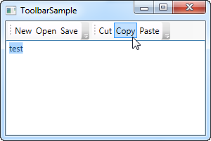
Notice how I use commands for all the buttons. We discussed this in the previous chapter and using commands definitely gives us some advantages. Take a look at the Menu chapter, or the articles on commands, for more information.
In this example, I add a ToolBarTray to the top of the screen, and inside of it, two ToolBar controls. Each contains some buttons and we use commands to give them their behavior. In Code-behind, I make sure to handle the CanExecute event of the first three buttons, since that's not done automatically by WPF, contrary to the Cut, Copy and Paste commands, which WPF is capable of fully handling for us.
Try running the example and place the cursor over the left part of one of the toolbars (the dotted area). If you click and hold your left mouse button, you can now re-position the toolbar, e.g. below the other or even make them switch place.
Images
While text on the toolbar buttons is perfectly okay, the normal approach is to have icons or at least a combination of an icon and a piece of text. Because WPF uses regular Button controls, adding icons to the toolbar items is very easy. Just have a look at this next example, where we do both:<Window x:Class="WpfTutorialSamples.Common_interface_controls.ToolbarIconSample" xmlns="http://schemas.microsoft.com/winfx/2006/xaml/presentation" xmlns:x="http://schemas.microsoft.com/winfx/2006/xaml" Title="ToolbarIconSample" Height="200" Width="300"> <DockPanel> <ToolBarTray DockPanel.Dock="Top"> <ToolBar> <Button Command="Cut" ToolTip="Cut selection to Windows Clipboard."> <Image Source="/WpfTutorialSamples;component/Images/cut.png" /> </Button> <Button Command="Copy" ToolTip="Copy selection to Windows Clipboard."> <Image Source="/WpfTutorialSamples;component/Images/copy.png" /> </Button> <Button Command="Paste" ToolTip="Paste from Windows Clipboard."> <StackPanel Orientation="Horizontal"> <Image Source="/WpfTutorialSamples;component/Images/paste.png" /> <TextBlock Margin="3,0,0,0">Paste</TextBlock> </StackPanel> </Button> </ToolBar> </ToolBarTray> <TextBox AcceptsReturn="True" /> </DockPanel> </Window>
By specifying an Image control as the Content of the first two buttons, they will be icon based instead of text based. On the third button, I combine an Image control and a TextBlock control inside of a StackPanel, to achieve both icon and text on the button, a commonly used technique for buttons which are extra important or with a less obvious icon.
Notice how I've used the ToolTip property on each of the buttons, to add an explanatory text. This is especially important for those buttons with only an icon, because the purpose of the button might not be clear from only looking at the icon. With the ToolTip property, the user can hover the mouse over the button to get a description of what it does, as demonstrated on the screenshot.
Overflow
As already mentioned, a very good reason for using the ToolBar control instead of just a panel of buttons, is the automatic overflow handling. It means that if there's no longer enough room to show all of the buttons on the toolbar, WPF will put them in a menu accessible by clicking on the arrow to the right of the toolbar. You can see how it works on this screenshot, which shows the first example, but with a smaller window, thereby leaving less space for the toolbars: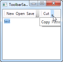
WPF even allows you to decide which items are suitable for overflow hiding and which should always be visible. Usually, when designing a toolbar, some items are less important than the others and some of them you might even want to have in the overflow menu all the time, no matter if there's space enough or not.
This is where the attached property ToolBar.OverflowMode comes into play. The default value is IfNeeded, which simply means that a toolbar item is put in the overflow menu if there's not enough room for it. You may use Always or Never instead, which does exactly what the names imply: Puts the item in the overflow menu all the time or prevents the item from ever being moved to the overflow menu. Here's an example on how to assign this property:
<ToolBar>
    <Button Command="Cut" Content="Cut" ToolBar.OverflowMode="Always" />
    <Button Command="Copy" Content="Copy" ToolBar.OverflowMode="AsNeeded" />
    <Button Command="Paste" Content="Paste" ToolBar.OverflowMode="Never" />
</ToolBar>
Position
While the most common position for the toolbar is indeed in the top of the screen, toolbars can also be found in the bottom of the application window or even on the sides. The WPF ToolBar of course supports all of this, and while the bottom placed toolbar is merely a matter of docking to the bottom of the panel instead of the top, a vertical toolbar requires the use of the Orientation property of the ToolBar tray. Allow me to demonstrate with an example:<Window x:Class="WpfTutorialSamples.Common_interface_controls.ToolbarPositionSample" xmlns="http://schemas.microsoft.com/winfx/2006/xaml/presentation" xmlns:x="http://schemas.microsoft.com/winfx/2006/xaml" Title="ToolbarPositionSample" Height="200" Width="300"> <DockPanel> <ToolBarTray DockPanel.Dock="Top"> <ToolBar> <Button Command="Cut" ToolTip="Cut selection to Windows Clipboard."> <Image Source="/WpfTutorialSamples;component/Images/cut.png" /> </Button> <Button Command="Copy" ToolTip="Copy selection to Windows Clipboard."> <Image Source="/WpfTutorialSamples;component/Images/copy.png" /> </Button> <Button Command="Paste" ToolTip="Paste from Windows Clipboard."> <StackPanel Orientation="Horizontal"> <Image Source="/WpfTutorialSamples;component/Images/paste.png" /> <TextBlock Margin="3,0,0,0">Paste</TextBlock> </StackPanel> </Button> </ToolBar> </ToolBarTray> <ToolBarTray DockPanel.Dock="Right" Orientation="Vertical"> <ToolBar> <Button Command="Cut" ToolTip="Cut selection to Windows Clipboard."> <Image Source="/WpfTutorialSamples;component/Images/cut.png" /> </Button> <Button Command="Copy" ToolTip="Copy selection to Windows Clipboard."> <Image Source="/WpfTutorialSamples;component/Images/copy.png" /> </Button> <Button Command="Paste" ToolTip="Paste from Windows Clipboard."> <Image Source="/WpfTutorialSamples;component/Images/paste.png" /> </Button> </ToolBar> </ToolBarTray> <TextBox AcceptsReturn="True" /> </DockPanel> </Window>
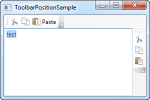
The trick here lies in the combination of the DockPanel.Dock property, that puts the ToolBarTray to the right of the application, and the Orientation property, that changes the orientation from horizontal to vertical. This makes it possible to place toolbars in pretty much any location that you might think of.
Custom controls on the ToolBar
As you have seen on all of the previous examples, we use regular WPF Button controls on the toolbars. This also means that you can place pretty much any other WPF control on the toolbars, with no extra effort. Of course, some controls works better on a toolbar than others, but controls like the ComboBox and TextBox are commonly used on the toolbars in e.g. older versions of Microsoft Office, and you can do the same on your own WPF toolbars.Another thing introduced in this example is the Separator element, which simply creates a separator between two sets of toolbar items. As you can see from the example, it's very easy to use!
<Window x:Class="WpfTutorialSamples.Common_interface_controls.ToolbarCustomControlsSample"
        xmlns="http://schemas.microsoft.com/winfx/2006/xaml/presentation"
        xmlns:x="http://schemas.microsoft.com/winfx/2006/xaml"
        Title="ToolbarCustomControlsSample" Height="200" Width="300">
        <DockPanel>
                <ToolBarTray DockPanel.Dock="Top">
                        <ToolBar>
                                <Button Command="Cut" ToolTip="Cut selection to Windows Clipboard.">
                                        <Image Source="/WpfTutorialSamples;component/Images/cut.png" />
                                </Button>
                                <Button Command="Copy" ToolTip="Copy selection to Windows Clipboard.">
                                        <Image Source="/WpfTutorialSamples;component/Images/copy.png" />
                                </Button>
                                <Button Command="Paste" ToolTip="Paste from Windows Clipboard.">
                                        <StackPanel Orientation="Horizontal">
                                                <Image Source="/WpfTutorialSamples;component/Images/paste.png" />
                                                <TextBlock Margin="3,0,0,0">Paste</TextBlock>
                                        </StackPanel>
                                </Button>
                                <Separator />
                                <Label>Font size:</Label>
                                <ComboBox>
                                        <ComboBoxItem>10</ComboBoxItem>
                                        <ComboBoxItem IsSelected="True">12</ComboBoxItem>
                                        <ComboBoxItem>14</ComboBoxItem>
                                        <ComboBoxItem>16</ComboBoxItem>
                                </ComboBox>
                        </ToolBar>
                </ToolBarTray>
                <TextBox AcceptsReturn="True" />
        </DockPanel>
</Window>
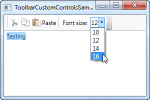
Summary
Creating interfaces with toolbars is very easy in WPF, with the flexible ToolBar control. You can do things that previously required 3rd party toolbar controls and you can even do it without much extra effort.The WPF StatusBar control
With the top of the application window usually occupied by the main menu and/or toolbars, described in previous chapters, the bottom part of the window is usually the home of the status bar. The status bar is used to show various information about the current state of the application, like cursor position, word count, progress of tasks and so on. Fortunately for us, WPF comes with a nice StatusBar control, making it very easy to add status bar functionality to your applications.Let's start off with a very basic example:
<Window x:Class="WpfTutorialSamples.Common_interface_controls.StatusBarSample"
        xmlns="http://schemas.microsoft.com/winfx/2006/xaml/presentation"
        xmlns:x="http://schemas.microsoft.com/winfx/2006/xaml"
        Title="StatusBarSample" Height="150" Width="300">
        <DockPanel>
                <StatusBar DockPanel.Dock="Bottom">
                        <StatusBarItem>
                                <TextBlock Name="lblCursorPosition" />
                        </StatusBarItem>
                </StatusBar>
                <TextBox AcceptsReturn="True" Name="txtEditor" SelectionChanged="txtEditor_SelectionChanged" />
        </DockPanel>
</Window>
using System;
using System.Windows;
namespace WpfTutorialSamples.Common_interface_controls
{
        public partial class StatusBarSample : Window
        {
                public StatusBarSample()
                {
                        InitializeComponent();
                }

                private void txtEditor_SelectionChanged(object sender, RoutedEventArgs e)
                {

                        int row = txtEditor.GetLineIndexFromCharacterIndex(txtEditor.CaretIndex);
                        int col = txtEditor.CaretIndex - txtEditor.GetCharacterIndexFromLineIndex(row);
                        lblCursorPosition.Text = "Line " + (row + 1) + ", Char " + (col + 1);
                }
        }
}
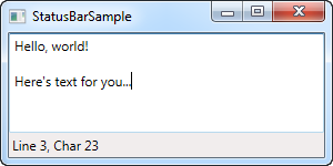
It's all very simple - a TextBlock control that shows the current cursor position, just like in pretty much any other application that allows you to edit text. In this very basic form, the StatusBar could just as easily have been a panel with a set of controls on it, but the real advantage of the StatusBar comes when we need to divide it into several areas of information.
Advanced StatusBar example
Let's try a more advanced example of using the StatusBar. The first thing we want to do is to make the StatusBar use another panel for the layout. By default, it uses the DockPanel, but when we want a more complex layout, with columns that adjusts its width in a certain way and aligned content, the Grid is a much better choice.We'll divide the Grid into three areas, with the left and right one having a fixed width and the middle column automatically taking up the remaining space. We'll also add columns in between for Separator controls. Here's how it looks now:
<Window x:Class="WpfTutorialSamples.Common_interface_controls.StatusBarAdvancedSample"
        xmlns="http://schemas.microsoft.com/winfx/2006/xaml/presentation"
        xmlns:x="http://schemas.microsoft.com/winfx/2006/xaml"
        Title="StatusBarAdvancedSample" Height="150" Width="400">
    <DockPanel>
        <StatusBar DockPanel.Dock="Bottom">
            <StatusBar.ItemsPanel>
                <ItemsPanelTemplate>
                    <Grid>
                        <Grid.ColumnDefinitions>
                            <ColumnDefinition Width="100" />
                            <ColumnDefinition Width="Auto" />
                            <ColumnDefinition Width="*" />
                            <ColumnDefinition Width="Auto" />
                            <ColumnDefinition Width="100" />
                        </Grid.ColumnDefinitions>
                    </Grid>
                </ItemsPanelTemplate>
            </StatusBar.ItemsPanel>
            <StatusBarItem>
                <TextBlock Name="lblCursorPosition" />
            </StatusBarItem>
            <Separator Grid.Column="1" />
            <StatusBarItem Grid.Column="2">
                <TextBlock Text="c:\path\of\current\file.txt" />
            </StatusBarItem>
            <Separator Grid.Column="3" />
            <StatusBarItem Grid.Column="4">
                <ProgressBar Value="50" Width="90" Height="16" />
            </StatusBarItem>
        </StatusBar>
        <TextBox AcceptsReturn="True" Name="txtEditor" SelectionChanged="txtEditor_SelectionChanged" />
    </DockPanel>
</Window>
using System;
using System.Windows;
namespace WpfTutorialSamples.Common_interface_controls
{
        public partial class StatusBarAdvancedSample : Window
        {
                public StatusBarAdvancedSample()
                {
                        InitializeComponent();
                }

                private void txtEditor_SelectionChanged(object sender, RoutedEventArgs e)
                {
                        int row = txtEditor.GetLineIndexFromCharacterIndex(txtEditor.CaretIndex);
                        int col = txtEditor.CaretIndex - txtEditor.GetCharacterIndexFromLineIndex(row);
                        lblCursorPosition.Text = "Line " + (row + 1) + ", Char " + (col + 1);
                }
        }
}
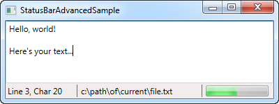
As you can see, I've added a bit of sample information, like the fake filename in the middle column and the progress bar to the right, showing a static value for now. You could easily make this work for real though, and it gives a pretty good idea on what you can do with the StatusBar control.
Summary
Once again, WPF makes it easy to get standard Windows functionality, in this case the StatusBar, integrated into your applications.You can even place other controls than the ones used in these examples, like buttons, combo boxes and so on, but please be aware that since the StatusBar doesn't apply any special rendering to these controls when hosting them, it might not look as you would expect it to for controls in a status bar. This can be handled with custom styling if you need it though, a subject discussed elsewhere in this tutorial.
Introduction to the ListView control
The ListView control is very commonly used in Windows applications, to represent lists of data. A great example of this is the file lists in Windows Explorer, where each file can be shown by its name and, if desired, with columns containing information about the size, last modification date and so on.ListView in WPF vs. WinForms
If you have previously worked with WinForms, then you have a good idea about how practical the ListView is, but you should be aware that the ListView in WPF isn't used like the WinForms version. Once again the main difference is that while the WinForms ListView simply calls Windows API functions to render a common Windows ListView control, the WPF ListView is an independent control that doesn't rely on the Windows API.The WPF ListView does use a ListViewItem class for its most basic items, but if you compare it to the WinForms version, you might start looking for properties like ImageIndex, Group and SubItems, but they're not there. The WPF ListView handles stuff like item images, groups and their sub items in a completely different way.
Summary
The ListView is a complex control, with lots of possibilities and especially in the WPF version, you get to customize it almost endlessly if you want to. For that reason, we have dedicated an entire category to all the ListView articles here on the site. Click on to the next article to get started.A simple ListView example
The WPF ListView control is very bare minimum in its most simple form. In fact, it will look a whole lot like the WPF ListBox, until you start adding specialized views to it. That's not so strange, since a ListView inherits directly from the ListBox control. So, a default ListView is actually just a ListBox, with a different selection mode (more on that later).Let's try creating a ListView in its most simple form:
<Window x:Class="WpfTutorialSamples.ListView_control.ListViewBasicSample"
        xmlns="http://schemas.microsoft.com/winfx/2006/xaml/presentation"
        xmlns:x="http://schemas.microsoft.com/winfx/2006/xaml"
        Title="ListViewBasicSample" Height="200" Width="200">
    <Grid>
                <ListView Margin="10">
                        <ListViewItem>A ListView</ListViewItem>
                        <ListViewItem IsSelected="True">with several</ListViewItem>
                        <ListViewItem>items</ListViewItem>
                </ListView>
        </Grid>
</Window>
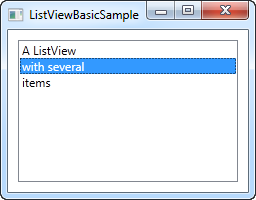 This is pretty much as simple as it gets, using manually specified
ListViewItem to fill the list and with nothing but a text label
representing each item - a bare minimum WPF ListView control.
 ListViewItem with an image
Because of the look-less nature of WPF, specifying an image for a ListViewItem isn't just about assigning an image ID or key to a property. Instead, you take full control of it and specify the controls needed to render both image and text in the ListViewItem. Here's an example:<Window x:Class="WpfTutorialSamples.ListView_control.ListViewBasicSample" xmlns="http://schemas.microsoft.com/winfx/2006/xaml/presentation" xmlns:x="http://schemas.microsoft.com/winfx/2006/xaml" Title="ListViewBasicSample" Height="200" Width="200"> <Grid> <ListView Margin="10"> <ListViewItem> <StackPanel Orientation="Horizontal"> <Image Source="/WpfTutorialSamples;component/Images/bullet_green.png" Margin="0,0,5,0" /> <TextBlock>Green</TextBlock> </StackPanel> </ListViewItem> <ListViewItem> <StackPanel Orientation="Horizontal"> <Image Source="/WpfTutorialSamples;component/Images/bullet_blue.png" Margin="0,0,5,0" /> <TextBlock>Blue</TextBlock> </StackPanel> </ListViewItem> <ListViewItem IsSelected="True"> <StackPanel Orientation="Horizontal"> <Image Source="/WpfTutorialSamples;component/Images/bullet_red.png" Margin="0,0,5,0" /> <TextBlock>Red</TextBlock> </StackPanel> </ListViewItem> </ListView> </Grid> </Window>
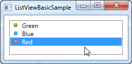 What we do here is very simple. Because the ListViewItem derives from
the ContentControl class, we can specify a WPF control as its content.
In this case, we use a StackPanel, which has an Image and a TextBlock as
its child controls.
 Summary
As you can see, building a ListView manually in XAML is very simple, but in most cases, your ListView data will come from some sort of data source, which should be rendered in the ListView at runtime. We will look into doing just that in the next chapter.ListView, data binding and ItemTemplate
In the previous article, we manually populated a ListView control through XAML code, but in WPF, it's all about data binding. The concept of data binding is explained in detail in another part of this tutorial, but generally speaking it's about separating data from layout. So, let's try binding some data to a ListView:<Window x:Class="WpfTutorialSamples.ListView_control.ListViewDataBindingSample" xmlns="http://schemas.microsoft.com/winfx/2006/xaml/presentation" xmlns:x="http://schemas.microsoft.com/winfx/2006/xaml" Title="ListViewDataBindingSample" Height="300" Width="300"> <Grid> <ListView Margin="10" Name="lvDataBinding"></ListView> </Grid> </Window>
using System;
using System.Collections.Generic;
using System.Windows;
namespace WpfTutorialSamples.ListView_control
{
        public partial class ListViewDataBindingSample : Window
        {
                public ListViewDataBindingSample()
                {
                        InitializeComponent();
                        List<User> items = new List<User>();
                        items.Add(new User() { Name = "John Doe", Age = 42 });
                        items.Add(new User() { Name = "Jane Doe", Age = 39 });
                        items.Add(new User() { Name = "Sammy Doe", Age = 13 });
                        lvDataBinding.ItemsSource = items;
                }
        }

        public class User
        {
                public string Name { get; set; }

                public int Age { get; set; }
        }
}
We populate a list of our own User objects, each user having a name and an age. The data binding process happens automatically as soon as we assign the list to the ItemsSource property of the ListView, but the result is a bit discouraging:
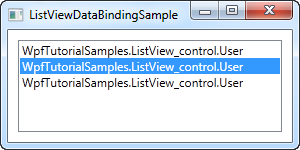 Each user is represented by their type name in the ListView. This is
to be expected, because .NET doesn't have a clue about how you want your
data to be displayed, so it just calls the ToString() method on each
object and uses that to represent the item. We can use that to our
advantage and override the ToString() method, to get a more meaningful
output. Try replacing the User class with this version:
Each user is represented by their type name in the ListView. This is
to be expected, because .NET doesn't have a clue about how you want your
data to be displayed, so it just calls the ToString() method on each
object and uses that to represent the item. We can use that to our
advantage and override the ToString() method, to get a more meaningful
output. Try replacing the User class with this version:public class User { public string Name { get; set; } public int Age { get; set; } public override string ToString() { return this.Name + ", " + this.Age + " years old"; } }
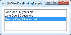 This is a much more user friendly display and will do just fine in
some cases, but relying on a simple string is not that flexible. Perhaps
you want a part of the text to be bold or another color? Perhaps you
want an image? Fortunately, WPF makes all of this very simple using
templates.
This is a much more user friendly display and will do just fine in
some cases, but relying on a simple string is not that flexible. Perhaps
you want a part of the text to be bold or another color? Perhaps you
want an image? Fortunately, WPF makes all of this very simple using
templates.ListView with an ItemTemplate
WPF is all about templating, so specifying a data template for the ListView is very easy. In this example, we'll do a bunch of custom formatting in each item, just to show you how flexible this makes the WPF ListView.<Window x:Class="WpfTutorialSamples.ListView_control.ListViewItemTemplateSample" xmlns="http://schemas.microsoft.com/winfx/2006/xaml/presentation" xmlns:x="http://schemas.microsoft.com/winfx/2006/xaml" Title="ListViewItemTemplateSample" Height="150" Width="350"> <Grid> <ListView Margin="10" Name="lvDataBinding"> <ListView.ItemTemplate> <DataTemplate> <WrapPanel> <TextBlock Text="Name: " /> <TextBlock Text="{Binding Name}" FontWeight="Bold" /> <TextBlock Text=", " /> <TextBlock Text="Age: " /> <TextBlock Text="{Binding Age}" FontWeight="Bold" /> <TextBlock Text=" (" /> <TextBlock Text="{Binding Mail}" TextDecorations="Underline" Foreground="Blue" Cursor="Hand" /> <TextBlock Text=")" /> </WrapPanel> </DataTemplate> </ListView.ItemTemplate> </ListView> </Grid> </Window>
using System;
using System.Collections.Generic;
using System.Windows;
namespace WpfTutorialSamples.ListView_control
{
        public partial class ListViewItemTemplateSample : Window
        {
                public ListViewItemTemplateSample()
                {
                        InitializeComponent();
                        List<User> items = new List<User>();
                        items.Add(new User() { Name = "John Doe", Age = 42, Mail = "john@doe-family.com" });
                        items.Add(new User() { Name = "Jane Doe", Age = 39, Mail = "jane@doe-family.com" });
                        items.Add(new User() { Name = "Sammy Doe", Age = 13, Mail = "sammy.doe@gmail.com" });
                        lvDataBinding.ItemsSource = items;
                }
        }

        public class User
        {
                public string Name { get; set; }

                public int Age { get; set; }

                public string Mail { get; set; }
        }
}
 We use a bunch of TextBlock controls to build each item, where we put
part of the text in bold. For the e-mail address, which we added to
this example, we underline it, give it a blue color and change the mouse
cursor, to make it behave like a hyperlink.
We use a bunch of TextBlock controls to build each item, where we put
part of the text in bold. For the e-mail address, which we added to
this example, we underline it, give it a blue color and change the mouse
cursor, to make it behave like a hyperlink.Summary
Using an ItemTemplate and data binding, we produced a pretty cool ListView control. However, it still looks a lot like a ListBox. A very common usage scenario for a ListView is to have columns, sometimes (e.g. in WinForms) referred to as a details view. WPF comes with a built-in view class to handle this, which we will talk about in the next chapter.ListView with a GridView
In the previous ListView articles, we have used the most basic version of the WPF ListView, which is the one without a custom View specified. This results in a ListView that acts very much like the WPF ListBox, with some subtle differences. The real power lies in the views though and WPF comes with one specialized view built-in: The GridView.By using the GridView, you can get several columns of data in your ListView, much like you see it in Windows Explorer. Just to make sure that everyone can visualize it, we'll start off with a basic example:
<Window x:Class="WpfTutorialSamples.ListView_control.ListViewGridViewSample"
        xmlns="http://schemas.microsoft.com/winfx/2006/xaml/presentation"
        xmlns:x="http://schemas.microsoft.com/winfx/2006/xaml"
        Title="ListViewGridViewSample" Height="200" Width="400">
    <Grid>
                <ListView Margin="10" Name="lvUsers">
                        <ListView.View>
                                <GridView>
                                        <GridViewColumn Header="Name" Width="120" DisplayMemberBinding="{Binding Name}" />
                                        <GridViewColumn Header="Age" Width="50" DisplayMemberBinding="{Binding Age}" />
                                        <GridViewColumn Header="Mail" Width="150" DisplayMemberBinding="{Binding Mail}" />
                                </GridView>
                        </ListView.View>
                </ListView>
        </Grid>
</Window>
using System;
using System.Collections.Generic;
using System.Windows;
namespace WpfTutorialSamples.ListView_control
{
        public partial class ListViewGridViewSample : Window
        {
                public ListViewGridViewSample()
                {
                        InitializeComponent();
                        List<User> items = new List<User>();
                        items.Add(new User() { Name = "John Doe", Age = 42, Mail = "john@doe-family.com" });
                        items.Add(new User() { Name = "Jane Doe", Age = 39, Mail = "jane@doe-family.com" });
                        items.Add(new User() { Name = "Sammy Doe", Age = 7, Mail = "sammy.doe@gmail.com" });
                        lvUsers.ItemsSource = items;
                }
        }

        public class User
        {
                public string Name { get; set; }

                public int Age { get; set; }

                public string Mail { get; set; }
        }
}
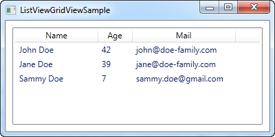
So, we use the same User class as previously, for test data, which we then bind to the ListView. This is all the same as we saw in previous chapters, but as you can see from the screenshot, the layout is very different. This is the power of data binding - the same data, but presented in a completely different way, just by changing the markup.
In the markup (XAML), we define a View for the ListView, using the ListView.View property. We set it to a GridView, which is currently the only included view type in WPF (you can easily create your own though!). The GridView is what gives us the column-based view that you see on the screenshot.
Inside of the GridView, we define three columns, one for each of the pieces of data that we wish to show. The Header property is used to specify the text that we would like to show for the column and then we use the DisplayMemberBinding property to bind the value to a property from our User class.
Templated cell content
Using the DisplayMemberBinding property is pretty much limited to outputting simple strings, with no custom formatting at all, but the WPF ListView is much more flexible than that. By specifying a CellTemplate, we take full control of how the content is rendered within the specific column cell.The GridViewColumn will use the DisplayMemberBinding as its first priority, it it's present. The second choice will be the CellTemplate property, which we'll use for this example:
<Window x:Class="WpfTutorialSamples.ListView_control.ListViewGridViewCellTemplateSample"
        xmlns="http://schemas.microsoft.com/winfx/2006/xaml/presentation"
        xmlns:x="http://schemas.microsoft.com/winfx/2006/xaml"
        Title="ListViewGridViewCellTemplateSample" Height="200" Width="400">
    <Grid>
                <ListView Margin="10" Name="lvUsers">
                        <ListView.View>
                                <GridView>
                                        <GridViewColumn Header="Name" Width="120" DisplayMemberBinding="{Binding Name}" />
                                        <GridViewColumn Header="Age" Width="50" DisplayMemberBinding="{Binding Age}" />
                                        <GridViewColumn Header="Mail" Width="150">
                                                <GridViewColumn.CellTemplate>
                                                        <DataTemplate>
                                                                <TextBlock Text="{Binding Mail}" TextDecorations="Underline" Foreground="Blue" Cursor="Hand" />
                                                        </DataTemplate>
                                                </GridViewColumn.CellTemplate>
                                        </GridViewColumn>
                                </GridView>
                        </ListView.View>
                </ListView>
        </Grid>
</Window>
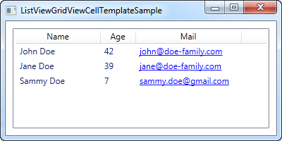
Please notice: The Code-behind code for this example is the same as the one used for the first example in this article.
We specify a custom CellTemplate for the last column, where we would like to do some special formatting for the e-mail addresses. For the other columns, where we just want basic text output, we stick with the DisplayMemberBinding, simply because it requires way less markup.
How-to: ListView with left aligned column names
In a normal ListView, the column names are left aligned, but for some reason, Microsoft decided to center the names by default in the WPF ListView. In many cases this will make your application look out-of-style compared to other Windows applications. This is how the ListView will look in WPF by default:
Let's try changing that to left aligned column names. Unfortunately, there are no direct properties on the GridViewColumn to control this, but fortunately that doesn't mean that it can't be changed.
Using a Style, targeted at the GridViewColumHeader, which is the element used to show the header of a GridViewColumn, we can change the HorizontalAlignment property. In this case it defaults to Center, but we can change it to Left, to accomplish what we want:
<Window x:Class="WpfTutorialSamples.ListView_control.ListViewGridViewSample"
        xmlns="http://schemas.microsoft.com/winfx/2006/xaml/presentation"
        xmlns:x="http://schemas.microsoft.com/winfx/2006/xaml"
        Title="ListViewGridViewSample" Height="200" Width="400">
    <Grid>
                <ListView Margin="10" Name="lvUsers">
                        <ListView.Resources>
                                <Style TargetType="{x:Type GridViewColumnHeader}">
                                        <Setter Property="HorizontalContentAlignment" Value="Left" />
                                </Style>
                        </ListView.Resources>
                        <ListView.View>
                                <GridView>
                                        <GridViewColumn Header="Name" Width="120" DisplayMemberBinding="{Binding Name}" />
                                        <GridViewColumn Header="Age" Width="50" DisplayMemberBinding="{Binding Age}" />
                                        <GridViewColumn Header="Mail" Width="150" DisplayMemberBinding="{Binding Mail}" />
                                </GridView>
                        </ListView.View>
                </ListView>
        </Grid>
</Window>
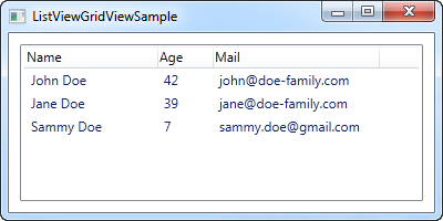
The part that does all the work for us, is the Style defined in the Resources of the ListView:
<Style TargetType="{x:Type GridViewColumnHeader}">
                                        <Setter Property="HorizontalContentAlignment" Value="Left" />
</Style>
Local or global style
By defining the Style within the control itself, it only applies to this particular ListView. In many cases you might like to make it apply to all the ListViews within the same Window/Page or perhaps even globally across the application. You can do this by either copying the style to the Window resources or the Application resources. Here's the same example, where we have applied the style to the entire Window instead of just the particular ListView:<Window x:Class="WpfTutorialSamples.ListView_control.ListViewGridViewSample" xmlns="http://schemas.microsoft.com/winfx/2006/xaml/presentation" xmlns:x="http://schemas.microsoft.com/winfx/2006/xaml" Title="ListViewGridViewSample" Height="200" Width="400"> <Window.Resources> <Style TargetType="{x:Type GridViewColumnHeader}"> <Setter Property="HorizontalContentAlignment" Value="Left" /> </Style> </Window.Resources> <Grid> <ListView Margin="10" Name="lvUsers"> <ListView.View> <GridView> <GridViewColumn Header="Name" Width="120" DisplayMemberBinding="{Binding Name}" /> <GridViewColumn Header="Age" Width="50" DisplayMemberBinding="{Binding Age}" /> <GridViewColumn Header="Mail" Width="150" DisplayMemberBinding="{Binding Mail}" /> </GridView> </ListView.View> </ListView> </Grid> </Window>In case you want another alignment, e.g. right alignment, you just change the value of the style like this:
<Setter Property="HorizontalContentAlignment" Value="Right" />
ListView grouping
As we already talked about earlier, the WPF ListView is very flexible. Grouping is yet another thing that it supports out of the box, and it's both easy to use and extremely customizable. Let's jump straight into the first example, then I'll explain it and afterwards we can use the standard WPF tricks to customize the appearance even further.For this article, I've borrowed the sample code from a previous article and then expanded on it to support grouping. It looks like this:
<Window x:Class="WpfTutorialSamples.ListView_control.ListViewGroupSample"
xmlns="http://schemas.microsoft.com/winfx/2006/xaml/presentation"
xmlns:x="http://schemas.microsoft.com/winfx/2006/xaml"
Title="ListViewGroupSample" Height="300" Width="300">
<Grid Margin="10">
<ListView Name="lvUsers">
<ListView.View>
<GridView>
<GridViewColumn Header="Name" Width="120" DisplayMemberBinding="{Binding Name}" />
<GridViewColumn Header="Age" Width="50" DisplayMemberBinding="{Binding Age}" />
</GridView>
</ListView.View>
<ListView.GroupStyle>
<GroupStyle>
<GroupStyle.HeaderTemplate>
<DataTemplate>
<TextBlock FontWeight="Bold" FontSize="14" Text="{Binding Name}"/>
</DataTemplate>
</GroupStyle.HeaderTemplate>
</GroupStyle>
</ListView.GroupStyle>
</ListView>
</Grid>
</Window> using System;
using System.Collections.Generic;
using System.Windows;
using System.Windows.Data;
namespace WpfTutorialSamples.ListView_control
{
public partial class ListViewGroupSample : Window
{
public ListViewGroupSample()
{
InitializeComponent();
List<User> items = new List<User>();
items.Add(new User() { Name = "John Doe", Age = 42, Sex = SexType.Male });
items.Add(new User() { Name = "Jane Doe", Age = 39, Sex = SexType.Female });
items.Add(new User() { Name = "Sammy Doe", Age = 13, Sex = SexType.Male });
lvUsers.ItemsSource = items;
CollectionView view = (CollectionView)CollectionViewSource.GetDefaultView(lvUsers.ItemsSource);
PropertyGroupDescription groupDescription = new PropertyGroupDescription("Sex");
view.GroupDescriptions.Add(groupDescription);
}
}
public enum SexType { Male, Female };
public class User
{
public string Name { get; set; }
public int Age { get; set; }
public string Mail { get; set; }
public SexType Sex { get; set; }
}
}

In XAML, I have added a GroupStyle to the ListView, in which I define a template for the header of each group. It consists of a TextBlock control, where I've used a slightly larger and bold text to show that it's a group - as we'll see later on, this can of course be customized a lot more. The TextBlock Text property is bound to a Name property, but please be aware that this is not the Name property on the data object (in this case the User class). Instead, it is the name of the group, as assigned by WPF, based on the property we use to divide the objects into groups.
In Code-behind, we do the same as we did before: We create a list and add some User objects to it and then we bind the list to the ListView - nothing new there, except for the new Sex property that I've added, which tells whether the user is male or female.
After assigning an ItemsSource, we use this to get a CollectionView that the ListView creates for us. This specialized View instance contains a lot of possibilities, including the ability to group the items. We use this by adding a so-called PropertyGroupDescription to the GroupDescriptions of the view. This basically tells WPF to group by a specific property on the data objects, in this case the Sex property.
Customizing the group header
The above example was great for showing the basics of ListView grouping, but the look was a tad boring, so let's exploit the fact that WPF lets us define our own templates and spice things up. A common request is to be able to collapse and expand the group, and while WPF doesn't provide this behavior by default, it's somewhat easy to implement yourself. We'll do it by completely re-templating the group container.It might look a bit cumbersome, but the principles used are somewhat simple and you will see them in other situations when you customize the WPF controls. Here's the code:
<Window x:Class="WpfTutorialSamples.ListView_control.ListViewCollapseExpandGroupSample"
xmlns="http://schemas.microsoft.com/winfx/2006/xaml/presentation"
xmlns:x="http://schemas.microsoft.com/winfx/2006/xaml"
Title="ListViewCollapseExpandGroupSample" Height="300" Width="300">
<Grid Margin="10">
<ListView Name="lvUsers">
<ListView.View>
<GridView>
<GridViewColumn Header="Name" Width="120" DisplayMemberBinding="{Binding Name}" />
<GridViewColumn Header="Age" Width="50" DisplayMemberBinding="{Binding Age}" />
</GridView>
</ListView.View>
<ListView.GroupStyle>
<GroupStyle>
<GroupStyle.ContainerStyle>
<Style TargetType="{x:Type GroupItem}">
<Setter Property="Template">
<Setter.Value>
<ControlTemplate>
<Expander IsExpanded="True">
<Expander.Header>
<StackPanel Orientation="Horizontal">
<TextBlock Text="{Binding Name}" FontWeight="Bold" Foreground="Gray" FontSize="22" VerticalAlignment="Bottom" />
<TextBlock Text="{Binding ItemCount}" FontSize="22" Foreground="Green" FontWeight="Bold" FontStyle="Italic" Margin="10,0,0,0" VerticalAlignment="Bottom" />
<TextBlock Text=" item(s)" FontSize="22" Foreground="Silver" FontStyle="Italic" VerticalAlignment="Bottom" />
</StackPanel>
</Expander.Header>
<ItemsPresenter />
</Expander>
</ControlTemplate>
</Setter.Value>
</Setter>
</Style>
</GroupStyle.ContainerStyle>
</GroupStyle>
</ListView.GroupStyle>
</ListView>
</Grid>
</Window> The Code-behind is exactly the same as used in the first example - feel free to scroll up and grab it.
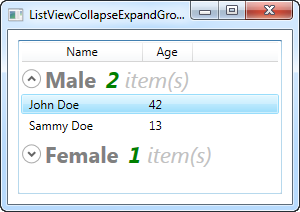
Now our groups look a bit more exciting, and they even include an expander button, that will toggle the visibility of the group items when you click it (that's why the single female user is not visible on the screenshot - I collapsed that particular group). By using the ItemCount property that the group exposes, we can even show how many items each group currently consists of.
As you can see, it requires a bit more markup than we're used to, but this example also goes a bit beyond what we usually do, so that seems fair. When you read through the code, you will quickly realize that many of the lines are just common elements like style and template.
Summary
Adding grouping to the WPF ListView is very simple - all you need is a GroupStyle with a HeaderTemplate, to tell the ListView how to render a group, and a few lines of Code-behind code to tell WPF which property to group by. As you can see from the last example, the group is even very customizable, allowing you to create some really cool views, without too much work.ListView sorting
In the last chapter we saw how we could group items in the WPF ListView by accessing the View instance of the ListView and then adding a group description. Applying sorting to a ListView is just as easy, and most of the process is exactly the same. Let's try a simple example where we sort the user objects by their age:<Window x:Class="WpfTutorialSamples.ListView_control.ListViewSortingSample" xmlns="http://schemas.microsoft.com/winfx/2006/xaml/presentation" xmlns:x="http://schemas.microsoft.com/winfx/2006/xaml" Title="ListViewSortingSample" Height="200" Width="300"> <Grid Margin="10"> <ListView Name="lvUsers"> <ListView.View> <GridView> <GridViewColumn Header="Name" Width="120" DisplayMemberBinding="{Binding Name}" /> <GridViewColumn Header="Age" Width="50" DisplayMemberBinding="{Binding Age}" /> </GridView> </ListView.View> </ListView> </Grid> </Window>
using System;
using System.Collections.Generic;
using System.ComponentModel;
using System.Windows;
using System.Windows.Data;
namespace WpfTutorialSamples.ListView_control
{
        public partial class ListViewSortingSample : Window
        {
                public ListViewSortingSample()
                {
                        InitializeComponent();
                        List<User> items = new List<User>();
                        items.Add(new User() { Name = "John Doe", Age = 42 });
                        items.Add(new User() { Name = "Jane Doe", Age = 39 });
                        items.Add(new User() { Name = "Sammy Doe", Age = 13 });
                        items.Add(new User() { Name = "Donna Doe", Age = 13 });
                        lvUsers.ItemsSource = items;

                        CollectionView view = (CollectionView)CollectionViewSource.GetDefaultView(lvUsers.ItemsSource);
                        view.SortDescriptions.Add(new SortDescription("Age", ListSortDirection.Ascending));
                }
        }

        public class User
        {
                public string Name { get; set; }

                public int Age { get; set; }
        }
}
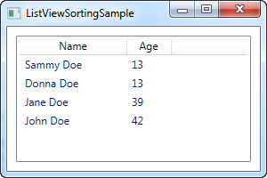
The XAML looks just like a previous example, where we simply have a couple of columns for displaying information about the user - nothing new here.
In the Code-behind, we once again create a list of User objects, which we then assign as the ItemsSource of the ListView. Once we've done that, we use the ItemsSource property to get the CollectionView instance that the ListView automatically creates for us and which we can use to manipulate how the ListView shows our objects.
With the view object in our hand, we add a new SortDescription to it, specifying that we want our list sorted by the Age property, in ascending order. As you can see from the screenshot, this works perfectly well - the list is sorted by age, instead of being in the same order as the items were added.
Multiple sort criteria
As shown in the first example, sorting is very easy, but on the screenshot you'll see that Sammy comes before Donna. They have the same age, so in this case, WPF will just use the order in which they were added. Fortunately, WPF lets us specify as many sort criteria as we want. In the example above, try changing the view-related code into something like this:CollectionView view = (CollectionView)CollectionViewSource.GetDefaultView(lvUsers.ItemsSource); view.SortDescriptions.Add(new SortDescription("Age", ListSortDirection.Ascending)); view.SortDescriptions.Add(new SortDescription("Name", ListSortDirection.Ascending));
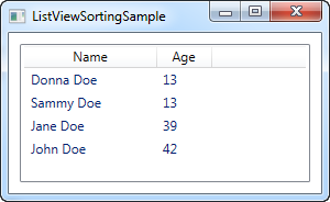
Now the view will be sorted using age first, and when two identical values are found, the name will be used as a secondary sorting parameter.
Summary
It's very easy to sort the contents of a ListView, as seen in the above examples, but so far, all the sorting is decided by the programmer and not the end-user. In the next article I'll give you a how-to article showing you how to let the user decide the sorting by clicking on the columns, as seen in Windows.How-to: ListView with column sorting
In the last chapter we saw how we could easily sort a ListView from Code-behind, and while this will suffice for some cases, it doesn't allow the end-user to decide on the sorting. Besides that, there was no indication on which column the ListView was sorted by. In Windows, and in many user interfaces in general, it's common to illustrate sort directions in a list by drawing a triangle next to the column name currently used to sort by.In this how-to article, I'll give you a practical solution that gives us all of the above, but please bear in mind that some of the code here goes a bit beyond what we have learned so far - that's why it has the "how-to" label.
This article builds upon the previous one, but I'll still explain each part as we go along. Here's our goal - a ListView with column sorting, including visual indication of sort field and direction. The user simply clicks a column to sort by and if the same column is clicked again, the sort direction is reversed. Here's how it looks:
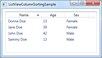
The XAML
The first thing we need is some XAML to define our user interface. It currently looks like this:<Window x:Class="WpfTutorialSamples.ListView_control.ListViewColumnSortingSample" xmlns="http://schemas.microsoft.com/winfx/2006/xaml/presentation" xmlns:x="http://schemas.microsoft.com/winfx/2006/xaml" Title="ListViewColumnSortingSample" Height="200" Width="350"> <Grid Margin="10"> <ListView Name="lvUsers"> <ListView.View> <GridView> <GridViewColumn Width="120" DisplayMemberBinding="{Binding Name}"> <GridViewColumn.Header> <GridViewColumnHeader Tag="Name" Click="lvUsersColumnHeader_Click">Name</GridViewColumnHeader> </GridViewColumn.Header> </GridViewColumn> <GridViewColumn Width="80" DisplayMemberBinding="{Binding Age}"> <GridViewColumn.Header> <GridViewColumnHeader Tag="Age" Click="lvUsersColumnHeader_Click">Age</GridViewColumnHeader> </GridViewColumn.Header> </GridViewColumn> <GridViewColumn Width="80" DisplayMemberBinding="{Binding Sex}"> <GridViewColumn.Header> <GridViewColumnHeader Tag="Sex" Click="lvUsersColumnHeader_Click">Sex</GridViewColumnHeader> </GridViewColumn.Header> </GridViewColumn> </GridView> </ListView.View> </ListView> </Grid> </Window>Notice how I have specified headers for each of the columns using an actual GridViewColumnHeader element instead of just specifying a string. This is done so that I may set additional properties, in this case the Tag property as well as the Click event.
The Tag property is used to hold the field name that will be used to sort by, if this particular column is clicked. This is done in the lvUsersColumnHeader_Click event that each of the columns subscribes to.
That was the key concepts of the XAML. Besides that, we bind to our Code-behind properties Name, Age and Sex, which we'll discuss now.
The Code-behind
In Code-behind, there are quite a few things happening. I use a total of three classes, which you would normally divide up into individual files, but for convenience, I have kept them in the same file, giving us a total of ~100 lines. First the code and then I'll explain how it works:using System; using System.Collections.Generic; using System.ComponentModel; using System.Windows; using System.Windows.Controls; using System.Windows.Data; using System.Windows.Documents; using System.Windows.Media; namespace WpfTutorialSamples.ListView_control { public partial class ListViewColumnSortingSample : Window { private GridViewColumnHeader listViewSortCol = null; private SortAdorner listViewSortAdorner = null; public ListViewColumnSortingSample() { InitializeComponent(); List<User> items = new List<User>(); items.Add(new User() { Name = "John Doe", Age = 42, Sex = SexType.Male }); items.Add(new User() { Name = "Jane Doe", Age = 39, Sex = SexType.Female }); items.Add(new User() { Name = "Sammy Doe", Age = 13, Sex = SexType.Male }); items.Add(new User() { Name = "Donna Doe", Age = 13, Sex = SexType.Female }); lvUsers.ItemsSource = items; } private void lvUsersColumnHeader_Click(object sender, RoutedEventArgs e) { GridViewColumnHeader column = (sender as GridViewColumnHeader); string sortBy = column.Tag.ToString(); if(listViewSortCol != null) { AdornerLayer.GetAdornerLayer(listViewSortCol).Remove(listViewSortAdorner); lvUsers.Items.SortDescriptions.Clear(); } ListSortDirection newDir = ListSortDirection.Ascending; if(listViewSortCol == column && listViewSortAdorner.Direction == newDir) newDir = ListSortDirection.Descending; listViewSortCol = column; listViewSortAdorner = new SortAdorner(listViewSortCol, newDir); AdornerLayer.GetAdornerLayer(listViewSortCol).Add(listViewSortAdorner); lvUsers.Items.SortDescriptions.Add(new SortDescription(sortBy, newDir)); } } public enum SexType { Male, Female }; public class User { public string Name { get; set; } public int Age { get; set; } public string Mail { get; set; } public SexType Sex { get; set; } } public class SortAdorner : Adorner { private static Geometry ascGeometry = Geometry.Parse("M 0 4 L 3.5 0 L 7 4 Z"); private static Geometry descGeometry = Geometry.Parse("M 0 0 L 3.5 4 L 7 0 Z"); public ListSortDirection Direction { get; private set; } public SortAdorner(UIElement element, ListSortDirection dir) : base(element) { this.Direction = dir; } protected override void OnRender(DrawingContext drawingContext) { base.OnRender(drawingContext); if(AdornedElement.RenderSize.Width < 20) return; TranslateTransform transform = new TranslateTransform ( AdornedElement.RenderSize.Width - 15, (AdornedElement.RenderSize.Height - 5) / 2 ); drawingContext.PushTransform(transform); Geometry geometry = ascGeometry; if(this.Direction == ListSortDirection.Descending) geometry = descGeometry; drawingContext.DrawGeometry(Brushes.Black, null, geometry); drawingContext.Pop(); } } }Allow me to start from the bottom and then work my way up while explaining what happens. The last class in the file is an Adorner class called SortAdorner. All this little class does is to draw a triangle, either pointing up or down, depending on the sort direction. WPF uses the concept of adorners to allow you to paint stuff over other controls, and this is exactly what we want here: The ability to draw a sorting triangle on top of our ListView column header.
The SortAdorner works by defining two Geometry objects, which are basically used to describe 2D shapes - in this case a triangle with the tip pointing up and one with the tip pointing down. The Geometry.Parse() method uses the list of points to draw the triangles, which will be explained more thoroughly in a later article.
The SortAdorner is aware of the sort direction, because it needs to draw the proper triangle, but is not aware of the field that we order by - this is handled in the UI layer.
The User class is just a basic information class, used to contain information about a user. Some of this information is used in the UI layer, where we bind to the Name, Age and Sex properties.
In the Window class, we have two methods: The constructor where we build a list of users and assign it to the ItemsSource of our ListView, and then the more interesting click event handler that will be hit when the user clicks a column. In the top of the class, we have defined two private variables: listViewSortCol and listViewSortAdorner. These will help us keep track of which column we're currently sorting by and the adorner we placed to indicate it.
In the lvUsersColumnHeader_Click event handler, we start off by getting a reference to the column that the user clicked. With this, we can decide which property on the User class to sort by, simply by looking at the Tag property that we defined in XAML. We then check if we're already sorting by a column - if that is the case, we remove the adorner and clear the current sort descriptions.
After that, we're ready to decide the direction. The default is ascending, but we do a check to see if we're already sorting by the column that the user clicked - if that is the case, we change the direction to descending.
In the end, we create a new SortAdorner, passing in the column that it should be rendered on, as well as the direction. We add this to the AdornerLayer of the column header, and at the very end, we add a SortDescription to the ListView, to let it know which property to sort by and in which direction.
Summary
Congratulations, you now have a fully sortable ListView with visual indication of sort column and direction. In case you want to know more about some of the concepts used in this article, like data binding, geometry or ListViews in general, then please check out some of the other articles, where each of the subjects are covered in depth.TreeView introduction
The TreeView control enabled you to display hierarchical data, with each piece of data represented by a node in the tree. Each node can then have child nodes, and the child nodes can have child nodes and so on. If you have ever used the Windows Explorer, you also know how a TreeView looks - it's the control that shows the current folder structure on your machine, in the left part of the Windows Explorer window.TreeView in WPF vs. WinForms
If you have previously worked with the TreeView control in WinForms, you might think of the TreeView control as one that's easy to use but hard to customize. In WPF it's a little bit the other way around, at least for newbies: It feels a bit complicated to get started with, but it's a LOT easier to customize. Just like most other WPF controls, the TreeView is almost lookless once you start, but it can be styled almost endlessly without much effort.Just like with the ListView control, the TreeView control does have its own item type, the TreeViewItem, which you can use to populate the TreeView. If you come from the WinForms world, you will likely start by generating TreeViewItem's and adding them to the Items property, and this is indeed possible. But since this is WPF, the preferred way is to bind the TreeView to a hierarchical data structure and then use an appropriate template to render the content.
We'll show you how to do it both ways, and while the good, old WinForms inspired way might seem like the easy choice at first, you should definitely give the WPF way a try - in the long run, it offers more flexibility and will fit in better with the rest of the WPF code you write.
Summary
The WPF TreeView is indeed a complex control. In the first example, which we'll get into already in the next chapter, it might seem simple, but once you dig deeper, you'll see the complexity. Unfortunately, the WPF TreeView control rewards you with great usability and flexibility. To show you all of them, we have dedicated an entire category to all the TreeView articles. Click on to the next one to get started.
No comments:
Post a Comment